Visual Arts Review: “Robert S. Neuman: Works on Paper” — An Academic’s Odyssey
By Helen Miller and Michael Strand
Robert S. Neuman used modernism’s interest in abstraction and material accident to shape lively compositions that riffed on urbanization, biblical themes, war, the space race, indigenous rights, mental illness, and other topics.
Robert S. Neuman: Works on Paper at the Childs Gallery through October 1. The gallery will screen Pieces of the World, a documentary on Neuman’s life and work, on September 22 at 6 p.m.
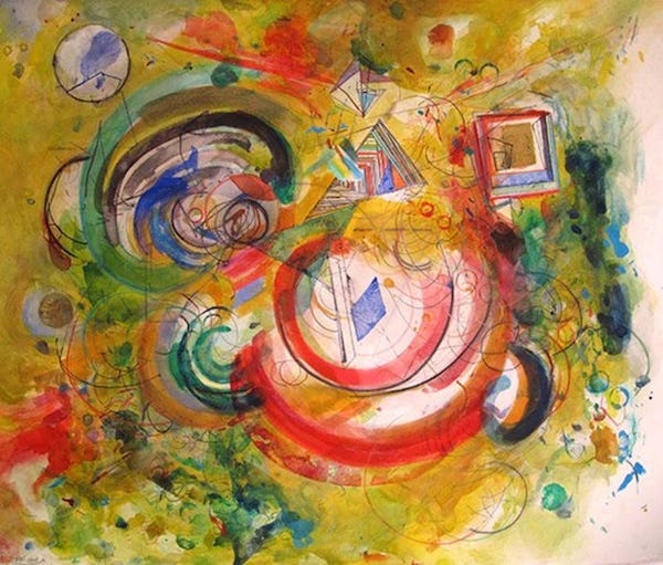
Robert S. Neuman, “Space Signs Drawing,” 2009. Photo: Childs Gallery
In the quaint second floor Print Department at Childs Gallery on Newbury Street in Boston, amidst stacks of picture frames, sit the vivid, fantastical, and surreal works on paper of American abstract painter Robert S. Neuman. These 20 small to medium sized pieces contain a little bit of everything, not unlike the artist himself.
Born in a small mining town in Idaho in 1926, Neuman acquired the hallmarks of his painting style at art school, which, in significant ways, he never left. He studied briefly at the University of Idaho and then, after serving in World War II, enrolled at the California College of Arts and Crafts and the San Francisco Art Institute. In the mid-’50s he made his way to Stuttgart on a Fulbright Scholarship, followed by Barcelona on a Guggenheim. His working life then unfolded in academic institutions across New England, landing him in the Boston area, where he became a distinguished teaching artist at Brown, MassArt, and Harvard.
The watercolors, etchings, and aquatints on display at Childs Gallery include studies for some of Neuman’s oil paintings from the ’50s and extend to equally ambitious projects he explored before the end of his life in 2015. Popular styles such as abstract expressionism, tachisme or art informel — the gestural, non-geometric form of abstract art — and themes such as space exploration and biblical voyages persist across six decades of Neuman’s work, absorbed if never quite transformed in the prolific artist’s own style. German painter Max Beckmann and other European modernists left a lasting impression, as did the burgeoning and overlooked postwar art scene of the Bay Area that steered expressionism on a slightly different course than the abstract expressionists in New York during roughly the same period. Early on, Neuman’s art was seeded with influences from Europe, reinforced during his extended trips to Germany and Spain. Over the course of his life, as his art becomes more American, it is under the imprimatur of those artists and artistic movements he had studied and been exposed to in school. The result is a novel synthesis and one that, we would argue, has enjoyed a lasting if rogue (and unacknowledged) influence on some of the most acclaimed of contemporary artists.
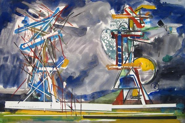
Robert S. Neuman, “Study for Monument to No One in Particular No. 5,” 1966. Photo: Childs Gallery
In “Study for Monument to No One in Particular No. 5” (1966), Neuman uses watercolor and ink to craft the solid but also faint rudiments of two monuments, which appear to be in motion. The angular rhythm observable in this and other pieces nods to Marcel Duchamp’s famous “Nude Descending a Staircase” as well as motifs and techniques of Bay Area Figurative artists Richard Diebenkorn and Henrietta Berk. Scattered, ruler-straight black lines form the delicate scaffolding of a machine set against a spacious, tumultuous sky; you can see the gears and pinion wheels, how they turn together, to no apparent purpose.
The theme of structure, actual and metaphorical, is found in many of Neuman’s works from this period. In “Tower for Dreams and Other Events” (1972), an elaborate geometric tower stands out against an overwhelming burst of color. The artist’s love of paint and color, as well as his graphic sensibility, are everywhere in evidence. In “Three Towers” (1972-75) the background has been almost entirely removed by a barrage of surrealist shapes and primary colors all loosely bound together. The result might, for some, be anxiety-provoking. Neuman rarely completes the pieces of architecture he presents. The effect can also be slightly irritating — a persnickety precision underlies the motley clutter.
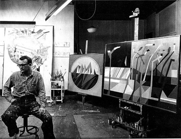
Robert S. Neuman: Artist’s Studio, Central Square, Cambridge, 1960. Photo: Robert Neuman.com
At the same time, we see examples of Neuman’s desire to let something genuinely unknown or unprecedented take place. There’s an air of experimentation: blank spaces pop up after tape has been removed, a la Diebenkorn, and there are marks left by the painted rims of various containers. The simple choice of watercolor, whose volatile nature Neuman appears to chase rather than contain, is also daring. Thematically, Neuman is a frequent explorer of other worlds. In “Voyage Drawing” (1969) optical lenses present the viewer with entirely different realities, either zoomed in or zoomed out, in richly chromatic compositions cut into a flat wash of topaz and opaque crystal.
Neuman’s “Figure in a Landscape” (1966) is the piece in the show with the most depth and point of view. Against a vaguely urban backdrop, we find a horizon line stopped abruptly by a pink square suggestive of a door or window onto another dimension. Again, Neuman uses black ink to deftly stencil in a human-like figure. A shadow image of the three graces — framed by the beckoning pink portal — this character might be cut off from the futuristic pyramids of an alternative landscape off to the right. The remarkable density of the surreal scene, as well as its unlikely cast of characters, is accomplished entirely with watercolor, evoking many of Neuman’s student works (influenced by Beckmann) which picture a world in ruin. But there is hope in the potential for movement of contrapposto; this tilted figure could cross over to the brighter side.
Robert S. Neuman, “Space Signs,” 2012. Photo: Childs Gallery.
The most recent pieces in the exhibit show the earlier interest in structure transformed into all-over abstraction and narrative. While these developments suggest the influence of Boston Expressionism, Neuman’s work is less figurative, less overtly emotional or visceral, than that of Hyman Bloom and Karl Zerbe, for example. In Neuman, we see a greater concern with planetary motion and external landscapes, including those that reflect social relations.
In “Space Signs” (2012), Neuman uses mixed media on paper, but this time without ink or line, instead giving the canvas over to an entangled biomorphic field of curvilinear red, lime green, and phthalo blue shapes with no space in between. The earlier “Space Signs Drawing” (2009) features a lighter, more open, almost floating array of circles, half circles and boxes, which stand out from a background of Meyer lemon yellow darkly splotched, seemingly at random, here and there. These visuals leave the viewer with a charged, biochemical impression of things coming into formation through a succession of chaotic though fruitful combinations, not unlike Neuman’s early construction of towers.
“Lame Deer Painting” (2011), meanwhile, shows the same late period color barrage, but with lineaments of Neuman’s ’60s line drawing. Against another DayGlo field of well-worked watercolor, we find nearly imperceptible single line constructions, not sketched but simply traced onto the canvas. At the top of the piece, the lines come together into triangular shapes that resemble outlines of the teepee dwellings of indigenous peoples from the American west. In fact, a visit to Lame Deer, Montana, near the site of the Battle of the Little Bighorn, provided Neuman with inspiration for the work. While acknowledging the tension (or awkwardness) triggered by an abstract expressionist depiction of indigenous life, it is not hard to find in the composition an important story of resilience and survival, extending back to the Battle’s culmination in indigenous victory and forward to the present, which finds impoverishment and despair all too common a feature of reservation life.
Neuman’s Lame Deer series is commonly remarked upon as evidence of his deep humanism, and with good reason given the single entry from the series in this show. However imperfectly, here we find Neuman putting the tools accumulated over a lifetime of painting and teaching at the service of a redemptive glimpse of events neither gone nor forgotten. But it is far from the only demonstration of Neuman’s humanity here.
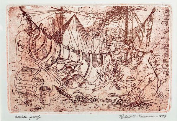
Robert S. Neuman, “Ship to Paradise (Fire),” 1979. Photo: Childs Gallery
The show’s collection of small etchings from Neuman’s “Ship to Paradise” (1979) demonstrate the artist’s range and, in this case, his drawing ability, which are only hinted at in other works. Commissioned to accompany a facsimile edition of Sebastian Brant’s medieval allegory, The Shype of Fooles, which featured original etchings by Albrecht Dürer, Neuman’s etchings combine playful whimsy and hallucinatory vision. Through a succession of scenes we see the ship in various states of disrepair and construction. The series includes no straight lines and no apparent respect for right angles or up and down. Each etching is thick with symbolism and storytelling, particularly when the ship appears to finally go off on an adventure. The result is almost cartoonish; these etchings almost beg to be animated. Above all, however, they supply an updated visual language for what Brant’s original 15th century text allegedly tried to accomplish: de-stigmatizing mental illness. Neuman sees it as part of our all-too-human condition. He replacies severity and fear with humor and a mockery of absolutes.
Neuman used modernism’s interest in abstraction and material accident to shape lively compositions that riffed on urbanization, biblical themes, war, the space race, indigenous rights, mental illness, and a number of other topics. There is energy, dynamism, and increasing confidence in these pieces, as we follow Neuman across the span of his distinguished career. Neuman’s is an accomplished hand, though he never quite realizes a language of painting on par with major figures such as Arshile Gorky, Lee Krasner, Willem de Kooning, and Norman Lewis, or those from his own, slightly later generation, such as Cy Twombly, Helen Frankenthaler, Sam Gilliam, and Jasper Johns. Neuman’s contribution remains tentative, tender, touched by examples, approaches, and ideas he came across in his extensive scholarly travels as well as the possibility for their coexistence in art.
This is not to say that a painter can’t have it all, or that Neuman’s work is done or of strict historical interest — quite the contrary. If only by chance, or the unpredictable nature of art and art school, some contemporary artists appear to be channeling Neuman’s exploration of shape and color (and color as shape), continuing his interest in irresolution and immersion in the mechanics of painting media. Several paintings by Matt Connors, for instance, a prolific mid-career American artist who is even rangier, perhaps, than Neuman himself, and in this way representative of his own time, appeared to great acclaim at the Whitney Biennial just last month. Connors’ paintings, such as “Body Forth” (2021) and “How I Made Certain of My Paintings” (2021), are more confident than Neuman’s, a testament to the risks they take, but they are equally invested in the potential of multiplicity, materiality, and chance.
If Neuman did not ultimately arrive at his own visual language, he explored the limits of several others — including the trendy — to see if they were really worth it. Some that he picked up passed his test; some he liked and put to solid use. In many respects his work epitomizes an institutional oeuvre, demonstrating the professorial freedom to explore — the proverbial freedom “to be academic” — and the risk that comes with it: to never fully realize a distinctive voice.
Helen Miller is an artist. She teaches at the Massachusetts College of Art and Design and Harvard Summer School. Michael Strand is a professor in Sociology at Brandeis University.
Tagged: Child’s Gallery, Helen Miller, Matt Connors, Michael Strand
Or, as an artist-writer who studied with Neuman at Harvard might edit: Neuman’s is an American original hand, while he never pandered to a stylistic or commercial cliche in painting on par with the more repetitive chorus of critic’s pick figures…
Pondering blue-pencil to “Academic Review: … A Visual Artist’s Odyssey”