
Book Review: “Roy Lichtenstein: Like New” — More Pop in the Pages Than the Prose
By Trevor Fairbrother
Irma Boom’s inventive design makes the Whitney’s Lichtenstein catalogue a visual adventure, even as its essays offer too little to engage general readers.
Roy Lichtenstein: Like New by Alex Da Corte and Meg Onli. Contributions by Dan Nadel, Marshall N Price and Carmen Winant. Yale University Press, 366 pages, $65.
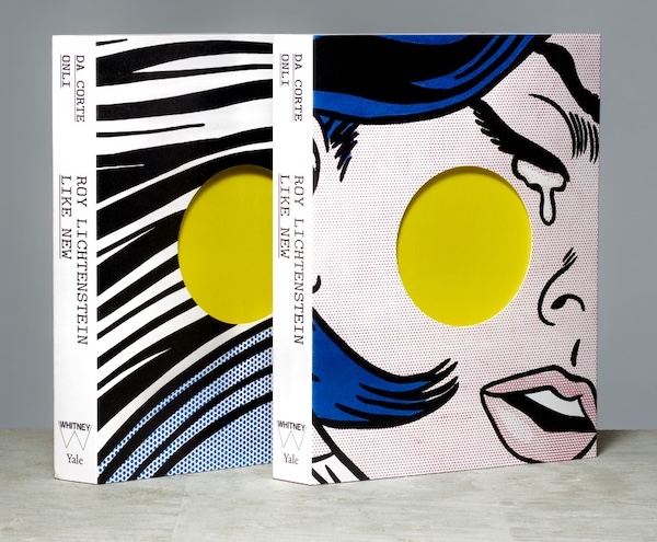
The catalogue for the Whitney Museum’s 2026 exhibition Roy Lichtenstein: Like New. Designed by Irma Boom, published by Yale University Press, and offered with a choice of two jackets.
Roy Lichtenstein, who died at 73 in 1997, enjoys the reputation of a New York old master. In 2023, the U.S. Postal Service commemorated the 100th anniversary of his birth with an array of stamps. He is currently the subject of a blockbuster at the Whitney Museum of American Art, organized by in-house curator Meg Onli, 42, and Philadelphia-based artist Alex Da Corte, 46. The installation of Roy Lichtenstein: Like New rejects traditional chronology in favor of thematic presentations and provocative juxtapositions that explore his interest in mass culture and his passion for citing and reimagining existing imagery. In the accompanying catalogue, the curators say they “began with the desire to look again at an artist whose work is often mistaken for being already understood.”
In 1961, the Pop movement was Lichtenstein’s ticket to infamy. His subject matter — details of war comics, romance comics and newsprint ads — was repulsive to devotees of high-modernist art, as was his static, deadpan technique. In an early interview with curator John Coplans, he stated, “I want my painting to look as if it had been programmed. I want to hide the record of my hand.” He favored heavy black outlines and a restricted palette in a style he described as “a kind of gross over-simplification.” The Ben-Day dots commonly used in low-cost color printing became Lichtenstein’s hallmark: in a parodic simulation of comics, he used dot patterns to indicate shade or light color.
Lichtenstein’s breakthrough work channeled the world of commercial media and assembly-line commodities. Six decades later, those provocations look like the opening act of a familiar art-world ascent: the radical embraced by adventurous collectors and museums; the signature style maintained even as detractors dismissed it as mannered and overly clever; the artist himself a blue-chip commodity long after his death. Little wonder, then, that the Whitney’s director wanted this retrospective to answer the question “What makes Lichtenstein relevant today?” The result, according to a critic for The Wall Street Journal, “frames Lichtenstein as a sage who predicted the 21st century … and argues that he was a figurehead of ‘appropriation art’ before it was a term.” The Whitney makes its pitch this way: “In an era when pictures are endlessly generated, copied, altered, filtered, and reposted across screens, Lichtenstein’s art is strikingly prescient and remarkably relevant. He understood long before the digital age that images are never stable: they move through the world and return transformed.”
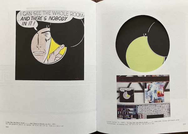
Spread from the Whitney’s Lichtenstein catalogue. The right-hand page shows a 1984 photograph by Louise Lawler, and its aperture gives a glimpse of a 2021 painting by Alex Da Corte. Photo by author.
While I’ve not seen the Whitney’s exhibition, its special curatorial gambits sound original and constructive. They include a film in which Da Corte, wearing prosthetics, plays Lichtenstein’s art school mentor, Hoyt Sherman, conducting perceptual training exercises in the classroom in the 1940s; a duplication of Leo Castelli’s gallery on East 77th Street hung with works from Lichtenstein’s 1962 solo show; a space with curved silver walls dedicated to paintings from the Mirrors series (1969–72); and the re-creation of several very large temporary works, including the mural made for the New York World’s Fair (1963), Super Sunset Billboard (1967) and Greene Street Mural (1983). An art critic for The New York Times called the show a “high-concept and high-speed” product from an “increasingly populist” institution. “It betrays,” he wrote, “an anxiety … that classics of the 1960s can only be made legible to young audiences through constant stimulation and Instagrammable backdrops.”
In an ingenious move, the Whitney invited Irma Boom, the maverick Dutch bookmaker, to design the catalogue, published by Yale University Press. In the late 1980s, Boom emerged as an oddball who proudly resisted conventions, a rebel who defied the notion that digital publishing would doom physical books to extinction. She admits to being stubborn and uncompromising and heartily approves of the nickname “Queen of Books.”
Boom’s Roy Lichtenstein: Like New is a hardcover catalogue available with two different jackets, both featuring a detail of a painting. One features an image appropriated from a romance comic (Drowning Girl, 1963); the other features an image from Lichtenstein’s series depicting expressive brushstrokes in his deadpan manner (Little Big Painting, 1965). Positioned off-center on each jacket is a die-cut circular aperture that reveals a flat expanse of yellow. When the jacket is removed, one sees Lichtenstein’s Mirror # 5 (1970), a circular painting that is predominantly yellow. This nod to the artist’s best-known device is splendid in every way.
Inside, Boom extends her illuminating exploration of cropping and framing in Lichtenstein’s work. In the “Plates” section, she cuts windows into 18 pages — six circles and 12 rectangles — turning the double-page spreads into exercises in looking and discovery. The rectangles evoke comic book panels. The circles summon a more specific association: Lichtenstein’s I Can See the Whole Room … And There’s Nobody in It! (1961), appropriated from a panel in William Overgaard’s newspaper comic strip Steve Roper. A peephole’s cover is partly raised, revealing a man peering through from the other side.
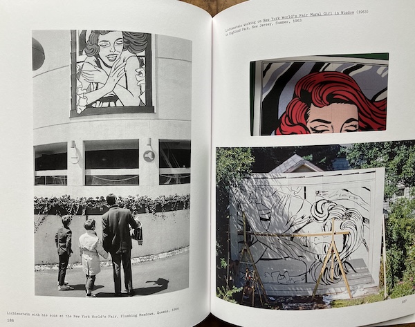
Spread from the Whitney’s Lichtenstein catalogue. The right-hand page shows a 1984 photograph by Louise Lawler, and its aperture gives a glimpse of a 2021 painting by Alex Da Corte. Photo by author.
Another winning feature of this catalogue is its treatment of Lichtenstein’s “Composition Notebooks,” which were scrapbook collections of pictures clipped from mass-media sources. There are copious selections from three different volumes, each of which has its own place within the catalogue. Boom treated them as books within a book by using paper stock that is lighter and more translucent than the stock used in the rest of the publication. Collectively, these notebook pages are a portrait of Lichtenstein’s exhilarating and nimble imagination.
In keeping with the exhibition’s presentation, the catalogue defies chronology. The “Plates” section is divided into eleven thematic segments, but overall, it feels like a glorious hodgepodge ready to be pored over, sampled, and explored. Boom uses a chunky typewriter-style font throughout. The front matter and essays have wide single columns of text, with endnotes set in three columns of tiny type. The decision to use underscored letters instead of italics gives the essays the look of a vintage typed report: the illustrations sit on the pages like glued-in pictures, and the column of text wraps around them. When the Art Institute of Chicago published its Lichtenstein retrospective catalogue in 2012, the whopper of a “Plates” section was printed on glossy paper; here, the choice of a slightly textured matte stock may disappoint some, but it did not bother me.
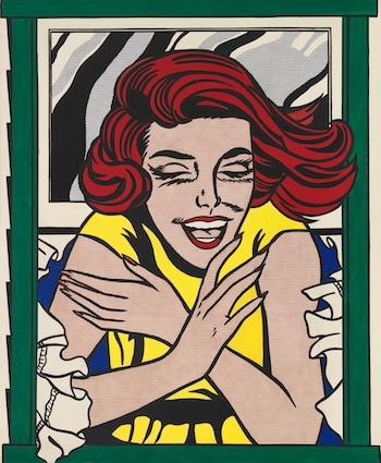
Roy Lichtenstein, Girl in Window (Study for World’s Fair Mural), 1963. Oil and acrylic on canvas. Whitney Museum of American Art, New York.
Blockbuster catalogues must serve two markets: the gift shop browser and the specialist. Boom’s design is the chief attraction of the Whitney’s offering; the essays do little to engage general readers. The welcome exception is Dan Nadel’s account of professional cartoonists’ responses to Lichtenstein over the years. An engagingly illustrated chronology would have helped bridge the gap. Instead, the catalogue passes over such key early supporters as the Ferus Gallery in Los Angeles, Galerie Ileana Sonnabend in Paris, and the Paul Bianchini Gallery in New York, where Lichtenstein met Dorothy Herzka, who became his second wife in 1968. Nor does it mention that Henry Geldzahler, then a rising curator at the Metropolitan Museum of Art, included Lichtenstein in the American Pavilion at the 1966 Venice Biennale — tellingly, alongside three abstractionists: Helen Frankenthaler, Ellsworth Kelly, and Jules Olitski.
Still odder is the near-burial of Lichtenstein’s German-Jewish roots. A diligent reader might spot the index entry “Lichtenstein, Roy, Jewish heritage of, 54n41.” In an endnote to Da Corte’s essay, we learn that the artist’s “Jewishness is inexplicit in both his art and the vast majority of the discourse around it.” Yet a 2016 Lichtenstein exhibition in Los Angeles explored precisely this subject, prompting Michael Kaminer’s article “How Jewish Comic Book Heroes Inspired Roy Lichtenstein’s Pop Art.” The subject is hardly uncharted; this catalogue simply leaves it in the margins.
The full complexity of Lichtenstein’s artistic individuality—his irony, humor, and impishness—has always been difficult to grasp. As he honed his technique, making his work ever more mechanically precise, he also expanded his repertoire from lowbrow print imagery to broad reaches of art history: Art Deco, Cubism, Impressionism, abstraction, landscapes, the female nude, architectural entablatures, and imagined interiors, from artists’ studios to collectors’ living rooms. Understanding him requires the visual acuity to distinguish and trace these shifts. The essays in Roy Lichtenstein: Like New offer ample conceptual commentary but do little to cultivate such connoisseurship. That makes the rambunctious, untethered landscape Irma Boom has crafted all the more valuable: it throws readers in at the deep end, leaving them to look, make connections, and look again.
Trevor Fairbrother is a curator and author. He recently wrote a text about the new photo collages by Ian Jeffrey currently on view at Anthony Greaney, 438 Somerville Avenue, Somerville, MA.
Tagged: Alex Da Corte, Book Design, Exhibition Catalogues, Irma Boom, Meg Onli, Pop Art, Roy Lichtenstein, Roy Lichtenstein: Like New, Trevor Fairbrother, art books, book-reviews