Fuse Visual Arts Commentary: The “Look” of the Rio 2016 Olympic Games
How well did the Rio 2016 Olympic Organizing Committee creatively frame and package the “Look” of the Olympic Games?
Rio 2016 Logo. Source: The Rio Olympic Organizing Committee.
By Mark Favermann
The Rio 2016 Olympics is literally a tale of two cities.
One city is visually stunning and robustly modern. Boasting one of the most beautiful natural settings of any major urban center in the world, Rio de Janeiro is known for its Carnival, partying, parades, samba, bossa nova, and spectacular beaches (Copacabana, Ipanema, etc.).
Yes, there are the beautiful bodies in tiny bathing suits, but one of the seven modern wonders of the world, the stature of Christ the Redeemer, sits on top of prominent Corcovado Mountain. On parallel Sugarloaf Mountain, there is a cable car to the top. There are permanent grandstands lining the avenue built for parades that lead to the Sambadrome, which serves as home base for Rio’s Carnival.
The second city is squalid and poverty-stricken. It is visually and economically underscored by socially shameful Favelas, Rio’s huge slums (population 1.4 million). During the run-up to the Olympics, many major problems were exposed, including political and police corruption, visible poverty, crumbling infrastructure, toxic water and raw sewage pollution, a financial emergency, Zika virus dangers, and excessive violence and crime.
Ironically, seven years ago, when the deservedly much maligned and recently investigated International Olympic Committee (IOC) awarded the 2016 summer Games to Rio, the organization stated more than once that the Rio 2016 Games should serve as a catalyst for desperately needed social and economic change in Rio. How’s that going? Not so well.
Looked at separately, these two contradictory urban portraits evoke a conflicted yet dense Rio reality. But the true picture of Rio de Janeiro would be a fusion of both extremes.
Since the Mexico City Olympics in 1968, the International Olympic Committee requires/mandates that there be created a “brand” or unique blanket visual theme for each of its Olympic games. The goal is to project the best possible public identity for the chosen city. This brand image — logo, typeface, and their applications — are collectively referred to as “The Look of the Games.” The latter is seen as the visual glue that holds together all of the diverse graphic elements that make up the various visual identities generated by the Olympics. “The Look of the Games” is expected to be the strategic expression of the character of the host country’s culture and landscape.
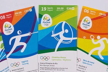
Tickets to events at the Rio 2016 Olympics, Source: The Rio Olympic Organizing Committee.
The “Look” applies to all the visual aspects of the Olympics including the signature logo, theme slogan, sports venues (walls, floors, entrances, etc.), sports apparatus (hurdles, lane markers, basketball hoops, etc.), banners, signage, torches, medals, pictograms, tickets, athletes’ number bibs, uniforms for staff and volunteers, transportation vehicles, marketing elements, official products (souvenirs), television imagery (some leeway is allowed for TV sponsor NBC), and social media. A separate but visually related “Look” is required for the Paralympics, which follows the Olympic Games.
So how well did the Rio 2016 Olympic Organizing Committee creatively frame and package the “Look” of the Olympic Games?
According to the Rio Olympic Organizing Committee, the visual identity of this year’s Games was to be inspired by the harmonic diversity and contagious energy of Brazil’s people, a brio amplified by Rio de Janeiro’s exuberant vibrancy. Each of the visual elements were designed to foster a celebratory atmosphere that would make a visitor’s experience at the Games memorable.
The sinuous curves of mountains, rivers, and lakes, as well as Sugarloaf Mountain and Corcovado, have been integrated into the visuals. Other Olympic venues in São Paulo, Brasília, Manaus, etc. were invited to add their own distinctive visual identity to the “Look” as well. The idea is to underline the distinctive “character” of each location.
The logo itself was designed by acclaimed Brazilian graphic designer Fred Gelli, the founder of the firm Tátil. Chosen from 139 competing firms, Gelli’s Tátil developed a 3-dimenstional logo that can evolve and transform, suggesting athletic motion and performance. It was also based on Rio’s natural forms. Gelli has stated that the visual identity challenge posed by the Olympics is enormously complex: the icon must work effectively on a variety of scales. The image must fit the small as well as the monumental — from a pin to dressing up huge swathes of Rio.
The logo also had to fit with the Rio 2016 Typeface, which also has landmark references subtly integrated into it. The elegant image took the better part of a year to be developed by type design studio Dalton Maag. To me, the type seems just right: exuberant, inviting, with an appealing character.
The third major aspect of the Rio 2016 “Look” is based on the concept of a deceptively simple multicolored “pebble” form. This image was created by the Rio Olympic Organizing Committee’s in-house design team and took about two years to complete.
The Pictograms are the fourth strong visual element. Created by the Olympics in-house design team, these sports symbols are based on the organic shapes that inspired the logo and typeface.
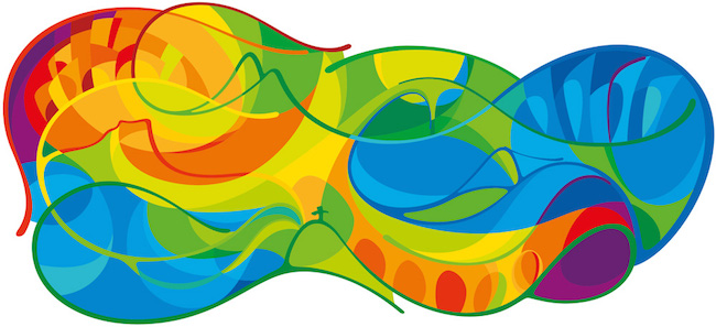
“Pebble” graphic that is used for decor elements Source: The Rio Olympic Organizing Committee
Historically, Olympic logos have ranged from the sublime to the ridiculous. Based on a Miro image, Barcelona’s 1992 image was unquestionably wonderful. Attempts to be trendy (Mexico City’s 1968 logo was based on OpArt) can be problematic. For example, the 1994 Lillihammer logo looked dangerously like an electronic appliance brand mark, while Sidney’s turned out to be a weak knockoff of Barcelona’s. Anxious to save money for the Salt Lake City games, Executive Director Mitt Romney was forced to add decor enhancement by the IOC. They didn’t want a Wal-Mart-looking Winter Games. Sochi’s design elements were too folk art-ish and dense, while Vancover’s Mid-Century Modern wallpaper approach included the kitchen sink. Few of these “looks’ were memorable much past their sell-by date.
Olympic logos sometimes prove controversial. Wolff Olins’ initial design for London 2012 was loudly blasted by the public and critics and it was eventually taken down from the official website. It was feared that it could have triggered epilepsy among susceptible viewers. It was toned down and eventually used; there were no seizures reported.
Rio 2016’s creative forces have said that their goal was to make the “Look” of the Rio Games both transformative and accessible. Considering the city’s ongoing social and economic problems, it would be fair to say that the design for Rio 2016 is both distinctively beautiful and elegantly functional. Of course, the “Look” doesn’t tell the whole story.
An urban designer, Mark Favermann has been deeply involved in branding, enhancing, and making more accessible parts of cities, sports venues, and key institutions. Also an award-winning public artist, he creates functional public art as civic design. Mark created the Looks of the 1996 Centennial Olympic Games in Atlanta, the 1999 Ryder Cup Matches in Brookline, MA, and the 2000 NCAA Final Four in Indianapolis. The designer of the renovated Coolidge Corner Theatre, he has been a design consultant to the Red Sox since 2002. He has previously written for The Phoenix, Art New England, American Craft Magazine, Boston Herald, Blueprint (UK), Design (UK), and Leonardo.
Tagged: Dalton Maag, Fred Gelli, Mark Favermann, Rio 2016 Olympics logo