Visual Arts Review: Red Writ Large — Soviet Propaganda from the Cold War Era
Darker Shades of Red focuses on the Soviet Union’s creation of internal propaganda, its array of striking posters aimed at keeping those in the Motherland and satellites in line.
Darker Shades of Red: Soviet Propaganda from the Cold War Era ,at the Museum of Russian Icons in Clinton, MA, through August 30.
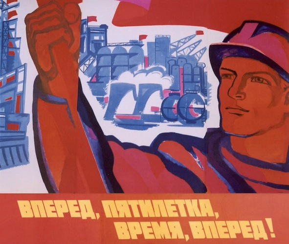
“Go Forward , Five Year Plan,” by N. Charuhin (1976)
By Mark Favermann
Uncle Sasha Wants You! Or at least wanted to control you.
One way was through the power of propaganda posters, which were among the major visual and ideological instruments of regulation generated by the Soviet Union during the Cold War, particularly as a means to influence its dependent Eastern European states. Historians say that the Cold War began at the end of World War II in 1946-47 and lasted until 1990. It is characterized as a sustained state of political and military tension between the powers of the Western Bloc countries (the United States, NATO allies and others in agreement) and the Eastern Bloc (the Soviet Union and its Warsaw Pact satellites).
It was “cold” because there was no full-scale fighting directly between the two sides, but there were major regional, often very “hot,” proxy conflicts, in which the powers faced off: Korea, Vietnam, Angola, and Afghanistan among them. Along with the development of nuclear arsenals and occasional saber rattling, Capitalism and Communism took each on by way of psychological warfare, espionage, propaganda campaigns, and technological competitions, such as the Space Race.
Darker Shades of Red: Soviet Propaganda from the Cold War Era focuses on the strategies shaped by the demands for internal propaganda, its array of polemical posters aimed at keeping those in the Motherland and satellites in line.
The fifty-five printed pieces are from the collection of Gary Hollingsworth of Orlando, Florida, a longtime art collector and professional conservator. He amassed his collection from Russian flea markets and antique shops in the early 1990s. After the collapse of the Soviet Union, these occasionally striking graphic celebrations of Communist triumph had been discarded as unwanted and undervalued relics of the relatively recent totalitarian past.
Posters pervaded every aspect of Soviet society during the Cold War. Their anti-Western, anti-capitalist messages are nothing if not broad — unbeatable Communist heroes are the omnipresent pictorial motif. During this period, the Soviet government aggressively plastered visual propaganda in schools, apartments, shops, office buildings, train stations, etc. Posters were an inexpensive yet effective method of communicating positive images of government actions and power to the masses.
Accordingly, this absorbing exhibition is as much or more about political, social, and economic history than it is about visual representations. The designs of the posters are often subservient to their ultra-rousing messages, their aesthetics firmly under the heel of politics. This was a medium that was all message, true or otherwise. Though the posters in Darker Shades of Red were published in the late 1940s, ’50s or even later, they are visually related to the 1930s Stalinist era regime-building images, as well as the plethora of patriotic World War II Red Army posters.
The period covered by the exhibition was not the “Golden Age” of Soviet poster design. That was the Russian Constructivist period of 1919-1929. Russian Constructivism wanted to express the experience of modern life though new, dynamic and disorientating depictions of space and time. Totalitarian regimes disdain the eccentricity of the avant-garde, so Constructivism was throttled by Stalin and the Soviet leadership. However, flickers of its influence can be seen throughout the succeeding decades of Russian art and design. Later versions — by less talented artists — do not come close to capturing its initial greatness.
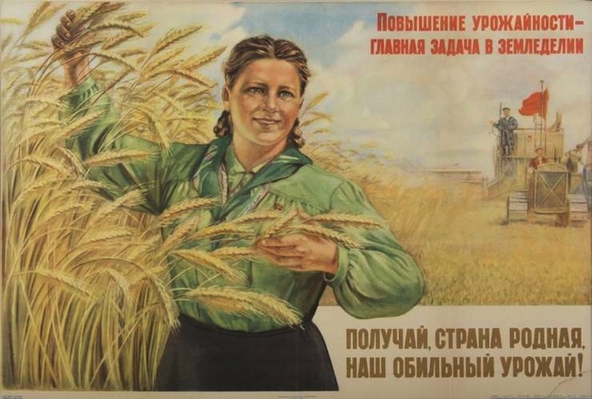
“Increasing the Yield is the Main Goal of Agriculture,” (1952)
One poster in the exhibition insists, “Increasing the Yield is the Main Goal of Agriculture” (1952); we see a smiling and sturdy Soviet woman standing next to a bountiful harvest. When not celebratory, the images in the exhibit are often warnings — about the threat of nuclear war and the competitive space race. The posters are filled with “ideal citizens,” healthy, educated, cultured, hardworking, and unquestionably moral types ready to take on any threats to Soviet success.
Soviet graphic design and art during the Cold War took several forms.The default mode was Socialist Realism, a stilted narrative of upward communal mobility inevitably populated by quasi-Norman Rockwellesque versions of stalwart rural peasants and soldiers. Also part of the propagandistic mix: satiric depictions of capitalists, graphic references to Russian Constructivism or traditional rural folk art (badly executed) used to proclaim the courage of the masses, and heavy-handed appropriation of cultural icons, such as the greatly admired avant-garde Ballet Russe.
The posters were generally ground out to formula: idealized (if skillfully drawn) portraits of peasants, soldiers or everyman (or woman) are usually framed by images of grain, leaves or other agricultural details. The peasants in the field were meant to convey the bounty of the countryside, while the images of muscular soldiers, weapons in hand, underscore strength and security. Sometimes there are smaller vignettes featuring characters working (often in the fields). The texts are located either in a box or floating somewhere in the illustration.
Only some of the artists/designers are known. The Soviets were into celebrating collective accomplishment, not rewarding individual creativity. Who knows how many bureaucrats and committees had to signoff on these designs before they were printed and distributed?
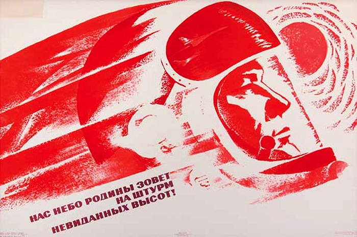
“The Sky of the Motherland Calls Us,” A. Tjapkin. (1969)
There are several high points in the exhibition. Perhaps the graphically strongest image is the red monotone Cosmonaut image. Ironically, it is an interpretation of a graphic style that is much more western, even American, than Soviet in approach and expression. A number of muscularly drawn, heroic images are also eye-catching, particularly one of Fidel Castro, which references revolutionary Communism. These posters have an elemental power, a contemporary feel and approach — their vibrant gestures are accompanied by robust color compositions. When it came to the posters, less was generally much better than more. The simpler, strongly gestural pictures are inevitably the most visually compelling; the fussier, more intricate ones often dilute their energetic point and therefore lack panache.
Darker Shades of Red provides a provocative counterpoint to the major exhibits in the Museum of Russian Icons, given that, after the Bolshevik Revolution, religious objects such as painted icons were removed and often destroyed. An aggressively secular Communism generated replacements: ‘inspiring’ posters that were meant to push traditional religious imagery aside — Marx, Lenin, and Stalin made up the new version of the Holy Trinity.
Accordingly, these secular posters draw on religious resonances. In Christianity, red represents the blood of Christ and the martyrs; it was also the symbolic shade of revolution. The evils of capitalism were presented as various aspects of the Devil Incarnate. These Cold War graphic images represent an ambitious attempt at transformation: the visions of traditional theology converted into imagery that huzzahed the new ‘religion’ of Communism.
An urban designer, Mark Favermann has been deeply involved in branding, enhancing, and making more accessible parts of cities, sports venues, and key institutions. Also an award-winning public artist, he creates functional public art as civic design. Mark created the Looks of the 1996 Centennial Olympic Games in Atlanta, the 1999 Ryder Cup Matches in Brookline, MA, and the 2000 NCAA Final Four in Indianapolis. The designer of the renovated Coolidge Corner Theatre, he has been a design consultant to the Red Sox since 2002.
Tagged: Darker Shades of Red: Soviet Propaganda from the Cold War Era, Mark Favermann