Book Review: Hey Look Me Over — “Just My Type”
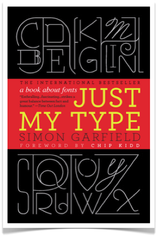
Simon Garfield’s tour of fonts, Just My Type, is a rollicking, sometimes snarky social history of the design decisions behind lettering from Gutenberg to the iPad.
Just My Type: a book about fonts by Simon Garfield. Gotham Books, 356 pages, $27.50
By Debra Cash
When Steve Jobs died of pancreatic cancer last October, and the encomiums started pouring in, much was made of the period during the early 1970s when he dropped out of Reed College and spent his time studying calligraphy under the watchful eye of a former Trappist monk, Robert Palladino.
As Jobs told the graduates at Stanford’s 2005 commencement
I learned about serif and san serif typefaces, about varying the amount of space between different letter combinations, about what makes great typography great. It was beautiful, historical, artistically subtle in a way that science can’t capture, and I found it fascinating.
None of this had even a hope of any practical application in my life. But ten years later, when we were designing the first Macintosh computer, it all came back to me. And we designed it all into the Mac. It was the first computer with beautiful typography. If I had never dropped in on that single course in college, the Mac would have never had multiple typefaces or proportionally spaced fonts. And since Windows just copied the Mac, it’s likely that no personal computer would have them. If I had never dropped out, I would have never dropped in on this calligraphy class, and personal computers might not have the wonderful typography that they do.
I’m writing this Arts Fuse entry in Calibri, which I find easy to read—and even more important, easy to proofread—on the screen of my PC (sorry, Steve).
I have to guess what font you’re reading, since that isn’t controlled by choices made by the Arts Fuse’s website designer, Jim Carroll, but by the defaults built into your browser. The browser—Microsoft’s Internet Explorer, Apple’s Safari, Mozilla’s Firefox, or whatever alternative you’ve launched—makes a choice between three different sans serif fonts (meaning they don’t have little projecting strokes at the ends of letters). It’s likely you’re reading the preferred font, Arial; if that’s not available, the browser tries Helvetica; and if that’s not available either, it employs its own standard sans serif font. I don’t even know if you’re reading Arts Fuse‘s attention-getting, white-on-black format (preferred) or have clicked on the tab at the top corner of the screen layout to turn this “page” into a more conventional, if slightly blinding, black on white emulation of paper.
You think this doesn’t matter. You are wrong.
I am a design geek from way back. I spent my pre-adolescent years with bottles of colored Pelikan inks and a pen that allowed me to change the metal nibs (I also applied sealing wax I bought at Pier One to the envelopes addressed to my much-missed friend from summer camp). I felt very William Morris, combining “radical” individualism with a romantic sense of the handmade. I certainly didn’t think I was striking a suburban girl’s blow against dark, Satanic mills or the soul-deadening power of mechanical reproduction: I just thought writing little, pseudo-medieval serif letters with green ink was pretty.
The shape of letters is ubiquitous in a culture that enjoys, and presumes, close to full literacy. (And as novelist Jennifer DuBois noted in a parenthetical comment in her new A Partial History of Lost Causes, “Boston’s major export is people who are funny and smart, who have advanced degrees, who read on public transportation.”) We read “through” the dark strokes on a white page or the back-lit pixels. The messages letter forms convey may be subliminal, but they are inescapable.
Simon Garfield’s tour of fonts, Just My Type, is a rollicking, sometimes snarky social history of the design decisions behind lettering from Gutenberg to the iPad. Like Gary Hustwit’s cult, indie 2007 documentary Helvetica, about how the ideas of a couple of Swiss modernists managed to colonize the signage of urban spaces everywhere, it has its heroes and villains, human and alphabetical. First among the humans, of course, is Johannes Gutenberg, creating reusable mirror-image forms that mimicked the calligraphic hand of monks just as surely as Henry Ford later would shape the Model T as a carriage minus the horses. We are introduced to Beatrice Warde, a publicist for the Monotype Corporation in Surrey, England, promoting the readability of a font designed by her sometime-lover Eric Gill. Cambridge, MA’s own genius-grantee typographer Matthew Carter, finds himself at the center of a multinational outcry (by designers, at least) when the popular font he designed, Verdana, is adopted by IKEA.
Typefaces have personalities that may be more predictive than, say, horoscopes. When Helvetica aired on PBS, the producers posted a fun “which type are you” quiz on the website (and yes, I was resigned to find myself a Times New Roman: “Some call you timeless—others call you a snob. Either way, you’re a class act all around. Just don’t take yourself too seriously.”). Garfield argues, pretty convincingly, that although his espoused policies and persuasive oratory may have closed the deal, Barack Obama made a brilliant design decision by standardizing his campaign materials in a version of Gotham, a font created for GQ magazine. Close your eyes, and you can probably remember the way the word HOPE looked on the bottom of Shepard Fairey’s portrait, set in caps. Now consider how easy it became to parody.
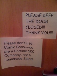
 The fight against Comic Sans, captured in this photo of unknown provenance, gets an entire chapter that traces the bleed from Batman comics to a Microsoft engineer named Vincent Connare to a full-blown “Ban Comic Sans” internet campaign with posters like the (marginally ungrammatical) one that says “every time you use Comic Sans, a designer loses their wings.”
One of the most salutary aspects of Garfield’s work is his stress on the impact of functional constraint over pure aesthetics. Gutenberg formulated new, oil-based inks because water-based ones wouldn’t adhere to metal; IBM Selectric typewriter’s ‘golfball’ allowed typists to change fonts without getting their hands dirty; and fonts are perceived differently on paper, on highway road signs, or on the screens of mobile phones.
Just My Type includes trivia that design geeks like me can share over drinks: about how Johnston Sans was created for the London Underground while the New York subways “finally succumbed to Helvetica”; how the dropped T in the middle of Ringo Starr’s bass drum probably had its origins in one of Paul McCartney’s schoolboy doodles; and where to find a YouTube video of a quick, brown fox actually jumping over a lazy (or anyway, calm) dog. Without Garfield, I never would have stumbled on Mark Simonson‘s related, and wonderful time-sink of a site that puts up a flag and a learned analysis every time Hollywood gets something wrong and uses a font anachronistically in a film.
While each font gets its due—and “speaks in its own voice” with descriptions of the font set in the font itself so you can experience it directly—Garfield is clearly a “let 100 flowers bloom” kind of guy. (Although to be fair, he doesn’t hide his scorn for Papyrus, the “theme park” font used in James Cameron’s Avatar.) Still, I wish he hadn’t been so reverent towards designers and the companies that employ them. I’m no Beatrice Warde, but while he acknowledges that fonts can be a kind of couture, he gives a pass to the designers, architects, and graphic artists who reduce language to noise and reading to a visual puzzle.
Read Just My Type in hardcover or paperback, set in Jan Tschichold’s Sabon with inserted sections in Univers. Or download it to your Kindle where you can increase the size of the Caecillia font to make it easier to read.
Just don’t try to listen to it.
c 2012 Debra Cash
Debra Cash usually comments for The Arts Fuse on dance and performance, but she is also a design researcher who earned her degree at the Harvard Graduate School of Design.
Tagged: Gotham Books, Just My Type: A book about fonts


Thanks for your enlightening review; I’d seen this book around and wondered how it was. I spent many years poring over font books in my job as head of publications at the Harvard Art Museums, but it never occurred to me that my fascination with type and design might have been foretold by my own adolescent experimentation with Pelikans, colored inks, and sealing wax. And Beatrice Warde and Eric Gill were an item? Who knew!
Who knew? Exactly my thought!
A fascinating overview and review —
I enjoyed your review, and it reminded me that I find myself a bit put off by the general preference for sans-serif faces. I write in Times New Roman, because it looks like a book page, not a department store ad. Also, I wonder whatever happened to paragraph indentation. Square blocks of type with a line between looks like a business memo to me, but seems to be de riguer for all online text.
When CERN scientists announced the identification of what they believe is the Higgs Boson particle, they presented the findings in Comic Sans. My favorite outraged tweet: “Every time you use Comic Sans on a powerpoint, God kills the Schrödinger’s cat. Please think of the cat.”
http://www.guardian.co.uk/artanddesign/2012/jul/04/higgs-boson-comic-sans-twitter?newsfeed=true