Visual Arts Commentary: Branded in Boston — Logos by Any Other Name
By Mark Favermann
What’s up? Several public and private agencies have changed their graphic identities and even names.
 In early 2020, Governor Charlie Baker agreed to appoint a commission to review, remove, and redesign the Massachusetts flag and seal. Critics have charged that the seal and flag perpetuate racism by visually representing the historic oppression of indigenous people.
Created in the late 19th century and officially adopted in 1901, the Commonwealth’s seal, which appears on the Massachusetts flag, centers on a depiction of Wampanoag Chief Ousamequin, aka Massasoit, holding a bow. Above him is an arm allegedly brandishing the (perhaps apocryphal) sword of Myles Standish, a prominent Mayflower settler who served as Plymouth Colony’s first commander and led attacks against local tribes. Below Massasoit is the state’s Latin motto — “Ense Petit Placidam, Sub Libertate Quietem” — interpreted as “By the sword we seek peace, but peace only under liberty.” In other words, the English settlers were looking to peaceably procure land — but on their own terms.
Two years ago, Native Americans, along with progressive politicians and sympathetic citizens, petitioned for a design change. A commission was appointed (absent professional designers) but no new image has been drafted or even suggested. Amateurishly, the Commission took to the press to ask for crowd “designsourcing.” Rather than draw on the ideas of experienced designers, the Commission took the embarrassing step of requesting free public ideas.
So, when (or if?) the Massachusetts state seal is changed, how should it best be transformed? Should the maligned Medieval Heraldic device of “Standish’s armed arm” be gotten rid of? What would it be replaced with? Or should the seal be completely redone? Perhaps it should contain a codfish (now depleted), or an urban wild turkey (the Massachusetts state bird) or an American Elm, Massachusetts’s official tree (now fending off disease)? Preemptively, a few years ago the State of Mississippi replaced its Ole Dixie Stars and Bars with an elegant white magnolia flower. Et tu, Bay State?
The answers to these questions will be shaped by our current state of “wokeness.” “Woke,” as I see it, not only means to be hypersensitive to being on the right (left) side of pressing social issues, such as racism, homophobia, etc. It also insists that believers be highly critical of others who are less sensitive to what are enshrined as impregnably enlightened positions. The commitment to condemnation reaches the point of silliness. A case in point: a conversation that my older sister had with her Gen-Z grandsons. She referred to her new ebony car as a Black Beauty. Shaking their heads, her grandsons told her that she shouldn’t use that term.
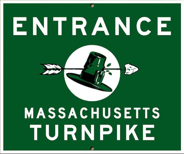
MassPike sign, circa 1957.
An earlier example of “wokeness” was the removal of the arrow in the Pilgrim’s hat icon found in MassPike signs. That decision underscores the “woke”‘s lack of a sense of humor and irony.

MassPike Sign — Woke Version.
Now museums are feeling guilty for past crimes and using rebranding to visually repudiate their historic institutional bias and prejudices. Being “woke” takes many forms. For example, there’s the new logo at the Boston Museum of Fine Arts. There wasn’t much wrong with the old one- — red on white in a distinctive font. But, after a rather ugly incident a couple of years ago in which a long-term white volunteer docent and staff members confronted a group of young Black public school students, the MFA, former bastion of Brahmin Boston high society, felt that it had to reach out to a more diverse and contemporary audience. Or at least to those who want those groups recognized.
MFA Logo Comparisons — then and now.
In order to visibly reimage itself, the MFA has now instituted a much less distinctive logotype. It’s not bad, but feels like a downgrade. The look is more modern, and it does suggest motion, but it’s not all that new. In fact, the single italic letter with zero kerning has been overdone. Its sans-serif lettering is not particularly refined or fine. The truth is that it was created and developed by BaseNYC (part of an international megadesign consultancy) “to pivot the MFA’s positioning, reminding all Bostonians that its spaces and collections are for everyone.” Yeah, and predictably, much of the succeeding marketing materials include mostly images of non-white figures as well.
![]()
When the ICA opened its new building in Boston’s Seaport District in 2006, some of my criticism was directed at its overly trendy logo, created by the British design firm of Wolff Olins. I predicted that the logo would be changed in five years or until the stationery ran out. The image hung on longer than I thought — it took 12. Pieces of the letters had been sliced in the design, and that was a problem. This customized font made the logo unusable for signage, informational plaques, and any kind of popular media copy. For me, these same designers also came up with the worst and most controversial Olympic logo ever for the London 2012 Olympic Games. But that is a different story for another time.
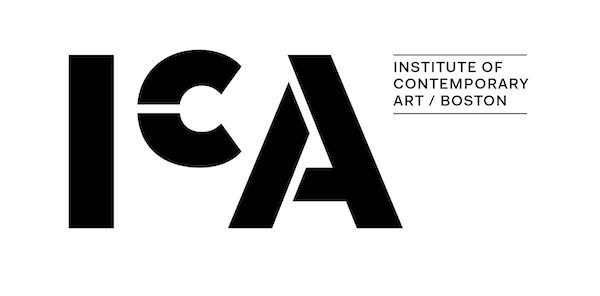
The New ICA logo. Image courtesy of the ICA
Designed by Pentagram, the new ICA logo was introduced in 2018. It coincided with the opening of the new ICA Watershed exhibition space across the water in East Boston. The institution explained that “the new identity strives to communicate ideas of openness, accessibility, and radical welcome embedded in both the new space and the institution’s mission.” Again, here is an institutional logo that is also supposed to serve as a visual magnet for a diverse culture. The design features a black sans-serif modified stencil I, (smaller) C, and A on a white background. The image is bland, unresolved, and rather meaningless. What’s more, it is not very contemporary — it feels like a ’70s throwback.


Founded in 1994, Partners HealthCare morphed into Mass General Brigham in 2020. The logos for these medical institutions couldn’t be less alike. While the Partners logo was elegantly corporate, the Mass General Brigham icon comes off as a bit cute, more like a public educational program graphic identity than the look of a serious healthcare consortium. For a quarter of a century, the problem for Partners was that its logo had little meaning to anyone — aside from (perhaps) its own board members. Its brand value outside of Route 128 was negligible. The new logo underscores the fact that these prestigious hospitals are regularly ranked in the nation’s top 10. When it comes to healthcare, prestige translates into desirable financial rewards.
![]()
Over the last few decades, the anachronistic ’50s model for The Boston Redevelopment Authority (BRA) has come under greater and greater scrutiny. No other major US city has a similar agency with dual (and naturally antagonistic) loyalties: it is charged with dealing with the wishes of private development and public planning. Through decades of inept leadership and sometimes even worse taste (e.g., The Seaport District, upper Boylston Street in the Fenway, Brighton’s Guest Street, etc.), the BRA has grown the city’s tax base — but at the expense of violating Boston’s authentic environmental ambience as well as architectural scale.

So it was about time, under former Mayor Marty Walsh’s regime, that the BRA tried to displace political shade and cater to current (trendy) demands to market civic transparency. A new identity was created. The agency was renamed The Boston Planning and Development Agency (BPDA). Still, a rose by any other name. The design for the BPDA logo is negligible. To add insult to injury, this example of underwhelming graphic identity cost three-quarters of a million dollars! It seems as if it all was a waste of time and resources because it is just a matter of time before Mayor Michelle Wu separates the BPDA into two distinct agencies.
Another sad instance of ephemeral Boston branding.
Mark Favermann is an urban designer specializing in strategic placemaking, civic branding, streetscapes, and public art. An award-winning public artist, he creates functional public art as civic design. The designer of the renovated Coolidge Corner Theatre, he is design consultant to the Massachusetts Downtown Initiative Program and, since 2002 has been a design consultant to the Boston Red Sox. Writing about urbanism, architecture, design and fine arts, Mark is contributing editor of the Arts Fuse.
I am fascinated by your definition of “wokeness” and the not-so-subtle implication that woke represents extreme. Perhaps the crimes of colonization, slavery, forced migration, and more that dominate the history (and frankly the present) of what we now call the United States warrants an extreme response, finally. Not sure what is “funny” about the arrow through the pilgrim hat – an image that more than implies that the Indigenous communities perpetrated consistent violence against some poor, well-intended puritans. And what does any of that have to do with the redesigns of the MFA, ICA, Partners, and various city agencies, let alone the much-needed redesign of the state flag and seal?
I suggest that you might re-read the article. Your notion of “Presentism” is so trendy–an uncritical adherence to present-day attitudes, especially the tendency to interpret past events in terms of modern values and concepts. Notice that the new ICA and MFA logos are institutionally defined as being demonstrative of openness and diversity. And my piece looks at graphics from different perspectives. It appears that this is difficult for you to do.
As an addendum to this point about the language — or branding power — of “wokeness,” journalist Samuel Adler-Bell had this to say: “‘wokeness’ … is hostile to the basic logic of leftist organizing. Solidarity requires an invitation, a warm and friendly offer to collude in a risky proposition. It doesn’t work as a sanctimonious entreaty to identity with an existing set of self-evident values.” Sanctimoniousness makes members of the power-that-be feel virtuous — it does not win over those needed to make the necessary changes in the depressing state of things. The truth is that, regardless of revising language and marketing logos, many American institutions and communities are more segregated now than they were 30 years ago.
I enjoyed this article and learned various things along the way. (I’m a former Bostonian, and not up to date about developments there.) I particularly appreciated the glimpse of practical considerations, such as that the “sliced” letters in the gorgeous old ICA logo made it impractical for public signage (and unreadable by computer programs?). The whole topic of how to “represent” an agency or organization is important, and I’m glad to see it addressed here in The Arts Fuse (including questions of process: public input, expensive contracts with design firms….).