Visual Arts Review: “Andy Warhol by the Book” — How to Read the King of Pop Art
The strong connections between Andy Warhol’s early drawings and his later Pop-pieces become clear as you walk through the exhibition.
Warhol by the Book, at the Williams College Museum of Art, Williamstown, MA, through August 16.
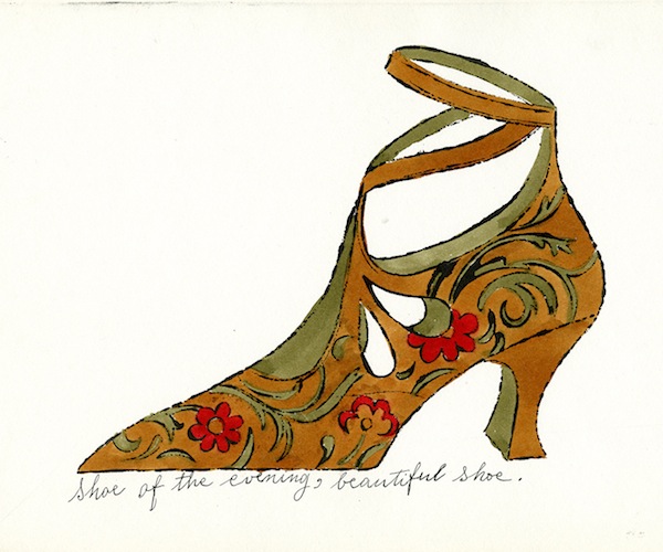
Andy Warhol, “Shoe of the Evening “(1955). Photo: Andy Warhol Foundation
By Anthony Merino
Andy Warhol’s oeuvre is like a fractal. Fractals are natural phenomenon or mathematical sets in which a single simple geometric pattern is repeated for infinity. Although the basic geometric grid remains the same, a close-up section of a fractal looks nothing like the complete pattern. It often takes a detailed explanation and numerous examinations in order for the spectator to make out the connections between the part and the whole. That dynamic plays out again and again in Warhol by the Book, an exhibition that is mostly made up of the early works of one of the most enigmatic artists of the second half of the twentieth century. The show includes one of Warhol’s signature works, “Marilyn,” 1967, two silkscreen portraits of Marilyn Monroe rendered with funky non-natural colors. At first this image seems completely out of place, given that Warhol by the Book is dedicated to his early illustrations and design work. These fledgling drawings seem to have almost no relationship to what would become one of Warhol’s most familiar images. Yet the strong connections between his early drawings and his later Pop-pieces become clear as you walk through the exhibition.
Warhol’s earliest drawings display his virtuosity with ink drawings. In works like “Untitled: Huey Long” 1948-49 and “Untitled (All the King’s Men)” 1948-49, his ink lines flitter about like the flight path of mosquitos maneuvering between rain drops. You are left with the impression of lines that exhibit a kind of choppy inelegant grace, an improvisational Miles Davis rift drawn in black and white. At their best, the lines seem to float on the periphery of the artist’s control, hovering on the cusp of the chaotic. Warhol’s mastery of the illusion of spontaneity contributes to their originality, the thrill that comes when you step back and see that what appears to be random squiggles up close congeals into an accurate rendering of a hand, face or body.
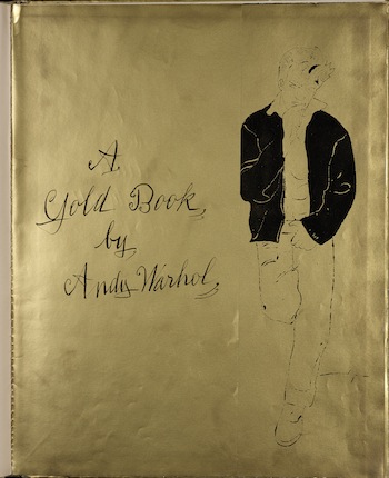
Andy Warhol, “A Gold Book by Andy Warhol” (1957). Photo: Andy Warhol Foundation.
These drawings look far more like what you would expect from a young Jackson Pollock or Willem de Kooning than Warhol. And at first glance it would be impossible to link the work of the young Warhol with the famous mature Warhol if it were not for the clues provided by a few intermediate pieces. Warhol by the Book is valuable because it dramatizes the process of Warhol’s transition from budding Abstract Expressionist to the King of Pop. And it suggests how the two manifestations of the man are grounded in the same aesthetic impulse.
As Warhol matured as an illustrator, some important differences between his initial aesthetic and his movement toward Abstract Expressionism developed. The exhibition includes several pieces that can be read as hybrid pieces on the way towards his Pop art work. In 1954, Warhol produced a limited edition artist’s book Twenty Five Cats named Sam and One Blue Pussy. The watercolor work includes several hand drawn cats whose shapes are filled with swaths of brightly hued color. There is a casual randomness to the coloring — the modulations in hue having nothing to do with representing the object or completing the form. This work seems to be a logical first step toward Warhol’s Pop art images, where the flatness of the image becomes central to its content.
The most revealing example of Warhol’s transition is his book jacket for “The Adventures of Maude Noakes,” offset lithograph, 1961. The illustration depicts 48 faces rendered via a rubber stamp along with a drawing of a redheaded girl wearing a striped red dress. Curiously, the picture of the adolescent looks cartoonish, almost devoid of any character. But each face, although created by the same rubber stamp, has an individual quality. On some, Warhol puts too much ink on the stamp, turning the face into an almost ominous silhouette. There is far less ink on others and the faces almost seem shaded. For me, this work could be a master key to all of Warhol’s creations. Here the artist exploits the imperfections of printing — not just to generate content, but to create beautiful images. This work precedes what for many is one of Warhol’s most iconic image: “Soup Cans,” 1962, in which Warhol painted all thirty-two varieties of Campbell’s Soup ™ and displayed them in a grid similar to “The Adventures of Maude Noakes.” Ironically, the faces in the latter image have been stamped on, but look as if they were drawn by hand, while the Campbell Soup cans were painted by hand—but look manufactured.
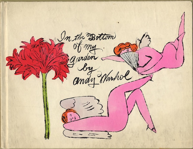
Andy Warhol, “In the Bottom of My Garden” (1956). Photo: Andy Warhol Foundation
The exhibition includes another important milestone in Warhol’s progression: a photograph by Edward Wallowitch, “Young Man Smoking a Cigarette” ca 1956, and “A Gold Book by Andy Warhol,” 1957. Warhol completely appropriates the former image, to the point that the obvious next step would be for him to forego drawing entirely and just make use of the photographic image. Tellingly, most of the works here — “Twenty Five Cats named Sam and One Blue Pussy,” “The Adventures of Maude Noakes,” and “A Gold Book by Andy Warhol” — detail a shift in Warhol’s work away from manual illustration to mechanically reproduced images. But the surface changes in Warhol’s approach to art fade away in this exhibition — what stays the same becomes more apparent.
Warhol by the Book shows that throughout his career the artist embraced an aesthetic of beauty that was deeply about imperfection. Whether it is early or late Warhol, the artist wanted to use the flaws in his medium to create marred images of beauty. The major difference between the two periods in his career is that the source of the imperfection was no longer a loosely held brush.
Anthony Merino is an unaffiliated artist and critic working out of Adams, Massachusetts. He has published and presented papers on contemporary art internationally. Additional articles are available here.
Tagged: Andy Warhol by the Book, Andy-Warhol, Anthony Merino