Book Review: The Look of the Sound — The Album Art of Prestige Records
By Jon Garelick
Along with its slew of images — photos, sketches, and ephemera as well as album covers — WAIL offers what amounts to a compelling oral history of the mid-century explosion, not only of recorded jazz but of graphic design and, by extension, a burgeoning New York cultural scene.
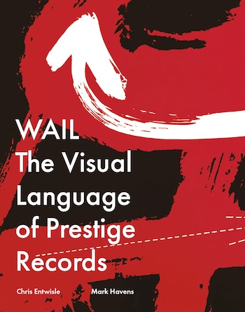
WAIL: The Visual Language of Prestige Records, by Chris Entwisle and Mark Havens, foreword by Sonny Rollins. RIT Press, 360 pages, $80
 Ah, album covers! Remember them? Yes, they’re coming back, along with the music they contain — 180-gram vinyl! So heavy, so cumbersome, so cool! But never in such abundance as during the years when vinyl was the main commercial means of distribution for recorded music, and when album covers helped define an artist’s persona, before the 12×12 image of the LP was shrunk to the 5×5 of the CD and then … pfffft! “Pure media.” Music’s physical manifestation — gone.
Album covers have become the subject of historical surveys — there are plenty of books devoted to album art. Now comes WAIL: The Visual Language of Prestige Records, by Chris Entwistle and Mark Havens. It acts as a kind of companion to the recent Listening to Prestige: Chronicling Its Classic Jazz Recordings 1949-1972, by Tad Richards (published by Excelsior Editions, an imprint of SUNY Press).
For jazz fans, the rough outlines of the story of Prestige Records will be familiar: how bebop-loving Manhattan teenager Bob Weinstock started selling records out of his parents’ apartment, then opened a record store, and then started recording his heroes and releasing albums. With the help of optometrist-turned-recording engineer Rudy Van Gelder, he began producing discs for a roster that soon included Miles Davis, Thelonious Monk, Sonny Rollins, John Coltrane, and scores of other jazz greats and near-greats. It was a label that helped define the jazz sound of the ’50s. And, as WAIL shows, it also helped define the look of the sound.
While Listening to Prestige offers granular discographic detail, taking us inside recording sessions and offering astute commentary, WAIL is a whole other thing. Aside from the lavish design of the book itself (its title and cover image come from a 1957 disc by saxophonist Frank Foster), and its slew of images — photos, sketches, and ephemera as well as album covers — the book offers what amounts to a compelling oral history of the mid-century explosion, not only of recorded jazz but of graphic design and, by extension, a burgeoning New York cultural scene.
The stories are told by the skeleton crew that produced the covers and the music they contained — designers, illustrators, photographers, and producers. Sometimes these were all the same person.
As Listening to Prestige shows us — and as WAIL confirms — Prestige was always a scrappy DIY operation. As a producer, Weinstock took a slam-bang approach: no rehearsals, no retakes. Or, as few retakes as possible. (This could have been one of the reasons that an exacting ensemble like the Modern Jazz Quartet eventually departed the label.) In the beginning, cover art was crude at best — little more than the artist’s name and a photo snapped by Weinstock. In WAIL, we can see how that design aesthetic was refined and evolved along with the visual art currents of the era.
Weinstock’s early gang was drawn from high school pals or people who hung around his store. (The same went for the label’s roster — located on West 48th Street, the store was a regular hangout for musicians playing the midtown clubs.) They were usually (but not always) jazz fans who were happy to do anything, including sweeping floors, just to be around the music.
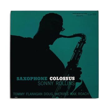
The cover for Sonny Rollins’s Saxophone Colossus (1957), photo and design by Tom Hannan.
Before long, the future jazz critic Ira Gitler, a Weinstock grade-school friend of a friend, was both producing dates and writing liner notes. And people with varied experience as visual artists or graphic designers came and went. After introductory sections by Weinstock and Gitler, the WAIL chapters divide the periods of Prestige by the key artist, illustrator, photographer, and producers who worked there.
The Bronx-born Don Schlitten is typical. Schlitten met Weinstock when he was a 16-year-old. He had gone to the High School of Art & Design but had dreamt of being “the Jewish Don Byas.” Failing that, he fell back on his art training and, working with “a nearly non-existent budget,” cut type from magazines to create cover text, and found ways to incorporate “mannerisms of both high and low art, from De Stijl to the Katzenjammer Kids,” as Entwistle and Havens write.
Another early Prestige artist, David X. Young comes off — in both an excerpt from his unpublished writings and in a candid 1952 photo where he’s caught in a classically louche posture, leaning back on a daybed, albums stacked on a table beside him, sketches and photos of musicians taped to the wall, heavy-lidded eyes contemplating cosmic absurdities — as the one true Beat hipster of the bunch. An aspiring painter, he was raised on Cape Cod and had headed for New York because “Boston was culturally dead as nails at that time.” He fell in with the abstract expressionist crowd at the Cedar Tavern — Willem de Kooning, Franz Kline, Jackson Pollock. He started presenting jazz shows at a loft called the Jazz Loft.
Young and Schlitten were probably the most idiosyncratic of the bunch. Others included photographer Bob Parent (an active chronicler of the scene for publications like DownBeat and Metronome), Tom Hannan (a scholarship student from the Hans Hoffman School of Fine Art), and Scott Hyde (a commercial photographer who concocted experimental designs with Hannan). Reid Miles, the one academy-trained graphic artist, was already working at indie jazz label Blue Note. The Harlem-born Esmond Edwards, a keen-eyed self-taught photographer, was the sole Black designer/producer.
What comes through in these chapters — most of them first-person recollections — is a creative process fueled by all the arts in a heated-up New York economy at mid-century. This especially comes out in Young’s Beat-laconic voice. It’s not as though there was interaction among different disciplines. Young sees the different groups of artists as separate tribes, even though they shared the same Village watering holes. “[P]eople like to think of Bird as the wavelength for Jack Pollock — but Pollock actually liked Wild Bill Davison. Dixieland, not bebop.”
But, from these varied accounts, you sense the collective atmosphere. Art, film, music, theater, dance — these guys were all breathing the same charged air.
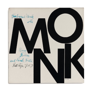
The cover for Thelonious Monk Quintets (1957), designed by Reid Miles.
The zeitgeist of the era seemed to be personified by Reid Miles — the one bona fide superstar of the Prestige design fraternity. Unlike the others in this group, Miles is described as “indifferent to jazz.” He wasn’t trying to create the visual equivalent of the music. For him, the 12×12 LP cover was a blank canvas. He wanted those covers to pop on the record store racks. And he understood the moment.
“I’m not a jazz fan,” he says in WAIL, “but when I did those covers, I understood how contemporary the music was, and my graphics were contemporary. Those go together, that’s how it happened. It wasn’t a matter of having to love the music to know what the appropriate graphics were.” The color choices, he points out, “were just a matter of economics — the independent labels couldn’t afford full color.”
One of Miles’s masterworks for Prestige was his cover for Thelonious Monk Quintets (1957): M-O-N-K in big block letters, black against a white background, on two lines. “I mean, putting a one-syllable word on two lines? It was totally outrageous, using type as the art element!” Again, economic limitations prompted creativity. “Prestige couldn’t afford to pay for art and I didn’t know how to take photographs…. I only had type to work with.”
The pale color script that accompanies the stark title, identifying a couple of players and the catalogue number, was handwritten by illustrator Julia Warhola, mother of Miles’s illustrator pal Andy.
Miles’s work at Blue Note was perhaps even more definitive. By 1962, he was creative director at CBS Records. And he eventually turned to photography as his medium.
The hodgepodge of graphic strategies at Prestige never exactly coalesced into a house style (it came closest in the later years with Esmond Edwards, who synthesized the early DIY inventions with Miles’s trained designer’s eye and his own elegant photography). But together, they tell a hell of a story — as varied and vibrant as the music itself.
Jon Garelick, a former arts editor of The Boston Phoenix and member of The Boston Globe editorial board, can be reached at [email protected].
Tagged: "WAIL: The Visual Language of Prestige Records", Bob Weinstock, Chris Entwisle, David X. Young, Don Schlitten, Ira Gitler, Mark Havens, Prestige Records
1 Comment
Leave a Comment

What a great article, Jon, written by the guy who KNOWS. And I am reeling at the beauty of Reed Miles’s cover for Monk.