Webmaster News: Getting Around Has Gotten Easier
By the Arts Fuse Webmaster
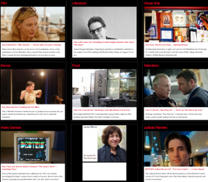
Welcome to the new look of the Arts Fuse! The insightful, in-depth content is the same as it’s always been, but now it’s easier to find.
The most obvious change is the new home page. Within the 3 x 6 grid you’ll find the latest posts in the major categories of the arts. Clicking on the name of the art form will lead you to a reverse chronological listing of every article that the Arts Fuse has published on that subject. There are also four new categories that will give you listings of all our commentaries, interviews, previews and reviews.
Above the grid, you’ll recognize the same (albeit larger) slideshow of our eight most recent full-length articles, while “In Brief” will keep you up to date with concise and timely news and opinion, previews and reviews, and much more.
For even quicker access, the new navigation bar under the header puts you one click away from the major artistic genres and article types that the Arts Fuse publishes every day.
Readers who in the past have found text on a dark background difficult to read will be pleased to discover that the full text and excerpts of articles now appear in black text on a white background, and article titles (which link to the articles themselves) are in a very visible red font.
We’ve kicked the tires on the new layout pretty thoroughly, but if you come across something that looks peculiar, please go ahead and drop a note here—webmaster@artsfuse.org—so we can fix it.
This is the first major update of the Arts Fuse since October 2010, but we’re not going to rest on our laurels for long. New features are already in the works, and you’ll begin to see the results this coming autumn and winter.
So, have a look around. We think you’ll like the new look.

