Visual Arts Review: The Unbearable Lightness of Watercolor at the Harvard Art Museums
By Helen Miller and Michael Strand
Among the usual suspects and idiosyncratic specimens, a handful of landscape paintings, prosaic portraits, and transcendent abstract works defy watercolor’s association with lightheartedness.
American Watercolors, 1880–1990: Into the Light, Harvard Art Museums, Cambridge, through August 13.
Watercolor paint consists of ground pigment dispersed in an aqueous binder such as gum arabic. When it dissolves in water, the gum holds the color pigment in suspension. With each brushstroke, washes of color flow over white or cream-colored paper, giving watercolor its distinctive luminescence — its lightness. All of this magic takes a bit of mastery … so the story goes.
Does this mean that watercolor is incurably precious? Old-fashioned? Frivolous? Its reputation for ethereality, combined with the medium’s popularity among so-called Sunday painters, might suggest as much. But in the exhibition American Watercolors, 1880–1990: Into the Light, a paradoxical seriousness prevails. Among the selection of usual suspects and idiosyncratic specimens, a handful of landscape paintings, prosaic portraits, and transcendent abstract works defy watercolor’s association with lightheartedness. Rather, their surfaces reveal surprising and poignant psychological depths.
Watercolor has been called “the American medium.” Many of our homegrown artists who initially impressed European art collectors and critics created substantial works on paper. There also seems to be something quintessentially American about attempts to control watercolor’s democratic potential: its affordability, portability, and overall accessibility. The American Watercolor Society, founded in 1866 and still in existence, governed watercolor through the late 19th and into the 20th century. The organization enforced a strict normativity — one right way to do watercolor painting — by way of closed membership, recommended pedagogy in schools, and jury-selected exhibitions.
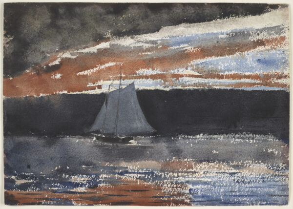
Winslow Homer, Schooner at Sunset, 1880. Watercolor over graphite on off-white wove paper. Photo: Courtesy of the Harvard Art Museums
Still, even in pieces praised by the society and displayed in this show, such as John Singer Sergeant’s The Grand Canal, Venice (1902) and Winslow Homer’s Schooner at Sunset (1880), watercolor’s impetuousness is evident, as well as its potential for pathos. Just consider Homer’s eerie red and black splotched sky, and his portrayal of a small boat, a stormy light caught in its sails, setting off into the unknown.
The exhibition’s most revelatory paintings draw on this pathos as the light touch required of watercolor is leveraged by some artists to capture the passing of time or complicated, subtle emotions that avoid sentimentality. The most compelling examples are supplied by what is arguably the high point of the show: an elegant, unassuming row of Edward Hopper’s paintings — smartly installed on the back wall of the exhibition’s middle gallery — including Cold Storage Plant (1933), Highland Light (1930), Jenness House, Truro (1934), and Schumann House (1931). Hopper depicts the structures from the back or side and, for the most part, from a distance, calling to mind a leisurely drive along winding country roads. The immersive perspective owes something to Paul Cézanne’s off-kilter compositions and, perhaps, to photography, which demonstrated the potential of capturing something unexpectedly — for example, the out-of-focus ground on which the artist stands.
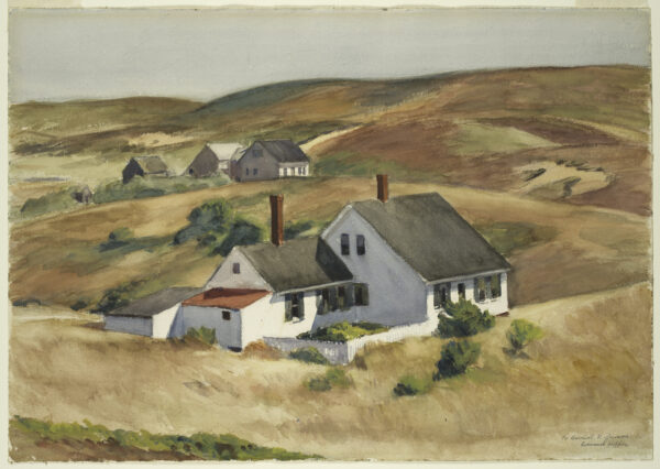
Edward Hopper, Jenness House, Truro, 1934. Transparent and opaque watercolor over graphite on white wove paper. Photo: Courtesy of the Harvard Art Museums
Painter and occasional critic Thomas Eggerer recently observed that a “stillness at the threshold of movement” was central to Hopper’s project. The attention required to accurately place each mark, combined with the speed at which water hits paper, creates a provocative tension. When applied to the sole building in a breezy setting, Hopper’s brush brings out the finicky nature of the built environment in contrast to the undulating hills that will outlast it. Adept at layering, fluent in the restraint required when you won’t have the opportunity to erase or paint over, Hopper leverages what we might call the unbearable lightness of watercolor to capture the transience of rural architecture and daily life. In Jenness House, Truro, for example, Hopper makes liberal and yet heartbreakingly precise use of bare paper to capture that certain slant of light when it is about to leave the kitchen garden in complete shade. His exploration of the themes of stillness and loneliness, detailing how they express themselves outside of the city, including in the nooks and crannies of coastal New England, is particularly fitting for a show in one of the region’s premier museums.
The show is organized chronologically into overlapping sections: 1880–1940 is titled “Perception/Representation,” 1930s–60s “Process/Mind,” and 1960s–90s “Presence/Vulnerability.” One phase in American watercolor painting leads into another. The thematic labels make sense of the work gathered in each of these periods, which are distributed across three rooms. (Though some of the best selections could appear under any of the headings.) To end in 1990(ish) might feel arbitrary, but there is more than enough here to capture the enormous variety of artistic styles and movements in which watercolor participated over a roughly 110-year period. The coming of the World Wide Web in 1991 may also mark a dramatic shift in approaches to watercolor, given that it found itself again placed in relation to other media, analog and digital archives as well as photography and film.
When considering the range of work covered here, it makes sense to start with John Marin’s Seascape (1914), the poster image for the show, a kaleidoscope of color and light in which a faintly perceivable beach appears through a mist of rainfall. “In painting water make the hand move the way the water moves,” Marin is said to have instructed an admirer, and indeed, the literalness of the brushwork is more reminiscent of J.M.W. Turner than Cézanne, whose mountaintops also inspired Marin. Alfonso Ossorio’s surrealist Fantastic Octopus (1942), with its illogical motifs and multiplying suckers, echoes Dali’s clocks and the techno tendrils of science fiction. Hedda Sterne’s Pink 1 (1952) is also otherworldly, a constructivist city sunset flush in pink.
Beauford Delaney’s Untitled (1964) stands out among the mid-century abstract pieces for its dynamic and yet subdued negotiation of order and chaos. The fleshy, sensuous shades of orange and pink … yellow, purple, and blue … capture a mood — not entirely pleasant but absorbing. Once again, Cézanne comes to mind, and we are not surprised to find that the painting was created after the artist expatriated to Paris, a move he credited with the “greater freedom” of his later work. Delaney’s light mixture of similar colors — applied and reapplied in soft, consistent strokes of turpentine-like gouache — channels the measured squiggles characteristic of his oil paintings into a rhythmical composition seemingly lit from within. Still, it is not as Zen as Agnes Martin’s Untitled (1977), where the peachy gloss of a minimalist square illuminates an almost imperceptible, complementary blue colored-pencil grid. The effect is transporting.
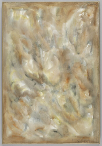
Beauford Delaney, Untitled, 1964. Watercolor on white wove paper mounted to canvas mounted to a stretcher. Photo: Courtesy of the Harvard Art Museums
Collage appears with the arrival of Mark Rothko’s early stabs at surrealism (Untitled [1944]), Alexander Calder’s Study for a Standing Mobile (1934), and Eva Hesse’s nested blue and yellow squares (Untitled [1963–64]). American artists, it seems, have often used watercolor to dip their toes, so to speak, into certain trends before landing on their own celebrated approaches and excelling in the artistic movements with which they are most readily identified.
Meanwhile, paintings by Stuart Davis and Romare Bearden offer salient interpretations of modernist collage. This is evident in Davis’s brightly colored Boats and Dock (1937), a jazzy Gloucester Harbor, and Bearden’s Madame’s White Bird (c. 1975), with its mysterious lamplight hues and mixed media on board. The monochromatic, geometric shapes of Paul Feeley’s paper sculptures and plans from the ’60s set the stage for those in Dmitri Hadzi’s sumptuous, near-miniature sketchbooks from the ’90s as well as Sol Lewitt’s wonderfully literal Wavy Brushstrokes (1995), the biggest watercolor in the show. Richard Tuttle’s Study for Stacked Color (I, II, and III) (1972) is another example of how watercolor can be adapted for concept-driven work, and is followed in short order by Hannah Wilke, with her Rorschach-inspired Self-Portrait, B.C. Series (1990).
Other work falls into a style that seems to be all watercolor’s own, echoing Hopper. Richard Foster Yarde’s Cunard Street, Interior II (1980) weaves a domestic double portrait out of precise gestures and graphic yet fluid patterns in a way that only watercolor could. Balancing skill, aesthetic detours reminiscent of Matisse, and the lessons of collage — not unlike fellow watercolorist David Hockney — in a kind of modern illustrative style rarely seen in museums, Yarde recreates a Roxbury interior from his youth: on one side, someone stands occupied at the kitchen table; on the other, someone folds their head in their hands. While the recognizable movements resonate, the exact actions being performed by the figures are indeterminate and, in this way, engaging. The vivid yellow, blue, green, and red color scheme reflects Afro-Caribbean art and Yarde’s own background — his parents were from Barbados — as well as French fauvism, which sought to replace impressionism and purely perceptual effects with something more subjective. Yarde’s brushstrokes are both delicate, with light pressure producing fine lines, and also saturated, as if made with a stencil. Concrete as the blocky tapestry can be, the picture is always resolving; inviting the viewer to fill in the blanks with their own daily tasks and memories of home. Framed in the center of the piece by curtains lit up by impending night — recalling the sails of Homer’s lonely schooner — a dark void splits the house in two.

Richard Foster Yarde, Cunard Street, Interior II, 1980. Watercolor on white wove paper, three overlapping sheets. Photo: Courtesy of the Harvard Art Museums
Yarde and Hopper are both exemplary in combining the lightness of watercolor with the heft of a prosaic world that includes a kind of subtext of unbearable pathos and dis-ease that is not exactly frightening. It is also interesting to think about the relationship of representation and imagination in each artist’s larger body of work — in his most famous later paintings Hopper also worked from memory.
Two impressions linger from American Watercolors, 1880–1990: Into the Light. First, a renewed appreciation of the remarkable potential of watercolor as an artistic medium, the astonishing range of artists who have used it, and the range of styles it has accommodated. The same could not be said about acrylic or oil paint, both younger than watercolor (the origins of which go back to antiquity). Through time, watercolor seems to retain a buoyant flexibility. Second, the most effective pieces here (Hopper, Yarde, Delaney, Martin) derive from watercolor painting and its history a gravity and ambiguity at odds with the popular immediacy of the medium. Each artist remakes a commonplace scene or set of marks into something profoundly turbulent or rumbling. In other words, part of the exhibition’s delight is how it defeats what we expect of watercolors, the variations it plays on its perennial youthfulness. Could it be that, among painting mediums, watercolor contains the most potential for difficult-to-capture subject matter and lasting work?
Helen Miller is an artist. She teaches at the Massachusetts College of Art and Design and Harvard Summer School. Michael Strand is a professor in Sociology at Brandeis University.
Tagged: American Watercolors, American Watercolors 1880–1990 Into the Light, Beauford Delaney, Edward Hopper, Harvard Art Musuems
4 Comments
Leave a Comment

A fine review and I saw the show today. I do wonder about your choice of the words “painting” and “paints” to describe what you saw. The Harvard show called the works “water colors” and the artists “colorists.” Isn’t that what’s correct?
Glad to hear you enjoyed the exhibition and our review.
In response to your question, I think both “watercolor” and “watercolor painting” could be used to describe much of the work in the show. It’s true that watercolor falls in a fluid space between painting and drawing, with some watercolors appearing more like paintings done in acrylic or oil, while others are closer to drawings. “Work on paper” is another, more encompassing phrase used to refer to any artwork that uses paper as its substrate, whether the piece is done in watercolor, gouache, tempera, pastel, charcoal, or any number of wet or dry media. Collages and prints, depending on the materials used to make them, are often considered works on paper. I think the liminality of watercolor is part of the charm and possibility of the medium. It defies categorization, it won’t stay put!
In terms of “colorist,” I have heard the word used to describe an artist who is particularly skilled at manipulating color, as opposed to, say, line, shape, or form, although I don’t often come across the descriptor in conversation about contemporary art. A Google search tells me that use of the term dropped off in the 1950s and never quite picked up again, although it may make good sense to use when describing historical work.
I hope that’s helpful!
What a fun review of a delightful summer show at Harvard! What I find most distinctive, and indeed, charming, is the engaging and thoughtful narrative which this review offers the reader, and ideally, the viewer of this collection of paintings. I applaud the helpful organizational overview of the exhibition and the contemplative analysis of the chosen works, which reads more like a conversational reflection shared by a generous companion who is well-informed both regarding the practice and the scholarship of American watercolor of the last century. Thank you for sharing this compelling analysis, and a lovely story.
Thank you for such a kind, in-depth response. We set out to give a tour but had to be so selective. What about that deceptively modest landscape by Helen Frankenthaler, you ask? Or Suzan Frecon’s patient study of shape? Claes Oldenburg’s monotype muffin and pie are to die for! Curious which pieces stuck with you…. We hope to run into you in the galleries next time!