Visual Arts Commentary: A Creative and Cultural Opportunity Lost — The Look of the Tokyo 2020 Olympics
By Mark Favermann
Dull, flat, and boring, with no discernible personality, the Olympics 2020 graphics made no impact on anyone other than, perhaps, their creator/developers and maybe a (very) few members of the host committee.
![]() Delayed for a year because of the global pandemic, Tokyo’s fanless, athletes-in-a-bubble Olympics (the XXXII Olympiad) ended last Sunday. Along with all the competitive drama and pain, there were the customary triumphs of victory and agonies of defeat. But, on another note, will anyone remember what the celebration looked like? Given its carefully controlled experiential design scheme, which underscored little of the event’s unique character, the Olympics this time around was a visually neutral event. Design be damned; apparently, the media was supposed to take center stage. The athletes? Guest actors that could have been doing their thing almost anywhere.
Delayed for a year because of the global pandemic, Tokyo’s fanless, athletes-in-a-bubble Olympics (the XXXII Olympiad) ended last Sunday. Along with all the competitive drama and pain, there were the customary triumphs of victory and agonies of defeat. But, on another note, will anyone remember what the celebration looked like? Given its carefully controlled experiential design scheme, which underscored little of the event’s unique character, the Olympics this time around was a visually neutral event. Design be damned; apparently, the media was supposed to take center stage. The athletes? Guest actors that could have been doing their thing almost anywhere.
My conclusions might be the result of watching too much men’s field hockey, mind-numbing beach volleyball, and unfathomable team handball, but the Tokyo 2020 Olympic Games were weird for a number of reasons. First, because of COVID-19, there were no fans in the stands. No one was walking around to watch, appreciate, or comment on the games — other than those who hovered about via television or computer. Also, because of rising COVID infections, the athletes were forced to live in an environmental bubble. No tours of the Ginza for anyone on this trip!
The “Look of the Games” is seen to be a strategic part of Olympic planning. The visuals express the Olympic host committee’s commitment to the ideal of unification; the images are supposed to enhance the venues while they connect the various sports and Olympic activities to each other. On that front, the overarching imagery of the Tokyo Olympics may have been among the worst created over the past 60 years. (London 2012 is in a solid second place.) Dull, flat, and boring, with no discernible personality, the Olympics 2020 graphics made no impact on anyone other than, perhaps, their creator/developers and maybe a (very) few members of the host committee. Aside from the sports pictograms, the “Look” was disappointing.
An anime image for the 2020 Tokyo Olympics.
According to the Tokyo Olympic Organizing Committee, Tokyo’s 2020 Look revolved around three rectangles out of which were formed the games’ emblems. A Japanese color-layering technique called kasane no irome, applied to kimono fabrics during the Heian Period (794–1185), was used. The design was presented in four base colors, which represented the four seasons: Kurenai (red), a traditional color of Japan; Ai (blue), the color of the games’ emblems; Fuji (purple), the color of Wisteria, a flower in Japan, Korea and China; and Matsuba (green), the color of pine needles, commonly used in Japanese celebrations. The official name of the logo is Harmonized Checkered Emblem. Olympic organizers claimed it combined traditional Japanese colors with the Tokyo 2020 Olympics’ Unity in Diversity motto.
Huh? Your average Japanese citizen probably couldn’t make sense of this ornate scheme. Even a somewhat sophisticated gaijin or foreigner like me was baffled by esoteric explanatory references that were more confusing than clear. The mission of “The Look” is to underscore the unique character of the Games — not to obscure it. My nephew, a former radio and television sportscaster for two decades, told me that the logo reminds him of a door wreath. And that it was lame.
The Harmonized Checkered Emblem was the Tokyo organizing committee’s second effort. The original logo, a thick graphic “T” with Rising Red Sun dots, was scrapped in 2015 following accusations of plagiarism. Japanese media reported that the designer, Kenjiro Sano, admitted copying material online by a Belgian designer. Toshio Muto, CEO of Tokyo 2020, explained at a news conference that the Olympics Committee wanted to avert a crisis and commissioned a second logo. The revised logos for the Tokyo 2020 Olympic and Paralympic Games were designed by Asao Tokolo, who won a competition. The result: The Matrix marries holiday decor.
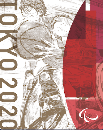
The design of the venues was generally uninspired and monotonous, emphasized by an overarching color scheme that favored variations on fuchsia marked by embedded darker blocky shapes that attempted to recall pieces of the wreath logo. Welcome alternatives to the dismal “Look” were the pictograms for specific sports: they lent smaller venues a specific identity. A third less used but perhaps more exciting alternative approach to the Tokyo repetitive “Look” was the adroit integration of anime illustrations with traditional Japanese art motifs. Though much more dynamic, they were only located at nonsports localities like airports, shopping malls, and subway stations.Too bad that these more uniquely contemporary Japanese art forms were rarely seen in NBC’s 24 hour coverage.

Track & Field Pictogram for the Tokyo 2020 Olympics.
The designers of the pictograms sought to recreate the three-dimensional movement of athletes in two dimensions, to evoke such dynamic movements as twists, turns, and speed. The Tokyo creative staff’s goal was to broaden the appeal of each sport by visually capturing its most easily conveyed expressions. The kinetic images were developed by a team led by graphic designer Masaaki Hiromura. Motion designer Kota Iguchi oversaw an additional team to further develop the visuals. And the pictograms worked. Arigato!
The big question now is, how much will we visually maintain and internally remember?
The first memorably creative “Look” of the Olympics was produced by Lance Wyman for the 1968 Mexico City Summer Olympics. His inspired design incorporated hypnotic geometric lines and colors along with the shapes of Pre-Columbian artifacts and modern typography. This was a unique visual theme character, stylistically reflecting the psychedelically inspired Op Art of the late ’60s.
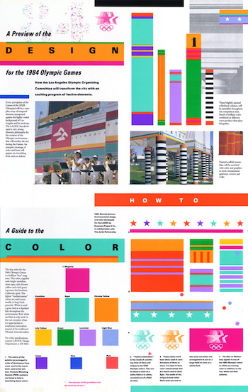
“A Kit of Parts” created by Sussman/Prejza and The Jerde Partnership, co-design directors for the LA 1984 Olympic Organizing Committee, 1982.
Prior to this, most Olympic venues were decorated by national flags, celebratory bunting, and large format paper posters. Remember the film Chariots of Fire about the 1924 Paris Olympics? A major exception: Hitler’s 1936 Swastika-laden Berlin Summer Olympics. On the one hand, this decision was politically and culturally effective, visually compelling, and viscerally repelling. The sight and symbolism of this evil banner probably stifled any thoughts of visually enhancing the Olympic Games for the next three decades. Following a 12-year WWII break, London’s 1948 Olympics were labeled the “Austerity Games” because of how a difficult economic climate and rationing shaped the proceedings. No new venues were built for those games and minimal decor was installed.
After 1968, the “Serene Olympics” of the 1972 Munich Summer Games ended in bloody disaster as 11 Israeli Olympians were murdered by Palestinian members of the Black September terrorist faction. Though the “Look” of this contest represented an aesthetic step up, this event, for obvious reasons, is not remembered for its visual and environmental quality. The 1976 Montreal Olympics are remembered for all the debt it saddled on the City of Montreal and the Province of Quebec. It took 40 years to pay creditors off. The 1980 Moscow Olympics were wrongly boycotted by President Carter: American athletes were punished much more severely than the Soviet Union, who had invaded Afghanistan. Oh yes, Afghanistan. Cartoon Russian Bears always seem to be everywhere at Olympic venues. Boycotted by the Eastern Bloc countries in return, the 1984 Los Angeles Olympics presented a seismic shift in design for all the Olympics to follow.
The 1932 Olympics had been previously held in L.A. Many of those original venues and several local stadiums and sports facilities had been upgraded or restored and rebuilt. Thus few new venues needed to be constructed. That meant, for once, a considerable budgetary commitment for decor, pageantry, and venue fit-outs. Design director Deborah Sussman developed an artistic methodology for the L.A. Games — “A Kit of Parts.” Twenty design firms worked together to create a visual element menu that could be adapted to the requirements of very disparate venues. This inspired approach, called “Festive Federalism,” called for the transformation of L.A. through the use of hot Pacific Rim colors, iconic geometries, and eye-catching temporal structures. Strategic wayfinding was also supplied, with markers and sign system directing spectators from highways to their seats.

The Quilt of Leaves created by the “Look Team” for the Atlanta 1996 Centennial Olympic Organizing Committee, 1994.
After L.A., all sports events were developed via “A Kit of Parts” approach. The Olympics that I worked on, the 1996 Centennial Games in Atlanta, used this methodology. Atlanta had its own image problems — a formal logo had been developed several years prior and it didn’t allow for much creative interpretation. Grouped together, the multiple logos looked like chicken scratches. So the design team, five designers commissioned from around the US (chosen from 500 applicants), met weekly for a year and a half and created a secondary logo, The Quilt of Leaves, which could effectively be used in venues, streetscapes, signage, uniforms, etc. Of course, local and group politics complicated the process, along with working with a bunch of large imaginative egos. Still, Atlanta’s influence can be glimpsed in Tokyo’s tepid “Look.” The original chosen sketch of the quilt of leaves I drew during a 1994 design team charrette hangs over my computer.
An urban designer and public artist, Mark Favermann has been deeply involved in branding, enhancing, and making more accessible parts of cities, sports venues, and key institutions. Also an award-winning public artist, he creates functional public art as civic design. The designer of the renovated Coolidge Corner Theatre, he is design consultant to the Massachusetts Downtown Initiative Program and, since 2002, he has been a design consultant to the Red Sox. Writing about urbanism, architecture, design and fine arts, Mark is Associate Editor of Arts Fuse.
Sad but true! As a sports design professional Favermann brings unique insights to this devastating critical analysis. The media emphasis seemed to focus on keeping score of which nation won the most medals. That’s not the true spirit of the traditional games. Of which 2020 (go figure) will likely prove to have been the least memorable.