Visual Arts Commentary: The “Look” of the 2018 PyeongChang Winter Olympics
The branding for the 2018 PyeongChang Winter Olympics is colorful, but not visually overwhelming like some of its predecessors.

By Mark Favermann
Four years ago, I wrote that the Olympic venues at Sochi, Russia looked a bit like a tray of overly sweet holiday desserts. The “Look” of the 2014 Winter Games seemed to try too hard to please everyone. Similar to Vancouver 2010’s everything including the kitchen sink approach to branding and event identity, Sochi’s “Look” was also over the top. Much too visually and perhaps ethnically layered, the oh-so very Russian “patchwork quilt” looked best only on athletes’ bibs and a few venue interiors. Multicolored and dense, you needed a tour guide schooled in Russian Art History and ethnology to interpret what everything meant.
The “Look” of the 2018 PyeongChang Winter Olympics is subtler and much more minimal. Colorful, yes, but not visually overwhelming like some of its predecessors. Instead of Russian nesting dolls (matryoshka), the South Koreans give medal winners stuffed toy white tigers. Traditional flowers countered efforts toward sustainability. In contrast to Sochi and Vancouver, the key element here is a simplicity to the patterning and graphics that encourages a clean, contextual embrace of visual and environmental values.
The mission of the “Look” is to communicate the Olympic Spirit while also expressing the distinctive culture of the host city. The challenge for the branding is to serve as a visual glue for all of the diverse pieces of the Olympic components, such as the competition’s five rings, venue interiors and exteriors, pictograms, etc.
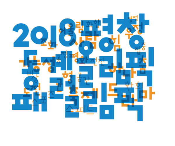
The 2018 Games “Look” uses the motif of Hangeul (the Korean alphabet), one of the most prominent cultural assets of Korea, to depict a festive scene celebrated by people from around the world. The visuals symbolize various values for visitors and participants to share, feel and identify with in PyeongChang during the Olympics.
There are two color motifs used as venue décor — a warm one (red, orange and yellow) on outdoor venues, a cool one (blue, purple and green) for interiors. Sprinkled throughout the venues — on banners and fencing — are elegant, quietly stated snowflakes made from Hangeul. These serve as visually beautiful, graceful punctuation marks.

Hangeul (Korean Alphabet) Used for Theme of 2018 Olympics. Source: PyeongChang 2018 Olympic Games Organizing Committee
The individual sport pictograms were created to depict the notion of confidence underscored by effort, challenge and potential. The pictograms expressed each sport (24 disciplines) and the movement of the players at a dynamic angle.
The Olympic medals are the work of South Korean designer Lee Suk-woo. He incorporated Hangeul into the final design by incorporating a series of consonants that symbolize the efforts of the competing athletes.
The medals were designed to reflect the traditions and culture of South Korea. His approach was inspired by the texture of tree trunks, with the award’s front displaying the Olympic rings, its set of dynamic diagonal lines reflecting both the history of the Olympics and the resolve of the participants. On the medal’s reverse: the discipline, event, and the PyeongChang 2018 logo.
The athletic complexes in the ski resort town of PyeongChang features two areas of venues: the PyeongChang Mountain Cluster and the Gangneung Coastal Cluster. The mountain cluster hosts skiing and snowboarding while the coastal cluster hosts skating and curling. Some of the venues had already existed; they had to be expanded, restored, and revamped. Others were built from scratch.
Several of the PyeongChang Olympic venues are visually compelling and elegant. The Gangneung Ice Arena for skating, the Gangneung Ice Arena, and the Alpensia Olympic Sliding Centre venues stand out by underscoring the strength of form following function. There is variety: some of the minimalist venues are made to sensitively blend in with the mountains and snow, others, characterized by sweeping curved lines and dramatic, changing artistic lighting, look streamlined futuristic.
Also integrated into the Coastal Cluster is a bizarre form, the inelegant 2018 Olympic Cauldron, which looks like a giant onggi – a traditional Korean cooking pot. This structure suggests an alien space invader rather than universal Olympic symbol.
The South Korean government has taken on half of the costs (about $45 million) to build the stadium for the Winter Games’ opening and closing ceremonies. The country has also spent more than $1.5 billion on the Alpensia Ski Resort, which serves as a major Olympic venue. In total, the 2018 Winter Olympics will cost South Korea about $12.9 billion, nearly double the amount the country projected when it won the bid in 2011.
To combat these escalating costs, the 2018 Olympic organizers built a pentagonal-shaped temporary (or “pop-up”) stadium for both Opening and Closing Ceremonies. Seating 35,000, the $85 million stadium was built to be dismantled at the end of the games. The PyeongChang county where the Olympics is located has only a permanent population of 45,000, an arena of this size would have become a financial burden.

Two man Bobsleigh Pictogram. Source: PyeongChang 2018 Olympic Games Organizing Committee
A temporary stadium is somewhat unusual for ceremonies at the Winter Olympics, though this is not the first time a dismountable arena has been used at a Winter Games. In 1992, a temporary circus-tent like structure was built for the games in Albertville, France. Parts of this structure were re-used during the 1992 Summer Olympics in Barcelona.
But what will happen to the other Olympic venues? What will be their use after these games? As the fall-out of the Summer and Winter Olympics have proved, time after time, the future use economics of these venues does not justify the earlier construction costs.
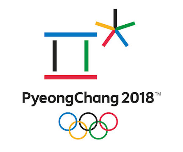
In a geopolitical sense, the 2018 PyeongChang Olympics has acted as a short respite from the verbal jousting and bomb-rattling of President Donald Trump and North Korea’s Kim Jung-un. Thankfully, athletes, not politicians, have been in the forefront. The 2018 PyeongChang Winter Olympic Games “Look” will be remembered as a sophisticated, subtle background rather than a bold framing device. This modesty has considerable value: the Korean emblem for the Games symbolizes a world open to everyone, a poetic space where heaven meets earth and humanity.
An urban designer, Mark Favermann has been deeply involved in branding, enhancing, and making more accessible parts of cities, sports venues, and key institutions. Also an award-winning public artist, he creates functional public art as civic design. Mark created the Looks of the 1996 Centennial Olympic Games in Atlanta, the 1999 Ryder Cup Matches in Brookline, MA, and the 2000 NCAA Final Four in Indianapolis. The designer of the renovated Coolidge Corner Theatre, he has been a design consultant to the Red Sox since 2002. He has previously written for The Phoenix, Art New England, American Craft Magazine, Boston Herald, Blueprint (UK), Design (UK), and Leonardo.

