Visual Arts Review: A Tale of Two Buildings — The New Balance Headquarters and the Novartis Research Complex
Two looks at sculpture as architecture and architecture as sculpture.
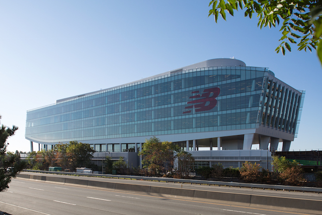
New Balance Headquarters Front Exterior: New Balance Corporation
By Mark Favermann
The highest quality architecture should assert a distinctive character and make a visual, perhaps even a metaphorical, statement. Two recent Boston and Cambridge buildings: 2015’s New Balance World Headquarters (athletic shoes) and 2016’s Novartis Research Center (Big Pharma) make statements, for better and for worse.
Set on the edge of the Massachusetts Turnpike in the Boston neighborhood of Brighton near the WGBH headquarters, the streamlined form of the New Balance structure seems to be perpetually in motion. Designed by architect David Manfredie of the firm Elkus Manfredie, the building makes an intriguing visual assertion about speed and movement — is it a gargantuan running shoe or a futuristic vehicle?
The New Balance building certainly has a “wow factor.” Aerodynamic, it probably looks like nothing else you have ever seen on such a large scale. Your reaction will be either “That is really cool” or “What the hell is that supposed to be?” Whatever you make of it, the structure certainly has plenty of personality, rooted in a very 21st century dynamism. It is architecture as sculpture.
With its curving walls and illusion of movement, the New Balance building is a sleek eyeful that also functions well on a pragmatic level. It is at the center of a family of new structures that will eventually include a hotel, two residential towers, additional office buildings, the Bruins’ practice ice rink, a sports complex that includes a running track, and a revamped parking garage, along with ground level retail shops. There is an outdoor park system in the works as well. Elkus Manfredie has designed all of the structures, and there is more to say about that. Adjacent to the complex is the new Boston Landing commuter rail station, which is scheduled to open in May 2017. Inspired by the new T Station, this section of the Brighton neighborhood is now called Boston Landing.
The interior of the New Balance headquarters building reflects Millennial-appealing, 21st century design thinking. With their high ceilings, the interior rooms are open, well-lit, and spacious. The various office spaces reflect the spirit of open concept. Walls do not separate spaces dedicated to different activities. Great views allow employees to enjoy the outside environment.
The sports complex’s racing track, with its adjustable slopes and curves, has been shaped to be the world’s fastest. Of course, this part of the building underscores the athletic shoe company’s cutting-edge research into the mechanics of running and walking. Massachusetts-owned, New Balance was bought in 1972 by now billionaire Jim Davis and became a major world player in the athletic shoe and sports clothing industry. Interestingly, it is the only shoe company in the United States that still manufacturers its products in the US.
There is a critical reservation: the New Balance complex comes off as more jumble of buildings than a consistent complex. Sightlines and scale relationships appear disjointed. This notion of hodgepodge must be a shared concept of the company and the architect; the idea was to highlight diversity through the use of structural heights, building footprints, façade colors, and construction materials. The layout is meant to serve as a contrast to the boring, too similar structural boxes like those in Boston’s Seaport District. But does the visual cacophony really work here? I don’t think so. For example, the roofline of the Bruins’ state-of-the-art Warrior Ice Rink is interesting, but the shape doesn’t harmonize with those of nearby structures. Taken on its own, however, the New Balance Headquarters is a visually compelling achievement.
Another recent and provocative structure: the Novartis Building. Swiss-owned Novartis is a giant Big Pharma company that, over the past couple of decades, has moved its research facilities to Cambridge. Set across the street from an earlier Novartis structure, the new research facility is located on the edge of MIT’s campus at the corner of Massachusetts Avenue and Albany Street.
Over the many months that the building was being constructed, the presence of a huge granite block screen posed a baffling question to curious passersby. For many, the perforated floating facade generated a prickly, in-your-face disturbance. What was this? Why was it there? How would it be integrated with the new building?
Completed, the building certainly exudes presence. Seen from a distance, crossing the Charles River into Cambridge and close up, it proffers plenty of street charisma. The granite block shield has been punctured with a pattern of holes (symbolic of cells?), a design that covers the more conventional yet rather elegant steel and glass laboratory building set close behind it.
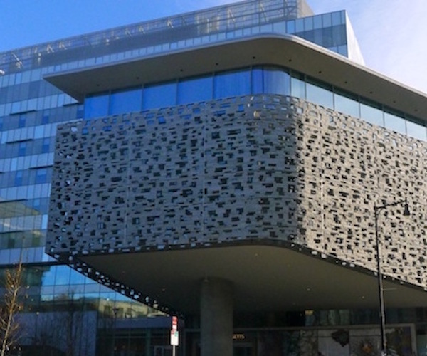
Novartis Research Lab, Cambridge, MA. Photo: Mark Favermann.
Starchitect Maya Lin, the artist/architect who as a Yale student created the Vietnam Veterans Memorial in Washington, DC. designed the Novartis building. She is known for her large environmental sculpture memorials, which can be found all over the country. The Novartis project seems to go against Lin’s earlier more elegant and often eloquent minimalist statements. Here, rather than drawing on her customary poetic simplicity, Lin is apparently going for ‘more of more,’ to the point that the bristly and aggressive impression is that of a brutalist shout-out.
The 850,000 square feet complex is actually a designers’ collaboration. The entire Novartis facility is a cluster of research labs, meeting spaces, offices, and first floor store locations: it is a large structure broken up into smaller pieces that revolve around a garden courtyard. Lin created the complex’s master plan: she designed the Massachusetts Avenue frontage, the smaller of the two laboratory buildings, and the larger interior spaces. But Toshiko Mori, the former chair of the Architecture Department at the Harvard Graduate School of Design, crafted the other laboratory wing. She also designed the wonderfully detailed lab floors. Canon Design were the architects and engineers of record.
Unfortunately, the distinguished landscape architect Michael Van Valkenburgh has contributed a very undistinguished green space. Instead of being an assertive public area, it has an air of defensiveness, a debilitating restrictiveness. In addition, the hard streetscape (sidewalk) surrounding the complex has not been thoughtfully landscaped. Is this the fault of the City of Cambridge, which didn’t make any demands, or an exterior envelope mistake by the design team?
Looked at from the street, the Novartis complex is visually awkward and somewhat uninviting. The building is more of a why than a wow; in this case, a gifted artist has confused sculpture with architecture.
An urban designer, Mark Favermann has been deeply involved in community branding, enhancing, and making more accessible parts of cities, sports venues, and key institutions. Also an award-winning public artist, he creates functional public art as civic design. Mark created the Looks of the 1996 Centennial Olympic Games in Atlanta, the 1999 Ryder Cup Matches in Brookline, MA, and the 2000 NCAA Final Four in Indianapolis. The designer of the renovated Coolidge Corner Theatre, he has been a design consultant to the Red Sox since 2002. Mark writes on architecture, design, and the fine arts.
These buildings truly showcase the blending of functionality and artistry, making them a testament to the power of design in modern architecture.