Visual Arts Review: Corita Kent at the Harvard Art Museums — Mingling the Mundane and the Sublime
The premise of the show, and especially the catalogue, is to put Corita Kent in her rightful place in the pantheon of major American Pop artists
Corita Kent and the Language of Pop at the Harvard Art Museums, Cambridge, MA, through January 3, 2016.

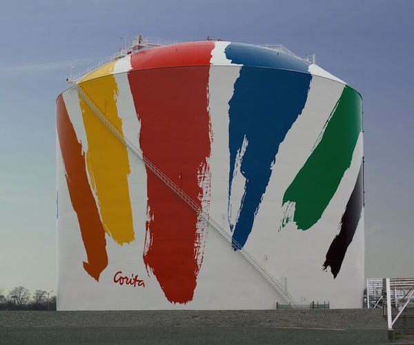
Corita Kent, “Boston Gas Tank (Rainbow Tank), 1971. Paint on Steel and aluminum. Photo: President and Fellows of Harvard College.
By Peter Walsh
Sometime in the mid-1960s, my father, then a professor at Boston University’s School of Theology, took me to a small Boston gallery that specialized in contemporary religious art. No plaster saints or imitation stained glass was on view. Instead, he pulled out drawer after drawer of brightly colored serigraph (silk-screen) prints by a Los Angeles artist, teacher, and Roman Catholic nun known as Sister Mary Corita.
Even at that time, when Pop Art was near its peak in popularity and Andy Warhol was already a major celebrity, Corita’s prints made a distinctly different impression. They mixed well-known Mad Men-Era advertising slogans, trademarks from cereal boxes, soft drinks, popular magazines, and gas stations with street signs, puns, lines of modern poetry, New Testament scripture, rock song lyrics, quotations from Thomas Merton, Rainer Maria Rilke, Günter Grass, and other mid-century icons of progressive culture.
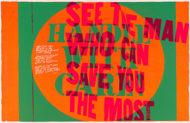
It didn’t really seem like it should work, but it did. The mix was oddly potent and gently aggressive. Unlike the deadpan and passive affect of most Pop art, which rarely told you much about what to think, Corita’s work went after your head in odd ways. The prints were text and color and the words were often hard to process, sometimes printed backwards or scrawled across swaths of color like pre-spray-paint graffiti. Unlike its slick commercial inspiration, Corita’s work looked intensely and intimately hand-made, with the vivid personality of the artist hovering over every image she pulled.

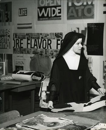
Corita Kent teaching with LIFE magazine, circa 1965. Photo: Mary Anne Karia (née Mikulka).
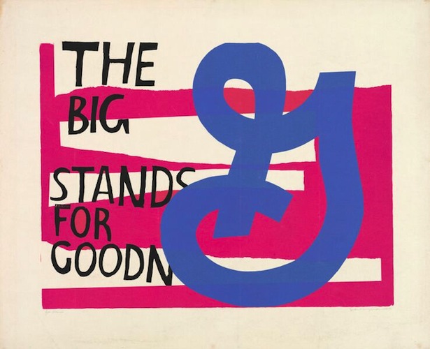
Corita’s mixture of references, familiar and unfamiliar, forced you to look in ways you hadn’t really planned on. Her sly humor was often punning and frequently softly shocking, though the context was highly moral and the messages based on traditional Christian teachings. One series was based on a well-known slogan for breakfast cereal maker General Mills, which proclaimed “The big G stands for goodness.” (Big G as in “God,” get it?) In another set, Corita drew connections between the famous “Wonder Enriched Bread” label and the Catholic doctrine of transubstantiation.
To say my father was enthusiastic about Corita’s work would be a major understatement. He and Corita eventually became friends, though never, I think, close ones, and he organized an exhibition of her work in Boston not long before she moved to the city. Corita Kent and the Language of Pop made me realize how deeply she influenced his thinking and teaching, for the rest of his life. Among the others she inspired, according to legend, were Alfred Hitchcock, John Cage, and Buckminster Fuller. She drew a wide circle for a nun.
The Harvard exhibition, organized by former print curator Susan Dackerman, is a major undertaking, with a massive, fully-illustrated 337-page scholarly catalogue with more than a dozen contributors, the sort of grand scale, coffee-table treatment a museum might give to Rembrandt or Caravaggio. The premise of the show, and especially the catalogue, is to put Corita in her rightful place in the pantheon of major American Pop artists.
The exhibition itself, though, comes across more like a cultural confrontation, one in which Corita comes out looking like much the cooler customer. The comparative material in the galleries — by big Pop names like Ed Ruscha, Robert Indianaa, Roy Lichtenstein, and Al Held — tends to comes across as oddly static and, well, dated. Somehow the woman who, according to the exhibition, was always put at a disadvantage by her profession, religious beliefs, gender, and devotion to a low-tech reproductive media, towers over all in the room.
To be fair, many of the name-brand Pop artists in the show are not played to their real strengths. The major Pop artists tended to work on a heroic scale in their major pieces, elevating soup cans and comic book images to a grandeur once reserved for the heroes of ancient history, Greek and Roman mythology, Biblical narratives, or massive battles deciding the fate of Europe. The grand scale of these Pop images added a level of irony to the work, as if to suggest that Coke bottles and gas stations and Brillo boxes had replaced Apollo and King David in modern American iconography.
Most of the non-Corita Pop works in the Harvard show, though, are prints or multiples. They are often much reduced versions of images made famous on large canvases. They are typically reproductive prints aimed at a less affluent, domestic-scale market, cranked out by a professional print atelier. For Corita, serigraphs were the main preoccupation and her leading passion, usually the first and only medium to express her ideas.

Corita Kent, “handle with care,” 1967. Screenprint. Photo: President and Fellows of Harvard College.
In the hands of the right artist, serigraphs encourage instant inspiration and experiment, a kind of spontaneous joy in creation. If you suddenly feel like changing a color or adding a shape, you can, in a couple of minutes, wash out the screen with a solvent, pour on a different ink, and set off again. Thomas Conrad’s engrossing film on view in the exhibition, Allelulia: Being a True Account of the Life and Times of Sister Mary Corita IHM (1967), shows Corita simultaneously printing and teaching, delivering a hands-on homily that she appears to be making up as she goes along. Most of the Pop artists missed this fun; their prints come across as slick and professional but several steps down the creative stream from the original inspiration. The relative crudeness and immediacy of Corita’s prints has kept them fresh and timely, and not only because of her fondness for Day-Glo inks.
For Corita, the message was deeply imbedded in the backstory of her medium. Her art was born in the early days of Vatican II and a host of social movements and is driven by the tools of the time. Developed by commercial sign shops to produce supermarket signs, T-shirt designs, and other cheap, mass-market graphics, serigraph is one of the quickest, least expensive print media to use and one of the easiest to master. Andy Warhol, himself originally a commercial artist, was one of the first to exploit screen print in a fine arts context, something that deeply impressed Corita when she encountered his work in the early 1960s. Silkscreen was also the medium of 1960s protest marches, used to put slogans on picket signs and quick posters throughout the era. The images of protests and happenings in the exhibition, with flower-draped nuns carrying Corita’s prints mounted on wooden slats, underscore that connection.
The lines between Corita’s political passions, her religious convictions, and her art are also nearly invisible. Never, apparently, particularly concerned with art as a commodity, she was able to create more freely as a nun, strangely enough, than her better-known colleagues in the outside art world. In works like Where there’s life there’s mud (1968), a play on a Budweiser beer slogan, “where there’s life… there’s Bud,” she offers a searching commentary on the messiness of the human condition and the need for redemption and forgiveness. She brings to this message a sincerity that carries through her moving works protesting the Vietnam War and the riots and assassinations of the late ’60s.

Corita Kent, “for eleanor,” 1964. Screenprint. Photo: President and Fellows of Harvard College.
As the exhibition points out, Corita’s chosen religious vocation was both a publicity advantage and a curse to her career as an artist. Ultimately, the two parted company. She left her order in 1968, taking the name “Corita Kent.” Moving to Boston for the last act of her life, she at last was able to create on a monumental scale in her famous design for the Boston Gas (now National Grid) tank on Commercial Point, overlooking Boston Harbor. There she finally beat her Pop brethren in size as well as passion.
Corita described her artist self as “half way between a landscape painter and a sign painter.” Like an Old Testament prophet, she saw signs and wonders in the everyday: along the highway, on the pages of glossy magazines, in supermarket aisles, and on the street. “Someone remarked,” she comments, “that the newspapers or the news magazines are the same as the psalms except that the names are changed in the stories.” More significantly, like Cage and Merce Cunningham, Corita realized the power of the coincidence, the impact of the unexpected random juxtaposition. The human mind is always searching for new ways to make meaning from events. Put the right things in its path, and it will come to transformative conclusions.
Harvard has done well by Corita’s living legacy. Beside the magnificent catalogue stands a well-planned installation. The wall texts are too long, but they’re so full of useful insights you read them anyhow. Corita’s work, this exhibition explains with grace and accuracy, mingles the “mundane with the sublime” and recreates both.
Note: A related exhibit, drawn from the artist’s papers, letters, and images, Corita Kent: Footnotes and Headlines, runs through December 4 on the first floor of the Schlesinger Library, Monday through Friday from 9 a.m. to 5 p.m. Free and open to the public.
Peter Walsh has worked for the Harvard Art Museums, the Museum of Fine Arts, Boston, Wellesley College, The Metropolitan Museum of Art, Dartmouth College, and the Boston Athenaeum, among other institutions. His reviews and articles on the visual arts have appeared in numerous publications and he has lectured widely in the United States and Europe. He has an international reputation as a scholar of museum studies and the history and theory of media.
Tagged: Corita Kent, Harvard-Art-Museums, Language of Pop, Pop Art
