Judicial Review #5: After the Hoopla — The MFA’s New Art of the Americas Wing
What is a Judicial Review? It is a fresh approach to creating a conversational, critical space about the arts and culture. This is our fifth session, with critics deliberating on the success of the Museum of Fine Arts’ new Art of the Americas Wing. Join the conversation.
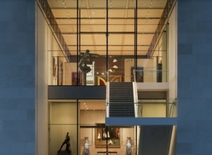
The Art of the Americas Wing -- Sublime, but the art seems to fit into it like a teenager into a hurriedly tailored suit.
The new Art of the Americas Wing at the Museum of Fine Arts (MFA), Boston is the product of a 10-year effort by director Malcolm Rogers. It entailed a $504 million fundraising campaign, double anything previously seen in Boston, according to reporting by Geoff Edgers, and resulted in a 133,491-square-foot expansion of the iconic Fenway building.
Of note, the project as it was originally conceived survived the economic downturn of 2008. In contrast, when the Seattle Art Museum (SAM) began its expansion in 2006, it was able to do so thanks to a partnership with Washington Mutual. One wonders how well SAM’s director slept between WaMu’s 2008 collapse and the 2009 decision by Northwestern Mutual to acquire WaMu’s share of SAM’s new, mixed-used building. The new wing also avoided insulting the neighborhood’s architectural fabric. Again, in contrast, after the Frank-Gehry-designed Walt Disney Concert Hall opened in Los Angeles in 2003, neighbors across the street complained that the sun reflecting off of its curved, mirrored surfaces was parboiling them, and workmen had to be called to grind off some of the sheen. In the MFA’s case, so far, so good.
That leaves the use of the building itself. My initial impression of the new Institute of Contemporary Art/Boston, when it opened in 2006, was that the facility was impressive, in some places sublime, but that the art seemed to fit into it like a teenager into a hurriedly tailored suit. It takes time for a museum’s curators to figure out the nuances of a new exhibition space, and I gave them a pass on it. But lack of depth in its permanent collection and curatorial turnover has made this a slow process. And it isn’t for not trying. They recently removed the computers from the Mediateque and are considering new ways to use it. The moral of the story here is that even with a satisfactory construction project, museological success is hardly assured.
Coming in to evaluate that success is John Pyper, a regular contributor to Daily Serving, and Matthew Gamber, who was one of the driving forces behind Big Red & Shiny. I picked them because both are hard-hitting critics who care profoundly about the status of Boston as an art center. We all want to see it develop further and believe that it can. The new Art of the Americas Wing is a significant addition to the local artistic landscape and likely to be the largest for some time to come.
— Arts Fuse Visual Arts Critic Franklin Einspruch
Majority Opinion: The judges are generally enthusiastic about the MFA’s new wing, one finding the Shapiro Court Yard “a haven for people—an interior space with the illusion of the outdoors offers an appreciation or sunlight, minimizing the discomfort of exposure to the elements. As it is becoming increasingly difficult to bring new audiences to art museums, one way of doing this is to build a space that allows people to see inside, enjoying themselves, creating desire to be inside.”
Minority/Dissenting Opinion: For one judge, the museum still has to master the nuances of the space, while for another, his “only sticky issue with the wing is the third floor.” He agrees with those who complain that it lacks focus.
— Bill Marx, Editor, The Arts Fuse
Matthew Gamber
This past November, with significant fanfare, the Museum of Fine Arts, Boston unveiled its latest architectural addition: The Art of the Americas Wing. Designed by Foster + Partners of London, the new wing is the result of a multiyear capital campaign now embodied in new galleries for the MFA’s extensive, pre-twentieth-century collection of works by prominent American artists and artisans. It also boasts a new space for the Art of Europe, the Ann and Graham Gund Gallery, and the new, expanded home for the education facilities, and the heart of the structure, the Shapiro Family Courtyard. However, the campaign to renew the MFA continues in the museum’s previous I. M. Pei addition, which will commit renewed attention to contemporary art programming.
Throughout the four gallery levels of the Art of the Americas Wing, the current installation is a unique arrangement of the MFA’s collection (some of it being displayed after a long-term respite in storage), guiding viewers through a series of aesthetic dioramas, realized in series of salon-style arrangements. Within the prismatic array of wall coverings, there is a unified progression of style defined through period-defined taste and technology. As they progress through the floors, viewers are treated to the similar pairing of art and interior (and industrial) design as they ascend the historical canon from Colonial America into the height of International Modernism on the topmost floor (The Ann and Graham Gund Gallery was closed in preparation of an upcoming Dale Chihuly exhibition).
The progression makes sense from the perspective of anyone who has only a casual interest in the history of the Western world, but the implied symbolism of placing the Ancient American, Native American, 17th-Century, and Maritime Art in what is ostensibly the basement is hard to ignore. Other interesting layout choices include the separation of the folk tradition from items of more refined taste, relegating cabinets, chairs, folk sculpture, and various trompe-l’œil pieces to dead-end galleries. While the room layouts are a grand gesture toward revising trends in exhibition design, it is hardly a revision of long held ideas constituted in the unbroken chain of connoisseurship in American history.
The unique feature of the MFA’s new addition is arguably the Shapiro Courtyard—an immense expanse though which one must pass to access the Art of Americas Wing. Encased in the illusion of an outdoor pavilion, this courtyard—or atrium, historically—has more in common with the galleria or the arcade, better known as a public market place or a shopping mall. Successfully, it is a haven for people: an interior space with the illusion of the outdoors offers an appreciation for sunlight, minimizing the discomfort of exposure to the elements. As it is becoming increasingly difficult to bring new audiences to art museums, one way of doing this is to build a space that allows people to be seen inside, enjoying themselves, creating desire to be inside. If the courtyard is used as an asset to attract people, then it would likely be filled with items that will please visitors rather than challenge them (for example: the New American Café, with “regional cuisine from the Americas,” reinterpreted by chef Ken Oringe).
Therefore, isn’t the end goal of MFA expansion similar to building an IMAX theater into Jordan’s Furniture in Natick, MA? This local furniture retailer, which started out as a small proprietorship, has become a regional New England franchise now owned by Berkshire Hathaway, with stores in New Hampshire and Massachusetts. The Natick, MA location boasts an IMAX theatre, a Kelly’s Roast Beef Restaurant, and an entry foyer clad in generic Mardi Gras phantasmagoria. This building design wears its baiting techniques on its sleeve. If you come for the entertainment, perhaps you might stay to purchase an area rug and resolve to appreciate nice things (as you become lost in the labyrinth of living room sets along the way).
Compared to the MFA’s new courtyard, isn’t the IMAX theater is also a kind of aesthetic achievement of technological sublime embodied in a spatial enclosure? That is an impossible comparison for an institution like a museum because Jordan’s Furniture is for the pedestrian lives as a consumption center. Museums are intended as a refuge for a more selective set of tastes, where the level of consumption is deemed more sophisticated.
New buildings like this offer much promise and excitement, perhaps because they represent such a focal point for a diverse set of desires from the people in the city. By featuring the architects Foster + Partners front and center, the museum is implying that the building is part of the museum experience and not solely a container for the artwork inside. Ultimately, the venue will bring people to have some sort of experience, which pitches one out of ordinary domesticity, out of the everyday. The building delivers on the promise of an aesthetic experience. More importantly, it also represents the shift in the city’s economy—where the infrastructure is, the high stakes culture follows, and likewise, the real estate.
The building can’t fulfill everyone’s individual wishes, but it can help prevent the city from becoming its own dusty museum. The new wing, along with the previously renovated Fenway and Huntington Avenue entrances, is a significant down payment on the museum’s renewed presence in the community. The long-term effect of reinvesting in this pocket of the Back Bay Fens has immense promise of reinvigorating the area after years of benign neglect.
Matthew Gamber is a Boston based artist and educator. He is the former Editor In Chief of Big RED & Shiny.
John Pyper
Confirmation bias, or seeing only what you expect to see, is always an issue when confronting something new. Art displays that you will never have to think about again are easy to live with for a few minutes, but when the Museum of Fine Arts, Boston creates 52,000 square feet of new exhibition space, you know that this space isn’t just a temporary friend, and you should get to know it. With time comes clarity, and we are now getting to know the MFA’s Americas Wing as it really is.
My initial reaction was that the changes found in the new wing will be received by both the public and museum professionals as good adaptations. The 53 galleries have two strengths: an expansion of the MFA’s encyclopedic programming and, with a few exceptions, purposely focused displays. Museologically, the MFA expanded into a pluralistic media presentation, intermixing prints, photos, and furniture with sculpture and easel paintings. The art spiraling up the wing has an intelligible timeline that allows the museum to flaunt its strong holdings in certain areas while broadcasting the direction in which the collection is moving.
The name of the new space, the Americas Wing, will give the more conservative among us worries about pluralistic, politically correct jargon. Instead, I’d argue that the museum is reflecting the reality of its collection, which spans centuries and speaks about the pluralism of America. Large parts of our country were once Spain, France, or other nations that have been displaced. It was a practical move that reflects the reality that the museum has collected objects steeped in these stories.
This new wing shifts the center of the museum from the Calderwood Courtyard to the most common museum design of our time: a giant glass cube. The Shapiro Family Courtyard, and the movable restaurant inside it, is a fearless move. Placing a casual sit-down restaurant at the center of a museum is quirky. It is designed to be used as a flexible entertaining space (to capture more donor money) and a meeting landmark for visitors, but the lack of art and the sheer size is alien to Boston’s architectural vocabulary, which usually focuses on maximal density.
The courtyard and the glass hallways between the three sections of the wing are intermissions. The glass allows visitors a moment to think about things other than art by seeing outside of the museum. I originally thought that both the courtyard and the division into three distinct areas was a wasteful design with some quirky circulation issues, but upon revisiting I had to rethink that. Arranging the museum vertically works, and each pod is filled with more than enough objects to wrap your head around.
These empty spaces allow for content-free time in the museum, which is a good thing. In the hallways, people talk comfortably at full volume, thus allowing for conversations and time to consider what you last saw. They are spaces intended for thought and escape, which makes the museum more comfortable.
The central column was suggested as the place to get a broad-brush introduction to the wing, and I agree. The MFA has placed the “minor” works in the side pods of each floor. If you are a lover of colonial objects, folk art, period rooms, or the Hale sisters, you’ll feel annoyed at my saying so, but they have been placed there to simplify the story that is being told the central column of the wing. When art is forced into a canonical model, with eras flowing into each other in logical order, the museum has to decide what marks the center and what marks the fringe.
MFA has settled upon a central narrative mostly told through easel paintings and some sculpture, but the integration of period specific ephemera into this canonical arrangement gives the galleries a life that was missing from the original MFA. The inclusion of Mary Cassatt’s 1891 color prints next to Loge or Charles Scheeler’s Ore Into Iron next to Champion Spark Plug isn’t revolutionary, but it is stimulating. The separation of art into distinct taxonomic units keeps the visitor from understanding how fickle an artist can be towards his medium.
The wallpaper and furniture create a soft-edged display without committing to the exactness of a period room. These sections allow for immersion into how objects from the era related to each other, creating a sense of history. The physically smaller rooms in the new wing create a dynamic, human-scaled atmosphere. You can scan the room and take in the impression of each display more than you could if it were located in a long hallway or in the grand proportions of the original MFA.
This atmosphere is heaviest on the second floor, in the salon room. The 19th century was a period of romantic excess and vigorous displays that were not unlike our news networks today. The louder and more obvious your work, the more foreign and ponderous your subject, the more likely your voice would be heard in the salons. They had an ambiance of battle. Paintings used stout gold frames to visually push away other works. The second floor holds what feels like miles of frames, a lifetime of setting suns, representations of every type of landscape, and enough stormy seas to give you motion sickness.
The revolutionary silence of William Merritt Chase’s Interior is all the more moving as you walk out of the salon room. You can see the radical approach of Mary Cassatt or William Merritt Chase just by entering the next room. These works, inspired by Japanese prints, seem leisurely and unruffled in comparison to the accepted academic subjects. You can feel the change in mood that these artists and the Impressionists brought to art.
The first floor, a treasure trove of portraits by John Singleton Copley and others, is an education in the ways that people wanted to be remembered. Each is slightly different, but their patterns become uncomplicated with time. The postures are conventional; they show the sitter being interrupted. The backgrounds are filled with idealized surroundings: homes, work, architectural objects that represent the stability of the empire, or comforting quiet gardens. Simply, the style is English. These portraits have the affectations of English heraldry without the family circumstances.
Despite that, you can see an American fashion coming through this Englishness. The portraits of Isaac Winslow show one way this happens, in a word: brown. In his 1748 portrait by Robert Feke, posed in the most sumptuously embroidered clothes he owns, resting on a piece of architecture, he points to the ocean, showing his connection to mercantilism and the founding of the settlements in Maine. He is as stately and blue-blooded as can be.
The Joseph Blackburn portrait of 1755 shows him turning towards his family. It combines a wall from his home and the English garden that was missing from his earlier portrait, but most telling, he has changed the opulent gold in his waistcoat to plain brown. This brown is still rich, but it is closer to the self-guided, American entrepreneur that we identify with.
His identification changes over time. He is not thinking about the sun setting on English profit but instead about the planting of roots here in America with his family. His daughter has the fruit of his labors in her lap and is relaxing in the garden while being protected by the walls of her father’s property as the sky glows a picturesque color. He chose to be in America, and that free choice is as much part of our national story as his plain, brown suit.
The only sticky issue with the wing is the third floor. I’ve heard nothing but negative things about it, and many of the complaints have merit. With the exception of the Eames furniture and other mid-century objects, it is unfocused and aimless compared to the thorough exploration of the two Johns, Copley, and Sargent. It partially reflects the shortage of holdings by the MFA from the modern era, but I can’t imagine this display will always be as it is. With a dedicated direction, it can turn into a serious and focused description of high modernism. It just needs some time to develop.
It’s not without its treasures or narratives though. Breaking Hue by Morris Louis is a good example of the pouring method that he stole from Helen Frankenthaler. Her husband Robert Motherwell’s Open #23 was part of his 1969 return to gallery shows after his 1965 retrospective at MoMA. The untitled Mark Rothko is from 1970, the same year as his suicide. But the polarizing Troubled Queen by Jackson Pollock is most like the gallery it resides in. Clement Greenberg was wrong when he said that the ugliness found in works like Pollock’s Queen “will become a new standard of beauty.” Soon after, Pollock painted his breakthrough dripped abstractions, executed on canvases spread out on the floor. What came after was better. One day the same will be said of the third floor of the Americas Wing.
John Pyper is an artist, writer, and curator based in Boston. He studied at numerous colleges in New England and graduated with a BFA from SMFA/Tufts. He has written for Big Red & Shiny, Southern Graphics Newsletter, Daily Serving, and Printeresting. His next curatorial work is “Contained” at the Boston Center for the Arts (March–April 2011). He loves long bike rides (not on the beach), books about art shows, and coffee matched with lemon meringue pie.
Tagged: Boston, Franklin Einspruch, Galleries, MFA, Museum of Fine Arts




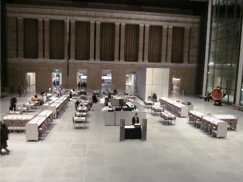
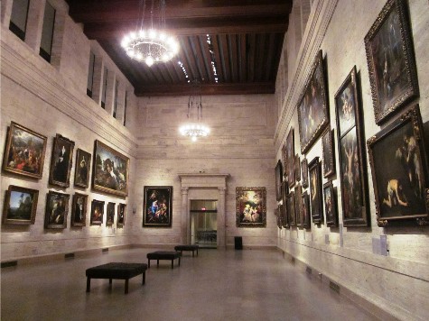


Dissent here. After a tour on a crowded Saturday I am disappointed by all the hoopla. I think the atrium is a huge waste of space. The idea of eating there is unattractive. The old cafe and cafeteria that I frequented happily for two decades are now like abandoned gas stations. The addition’s galleries are too small and the art seems a jumble. I’m not happy with the changes.
An interesting and informative site about the arts.