Visual Arts Review: The Design Language of Ettore Sottsass — at 100
Ettore Sottsass saw design as more than just an aesthetic achievement: it ideally served up an indelible experience, one filled with comedy and caprice.
Ettore Sottsass: Design Radical at the Met Breuer, the former Whitney Museum Metropolitan Museum satellite in Manhatten’s Upper East Side, through October 8.
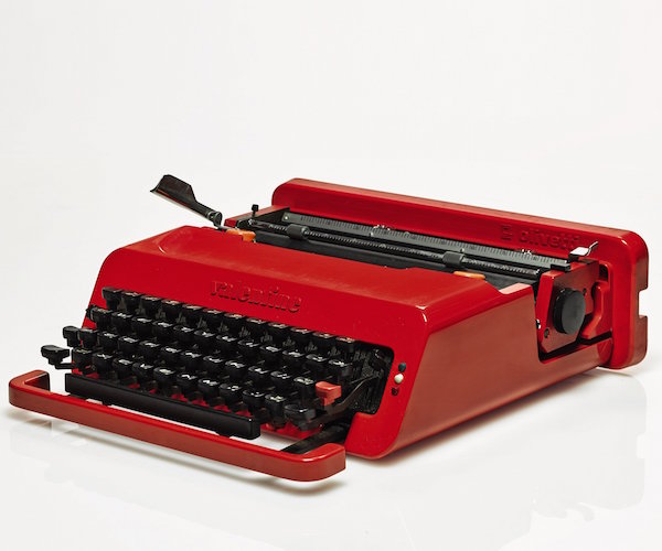
The Valentine Olivetti Typewriter (1969) by Ettore Sottsass,. Photo: Olivetti Company.
By Mark Favermann
Milanese maestro Ettore Sottsass (1917-2007) was more than just a vital part of 20th Century design history: he was a designer’s designer. At the current Met Breuer show, his boldly shaped and colorful visions are splendidly exhibited, placed in the context of the historical artefacts they referenced and, in turn, the contemporary pieces they influenced.
The Italian industrial designer and architect had a remarkably productive and at times provocative career; he created a huge body of work over six decades. Not only was he an original-thinker, but he was the founder of a revolutionary postmodern design group Memphis. This exhibition showcases the designer’s key works in a variety of media. Included are the designer’s wonderful furniture. architectural drawings, interiors, machines, ceramics, glass, textiles, paintings, photography, and even pieces of jewelry.
The show boasts a somewhat unusual approach: nearly half of the pieces don’t belong to Sottsass. His work is contextualized, placed in dialogue with some of the ancient and contemporary objects that inspired his creative vision. The exhibit is about encouraging conversation, inspired by its visuals and cultural ideas. The upshot is to strategically place Sottsass in a broader design environment — this is the portrait of a genuine design original.
Opening his own design studio in 1947, Sottsass went through numerous stages of design exploration over the course of his fecund career. He spent twenty years as a consultant to Italian manufacturer Olivetti, coming up with stylishly functional machines and early computers. Over time, his style became increasingly playful.
One of his most iconic and famous objects was co-designed with British designer Perry King: the Valentine Olivetti portable typewriter. It first sold in 1969, when its signature bright red turned heads. The look and the machine are now dated, but at the time it was, like the majority of Sottsass’ work, elegant, and cutting edge.
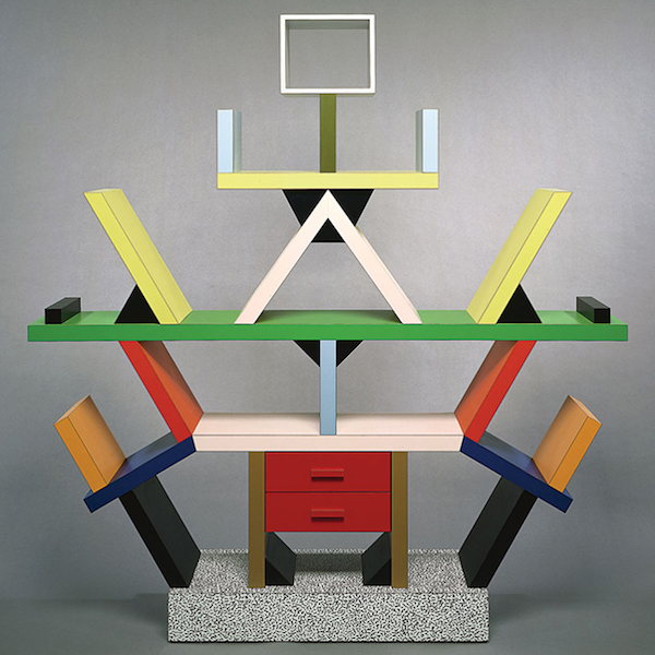
The Carleton Room Divider, Wood, Plastic Laminate (1981) by Ettore Sottsass. Photo: Studio Ettore Sottsass.
The shape was simple: an extruded rounded rectangle was sliced at an angle to house the keyboard. The front bar seems to float in the air, just below the front row of keys. Its adroit form emphasized function — stylishly, its visual look was enhanced by successive layers of details and textures.
Unlike his typewriters, much of Sottsass’ work was not always visually comfortable or as compellingly pragmatic. His later work often tended toward the metaphorical and sculptural — a conscious rebellion against the functional. This is especially true of his brightly colored and often physically prickly designs for the Memphis Group.
Founded in 1980 in Milan, the Memphis Group was an Italian design and architecture collaborative that, from 1981 to 1988, created Postmodern furniture and objects. The work often incorporated plastic laminate and was characterized by colorful decoration and asymmetrical shapes. It often arbitrarily referenced earlier aesthetic styles.
The name Memphis was inspired by the Bob Dylan song “Stuck Inside of Mobile with the Memphis Blues Again,” which the group had listened to repeatedly during its first meeting. Drawing inspiration from Art Deco, Art Nouveau, and Pop Art (as well as such styles as 1950s Kitsch, Scfi, and Italian Futurism, the group’s often flamboyantly colored furniture and objects were often described by friend and foe as bizarre, unpredictable, and even exceedingly “plastic.” One critic impishly characterized the group’s output as “a marriage of The Bauhaus to Fischer-Price.” Memphis‘ colorful geometric style became particularly popular in the 1990s. It was seriously collected by such international icons as Dior fashion designer Karl Lagerfdeld and the late great singer David Bowie. Today, the work has taken on the patina of nostalgia.
In June 1977, I spent an afternoon with the Maestro at a hotel pool in Aspen, Colorado. We were both attending the International Design Conference, a star-studded design conference that flourished for several decades. He was among the featured speakers, and I was the young stage manager for the event. He was elegant, soft-spoken, and quite a lot of fun to deal with.
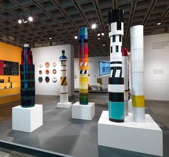
Interior of Ettore Sottsass Exhibit. Photo: Courtesy of The Metropolitan Museum
Because the sun was quite hot at the high altitude, Ettore and I went into the water to cool off. Echoing the Marco Polo (Marco, pause, Polo) children’s water game, I called him Maestro and he called me Doctori! We laughed a lot that afternoon. I didn’t learn much about design, but I was impressed by his effusive charm, easy dignity and, most importantly, his sophisticated sense of humor — he had the whimsy of a confident and content master designer.
And, in an illuminating way, Sottsass’ personality infuses his design oeuvre. Each of his creations generated a joyous and playful mirth. They also proffered an aesthetic ‘twist’ or visual statement (via form, color, or means of fabrication) that set them apart from comparable works. This ‘twist’ is what the exhibition curators refer to as the “radical” aspects of Sottsass’ designs. In truth, he was more of an original than a radical; his gift was for genially pushing modernist design beyond conventional boundaries, often crossing the line between formal functional design and personal artistic statement.
The exhibit contains many of the best examples of his work. In the 1950s, some of his designs were influenced by Abstract Expressionism and Colorfield Painting. His vases were decorated by drips. By the 1960s, Sottsass moved away from his modernist roots, leaving the functional behind by creating objects that were infused with symbolism and emotional appeal. Filled with historical and cultural references, his designs no longer hewed to minimalism.
Highlights include five ceramic totems (1965-66); a variety of smaller 1960s ceramics set next to ornate Indian mandalas that inspired Sottsass’ designs; rare architectural pencil drawings of futuristic buildings based on classical plans, and his Carleton Bookcase (1981), the most iconic object from the Memphis Group.
Sottsass once proclaimed that “Functionalism is not enough. Design should also be sensual and exciting.” On that front the exhibit falls short; it comes off as more of an academic exercise than a festive designer celebration. The Maestro saw design as more than just an aesthetic achievement: it ideally served up an indelible experience, one filled with comedy and caprice. More, for Maestro Sottsass, was always supposed to be … much more.
An urban designer, Mark Favermann has been deeply involved in community branding, enhancing, and making more accessible parts of cities, sports venues, and key institutions. Also an award-winning public artist, he creates functional public art as civic design. Mark created the Looks of the 1996 Centennial Olympic Games in Atlanta, the 1999 Ryder Cup Matches in Brookline, MA, and the 2000 NCAA Final Four in Indianapolis. The designer of the renovated Coolidge Corner Theatre, he has been a design consultant to the Red Sox since 2002. An Associate Editor of The Arts Fuse, Mark writes on architecture, design, and the fine arts.
Tagged: Ettore Sottsass, Mark Favermann, Memphis Group, Met Breuer