Visual Arts Review: Junk Yard Kids — Consecrating American Anti-Culture
Could there be a better place to satirize American taste than in the center of Boston’s thriving commercial district?
“TRA$H”, found objects, acrylic paint. Installation shot. 2016. Photo: Olivia Rose Turner.
By Stace Brandt
An incantation buzzes though through the radio … Baby bombs blasting blue, scavengers picking through the ashes …The words pelt a proclamation and ring out like a call to arms … Children of the mills! Children of the junkyards! — Patti Smith
It’s a soggy November. Fog thickens among the trees in the Boston Common. The brownstones on Newbury Street look muddy, clay-colored. Shoppers huddle beneath umbrellas, then duck into glowing storefronts. Above a popular Asian fusion restaurant sits the address 254 — the letters JYK on a glass door marks the entrance to the gallery. Inside, warm light reflects off the polished hardwood floors as well as the doorframe’s mahogany finish. The space is oblong; a massive collage of ephemera fills the walls of the entry room. Painted beer bottles litter the mantel place. Mustard yellows and bubblegum pinks ping-pong across the room. Glitter. Near the far windows a twisted form — which may have once been a piece of furniture — sits like a frozen contortionist.
I’m greeted by four artists—J.N. Esdaile, Olivia Rose Turner, Shannon VanGyzen, and Daniel Joseph—as if they are welcoming me into their home. In fact, Esdaile tells me that the gallery space had once been a residence. The quartet call themselves the Junk Yard Kids, a title cherry-picked from Patti Smith’s cover of “Smells Like Teen Spirit.” In the song, Smith summons the “children of the junkyards” to create an American anti-culture. As if inspired by the spirit of rock n’ roll, the JYK collaboration (its current exhibition is running through December 31) gives off the vibe of a collective. Though each artist has his or her own repertoire, they share a common a mission, which is stated in their press release:
Junk Yard Kids takes a playful stab at combining and re-contextualizing American kitsch with supposed notions of higher art and culture. The result is a burst of collage, assemblage, sculptures, paintings, photography and found objects creating a common language from disparate views, weaving and flaring from artist to artist.
The choice to forgo the standard white cube in favor of a domestic space (complete with two fireplaces and painted ceiling decorations) highlights the show’s themes as well as the group’s desire to eschew the status quo. Could there be a better place to satirize American taste than in the center of Boston’s thriving commercial district?
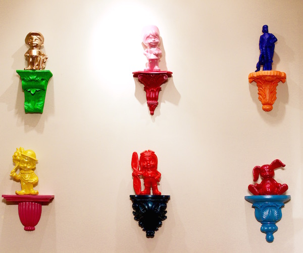
Esdaile and Turner lead me to the far fireplace, where their work grins out from wall sconces, the mantel, and glassy pedestals. The statuettes, which range from 12 inches to three feet in height, are roughly the size of garden gnomes and comprise an array of cats, a Pegasus, and cartoonish characters — golfer, pilot, and clown, to name a few. Each one sports a candied hue that recalls the coating on plastic toys. The cherry red and ultramarine paint resonates with the work of Warhol and Lichtenstein, while the metallic blue finish on a cheerleader calls to mind Jeff Koons’ “Balloon Dog.” The sconces supporting the statuettes are painted with equivalent flamboyance—sunburst orange, peppermint green, deep turquoise.
Despite the pop art palette, the series draws on Duchamp-ian logic, the language of the readymade. For six months, Esdaile and Turner scoured New England and New York City for sconces and ceramic figures that had been produced and popularized by the Atlantic Mold Company in the sixties and seventies. The figures were purchased as unadorned casts and then painted as house decorations. By repainting and recontextualizing the sconces and statuettes, the artists challenge staid conceptions of what can be “upheld” or “elevated” as an art object. They also dramatize a humorous clash between middle and upper class décor, though the democratic, wildly colorful defacement of the objects marginalize questions of “good” or “bad” taste.
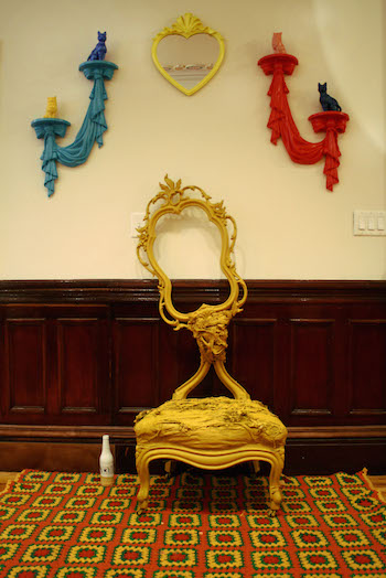
“Chainsmokin’ Grandma,” found antique chair, found plastic Victorian style frame, lace, house paint. Installation Shot. 2016. Photo: Stace Brandt.
Obviously, embracing kitsch is a big part of JYK’s mentality. But the tongue-in-cheek quality of their work also points out cultural delusions. For example, Shannon Van Gyzen’s work moves into self-consciously outlandish territory. Her disorientating sculptures draw on an amalgamation of found furniture, household materials, and acrylic paint; her goal is to tear open myths of perfection by exploring the dark side of domestic narratives (think “The Yellow Wallpaper” and Sylvia Plath’s The Bell Jar).
The inherent figurative quality in Van Gyzen’s tables and chairs (arms, legs, backs) invite playful personification. And that humanization of the inanimate inevitably generates pathos. Each sculpture is given a strong personality; titles like “Chainsmokin’ Grandma” and “There Was One Chair that Always Seemed Like a Strong Friend” emphasize this interest in character. There’s a feisty ugliness in these pieces as well. Van Gyzen wants to provoke: both of the aforementioned sculptures appear slightly dilapidated and are doused in a horrid, yellowish-brown paint which the artist describes as “grandma vomit.”
Towards the back of the gallery, Van Gyzen’s “Hang In There” stands on four chair legs. The piece seems to be struggling to escape its condition. Yellow armature buckles in a tangle of curtains, bed sheets, and gold-colored pillowcases. A web of tulle looks like cobwebs. The whole thing is quite literally bent out of shape and could very well have been pulled from Miss Havisham’s basement. The key to this vision of torture is explained by the title: it’s not quite broken but not quite all together, a portrait of hanging on at all costs.
While Esdaile and Turner and Van Gyzen’s pieces may make viewers feel as though they have slipped down Wonderland’s rabbit hole, Daniel Joseph offers a more familiar version of reality. Joseph has filled every inch of the first section of the gallery with a collection of desk-drawer memorabilia that many would have tossed out long ago. He calls the work “Black Rainbows (or jet fuel couldn’t melt these dank feels)” in reference to the rainbows motif throughout the collage. “I was thinking about the rainbow being the symbol of tolerance and positivity and awakening—Something to look forward to after a storm,” the artist explains. “But under a great deal of stress and dread and disillusionment, the colors become dim, distressed, and darkened.”
Mostly affixed to the wall with scotch tape, “Black Rainbows” has the feel of a teenager’s bedroom and it requires patient attention. Exploring the myriad items takes time and up-close examination: handwritten playlists, scribbled manifestos, a sign language worksheet, ironic doodles, drawings in crayon, pictures of guns, emails censored with Sharpie, photographs of clouds, Kurt Cobain with a hole punched through his head. These scraps of adolescence come off as a montage of a ’90s skater kid—punkish and audacious yet emotional.
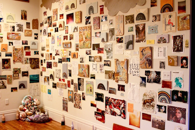
“Black Rainbows (or jet fuel couldn’t melt these dank feels),” mixed media collage. Installation Shot. 2016. Photo: Olivia Rose Turner.
What keeps Joseph’s work from becoming generic or redundant lies is his wit, consistency, and concern with detail. Each of the hundreds of elements contains either a visual motif or a deliberate (albeit ironic) statement. His text-and-image based works lean toward the sardonic. A few examples: an image of a little girl wrapped in an American flag is accompanied by the phrase “It’s not for everyone.” Or a crumbled tabloid shot of Paris Hilton and Britney Spears has “you have no idea what it’s like” penned in cursive over Spears’ bursting cleavage. Among the other handwritten epigrams: “You played with my heart like a toy heart” and “i don’t think you guys know ghetto i am.” Sarcastic news headlines proclaim “MOM BOMB” and “Dancer Risks Everything.”
Perhaps Joseph’s paintings on wood, which depict scenes from children’s stories, delivers the work’s unifying message. Though he uses a pastel palette, Joseph inevitably filters the imagery through an adult perspective. These fantasy worlds are subtly tainted: the characters appear to have grown more violent, distressed, and depressed. The images epitomize the collage as a whole: it is simultaneously about the loss of innocence and a longing to return to it. In reexamining the evidence of his formative years, Joseph searches for the gritty truth behind comforting nostalgia.
By the end of my visit, I had difficulty differentiating the hand behind each work. Though four artists comprise the JYK, the installation on the whole feels seamlessly collaborative. The interplay and overlap among the works generate a powerful narrative that consumes, conforms to, and resists the gallery’s domestic interior. In that sense, the show’s over-the-top sensibility offers a welcome visceral reminder of the absurdity of mainstream culture.
Stace Brandt is a local artist, musician, and arts writer. She recently graduated from the University of Vermont with her Bachelor of the Arts in Studio Art and English. A multidisciplinary writer, Stace has contributed to print and web publications including Seven Days Vermont and Big Red & Shiny.
Tagged: Daniel Joseph, J.N. Esdaile, Junk Yard Kids, Olivia Rose Turner, Shannon VanGyzen