Homage: Mega Designer Massimo Vignelli Leaves Modernist Design Legacy
Massimo Vignelli was one of the design world’s true masters, and his name and personality are synonymous with the best qualities of modern experiential design.
By Mark Favermann
A star designer, he was the Guru of the Grid, the Titan of Type, and the Colossus of Color. Each of his projects dealt with one or more of these basic elements of design.
To those who knew him best, he was always elegant, often loquacious, meaningfully gesticulating, demonstratively enthusiastic, and always intense. To others, he was blunt, brusque, and perhaps too direct.
The Italian-born, New York City–based graphic and industrial designer Massimo Vignelli died on May 27, 2014. He was 83. Vignelli was one of the design world’s true masters, and his name and personality are synonymous with the best qualities of modern experiential design.
To him, designing anything, be it a logo, a book or a chair, was not just about being clever or coming up with a creative solution to a problem. It was about the quality of the materials chosen, about scale, about pacing and always, always about refinement. There was also a wonderful sense of grace, warmth, and even a bit of wry humor in all of his projects. Each design solution was formally elegant yet accessible.
Vignelli saw his designs as a means to create experiences. It was not about producing momentary impressions. It was about shaping something that had a lasting, even timeless appeal.
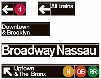
His minimalist, eloquent identities for international brands continue to influence the look and feel of our world. Vignelli‘s iconic Helvetica font signage remains memorable, as well as his 1966 diagram for New York City’s massive MTA subway system, which simplified its complexity. His design led to pedestrian navigational maps that proffered a graphic language that clearly defined all of the city. The various subway lines were designated by different colored ribbons—Central Park was a square. Because of its abstraction, the map was controversial, cherished by some, denounced by others. For the Washington, DC, Metro, his signage branding was more subdued than New York’s because of the large-scale modern architecture of the stations.
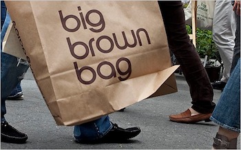
His understated but surprisingly glamorous Big Brown Bag (as well as Medium and Small Bags) for Bloomingdale’s seamlessly fused brand with function. The image became an instant status symbol.
In 1967 Vignelli was introduced to a fledgling American Airlines by pioneer American industrial designer Henry Dreyfuss, who at the time was a consultant to the company. After Dreyfuss’s recommendation, Vignelli was commissioned to design the logo and branding for the growing airline. Alas, almost 50 years later, the now mega-airline ditched the image last year for a much weaker replacement.
With just a bit of 3-D tweaking, Vignelli’s logo and branding for the Ford Motor Company has stood the test of time for over half a century, proof of Vignelli’s belief that “If you do it right, it will last forever.”
In 1964 he created a colorful, unbreakable, and stackable plastic dinnerware set for Heller, a new furniture company. Plastic plates became chic rather than cheap, a prerequisite for casual dining, children’s tables, and summer barbecues. A white set is currently available at Design Within Reach.
In 1967 Vignelli created a new graphics standard for the furniture company Knoll. Based largely on the shape of a grid, the design visually articulated Knoll’s corporate mission while meeting all of its corporate communication needs. The latter included stationery, business cards, stickers, tags, boxes, brochures, price lists, and four-color ads for trade magazines and publications. Not only did the design become the foundation for the company’s public identity, but the elegant branding gave Knoll an international graphic identity that became the industry standard.
 In addition to creating Knoll’s branding, the company also commissioned Vignelli to create a stackable chair system (Handkerchief Chair, 1983) and then a decade later a complimentary table (PaperClip Table, 1994). The chair suggests the windblown contours of a floating handkerchief; the table uses the same materials to create a similiar impression.
Born in Milan in 1931, Vignelli studied architecture in both Milan and Venice. Architecture is taught differently in Italy and much of Europe than it is in America. Here design is seen as a creative and technical exercise moving from print (now digital) to object to structure. There, design is about form, materials, color, function, and beauty. The American approach to design tends to pigeonhole professions into separate slots: graphics, industrial design, landscape, and architecture. Vignelli was the epitome of Europe’s more comprehensive notions of training, practice, and attitude.
Before moving to New York in 1966 to start a US branch of Unimark International, Vignelli and his wife Lella ran a successful design firm in Milan. In 1971 they founded Vignelli Associates, where they worked together for decades on a wide variety of graphic and industrial design projects for major public and corporate clients. Lella, his wife of over 50 years, contributed equally to the design process and practice. She has said that Massimo was the dreamer and that she brought his visions into reality.
“The life of a designer is a life of fight: fight against ugliness,” wrote Massimo Vignelli. Inspired by a deep desire to be logical and consistent in the pursuit of beauty, he brought a sleek visual order to our contemporary chaos.
An urban designer, Mark Favermann has been deeply involved in branding, enhancing, and making more accessible parts of cities, sports venues, and key institutions. Also an award-winning public artist, he creates functional public art as civic design. Mark created the Looks of the 1996 Centennial Olympic Games in Atlanta, the 1999 Ryder Cup Matches in Brookline, MA, and the 2000 NCAA Final Four in Indianapolis. The designer of the renovated Coolidge Corner Theatre, he has been a design consultant to the Red Sox since 2002.


