Visual Arts Review: The Strange Beauty of “Prints and the Pursuit of Knowledge”
The astonishing exhibition “Prints and the Pursuit of Knowledge” has the strange beauty and density of a scientific diagram or star chart. You can’t examine it deeply all at once. It is best to take a certain reading, see what questions arise, and go off to your lair to think.
Prints and the Pursuit of Knowledge in Early Modern Europe. At The Arthur M. Sackler Museum of the Harvard Art Museums, 485 Broadway, Cambridge MA, Tuesday through Saturday, 10 a.m.–5 p.m., through December 10, 2011.

Prints and the Pursuit of Knowledge examines how celebrated Northern Renaissance artists contributed to the scientific investigations of the 16th century. The exhibition and its accompanying catalogue challenge the perception of artists as illustrators in the service of scientists. Artists’ printed images served as both instruments for research and agents in the dissemination of knowledge.” — Curatorial Description from the Museum website.
The time period covered in this exhibit represents a shift towards direct experimentation and observation of the natural world, away from relying on ancient, classical texts for scientific information. While the show is largely prints and books, there are also instruments—sundials, globes, astrolabes, and armillary spheres—made from printed paper. There are even flap books showing different layers of internal organs of males and females, early precursors to children’s pop-up books. Some of these have been assembled from printed reproductions, and we are invited to handle them.
This exhibit is so beautifully curated, by Susan Dackerman, Carl A. Weyerhaeuser Curator of Prints, that I take it as a given when she asserts: “. . . we really wanted to explore the important role artists played in scientific inquiry of the 16th century. One of the things artists did at that time was help theorists visualize kinds of knowledge, and by helping them visualize it, they actually helped them in many cases conceptualize it as well.”
Accepting the premise of the show catapults me into other questions and fascinations that come from gazing at some of the individual works. I will just touch on a few of my own favorites, for the show is vast. The section headings are my own, just to help us all navigate through this review.
[See the gallery at the end of this article for links to full-resolution images.]
Man and Geometry

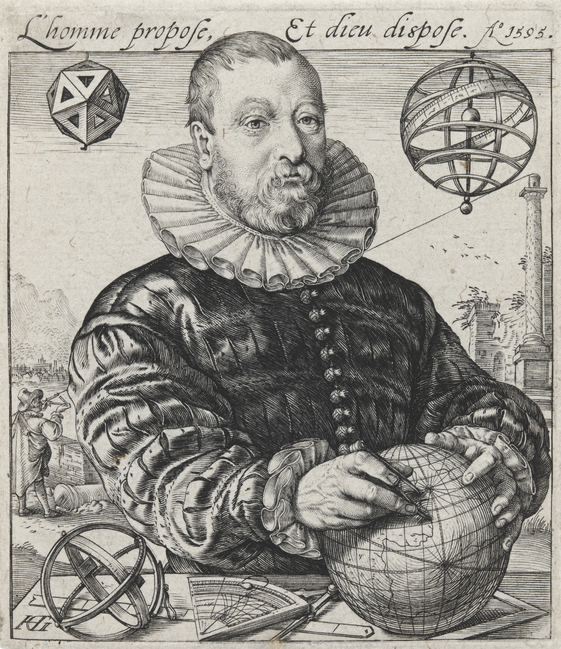
Hendrick Goltzius, PORTRAIT OF NICOLAUS PETRI VAN DEVENTER, 1595. Engraving. Harvard Art Museums/Fogg Museum. Photo: Department of Digital Imaging and Visual Resources, Harvard Art Museums, © 2011 President and Fellows of Harvard College.
Holding the world in his hands, surrounded by the tools of his trade, this mathematician and astronomer looks off into the distance over our right shoulder as he makes his calculations. Behind him in the distance, a man with a sextant measures the height of the one remaining column of a ruined temple. Although the French at the top of the picture proclaims “Man proposes, And god disposes,” it might be more fitting if it said, “Man is the Measure of All Things.” Petri is shown in the middle of four perfectly formed, geometric objects: a polyhedron (probably an icosohedron) on the upper left, an armillary sphere upper right, an astronomical sphere and the globe on his table. No matter how perfectly curled the segments of his ruff, how perfectly round the nubbins of his buttons, his face and hands are rather lumpishly human . . . and yet it is we humans who invent, or discover, the perfections of the geometric forms.
The Truth of the Fine, Black Line

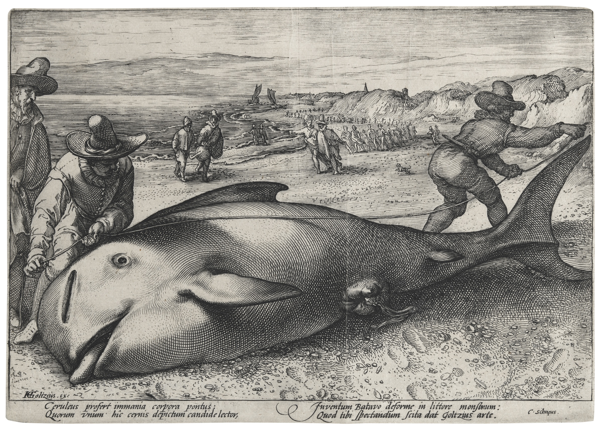
Unknown artist, after Hendrick Goltzius, PILOT WHALE BEACHED AT ZANDVOORT, 1594. Etching and engraving. Harvard Art Museums/Fogg Museum.Photo: Department of Digital Imaging and Visual Resources, Harvard Art Museums, © 2011 President and Fellows of Harvard College.
What would we do if we came across a dead whale on the beach, and we had never seen one before? I would stand there for a bit muttering, “What is it? Do fish get that large? That is one huge fish.” Then I would pace it off, or if I was feeling more scientific, measure it, as these two men are doing, with a rope of some sort. The artist here is allowing us to measure it, too, by putting the arm of the man on the right more or less in the plane of the whale, and if a man’s arm is about a yard, this animal seems at least 21 feet long . . .
I was a research scientist for a couple of decades, before turning to the other truth of fiction writing. When I think of science, even now, it is associated with the fine, black line. For me, the fine black line is the visual counterpart of the Greek or Latin neologisms that flavor so much of medicine and science; it is a sign that the scientific mode of thinking may be involved here.
Dürer and some of his colleagues were able to get wonderful, detailed lines in their woodcuts, but the copperplate engraving allows another order of magnitude of precision. With the wood block, one always has the problem of working with or across the grain while carving and limits to the amount of pressure and number of impressions one can make before the block itself breaks.
Anyway, with the print—either by woodblock or the technological innovations of copperplate—comes the possibility of sudden, widespread broadcasting of the new empirical and observational scientific findings. Thus it could be that these 16th-century artist-scientists are in fact responsible for our association of fine, black lines with science.
I wonder if our notion of sharp ideas or incisive thinking is linked to the sharpness of the engraving tool—the burin—and the way it cuts so finely into woodblock or copperplate. Conversely, fuzzy ideas, or “painting things with a broad brush,” we associate with imprecisions and omissions.
This leads me to wonder: What if the technological innovations in art in the 16th century had been not connected with fine, woodblock cutting or copperplate engraving, but rather with lithography or some other broad brush process? Would our whole notion of scientific thought and illustration be hugely different? I am reminded of Junichiro Tanizaki’s odd little masterpiece, In Praise of Shadows, where he conjectures what would have happened if the modern hospital had been invented in Japan, with its shadowy interiors, sliding paper panels, and floors made of woven grass.
Back to the matter at hand. I mentioned that for me the fine line is the visual counterpart of the Greco-Latin language of science; that language both clarifies, to those who know, and obscures, to those outside the field. Polymyalgia they say, instead of many muscles hurting. But the fine line of the print is meant only to convey and to clarify. Its own precision carries with it the implication of accuracy and truth. We have to believe it. This can lead to interesting problems, as we’ll see below.

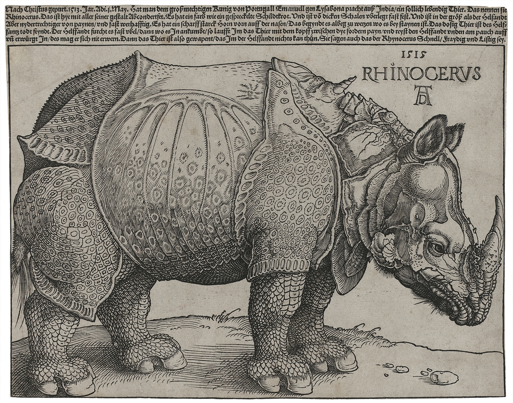
Albrecht Dürer, RHINOCEROS, 1515. Woodcut and letterpress. Museum of Fine Arts, Boston. Photo: Photograph © 2011 Museum of Fine Arts, Boston
For ages this image has been the iconic rhinoceros for me. Even though I have seen such beasts in the zoo, it is this picture that I believe. I know that they are not as reptilian or scaly in real life. I know that they don’t have plates like an armadillo. But still, this is the picture I would grab, needing one of a rhino. Even though this is a woodcut (with letterpress at the top for the writing), the black lines are so fine that if you zoom in or blow it up, you’ll see every hair lining the ears, every bristle on the muzzle. For years and years, I had a print of this hanging in my house. I never noticed that inaccuracy, that piece of un-truth: that second horn, the spiral one projecting from between the beast’s shoulders, pointing toward the “R” of Rhinoceros. Discussing this horn, the catalog mentions that Dürer never saw the animal himself and worked from notes and sketches of someone who had seen it in Portugal, the first Rhino to come to Europe since the 3rd century. I know that dorsal horn is “wrong.” But with all those fine black lines, all Dürer’s genius and virtuosity, it is hard to disbelieve.

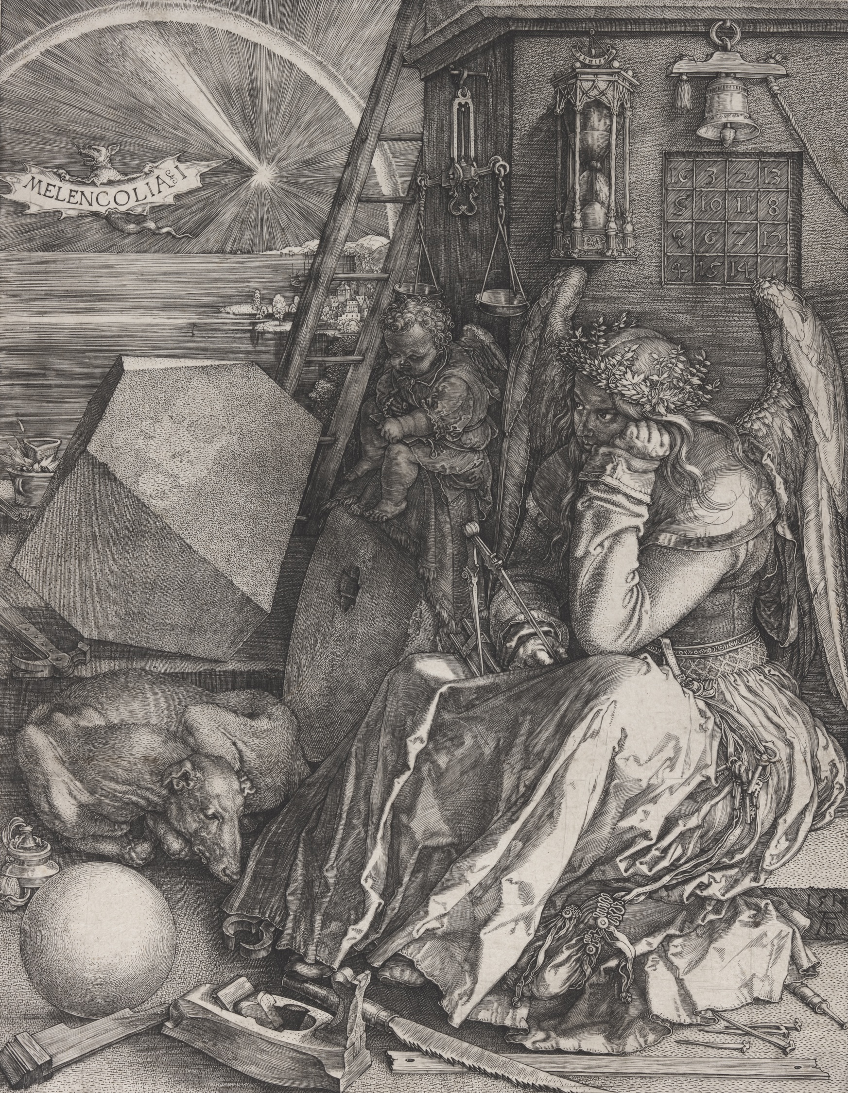
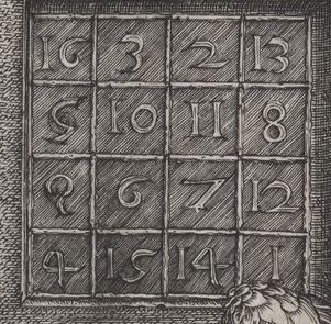
Albrecht Dürer. MELENCOLIA 1. 1514. Engraving. Harvard Art Museums/Fogg Museum. Photo: Department of Digital Imaging and Visual Resources, Harvard Art Museums, © 2011 President and Fellows of Harvard College.
Another well-known Dürer print brings up a new set of questions. This image occurs in the part of the exhibition devoted to “Allegory,” in which humans or gods represent attributes or senses. Books and books have been written on this astonishing picture, so I will just mention what happens when I look at it for a while. The more you magnify the picture, the lighter it becomes, and as the winged, female figure comes out of the shadows, it becomes impossible to see her as melancholic. She does not have “black bile” the original meaning of melancholia. She is not grieving or sad or depressed. If she is focusing on some cosmic judgment, it is alloyed with cosmic humor. She and the cherubic figure beside her are in the throes of work. She holds dividers, which, as the catalog notes, are the tools of divine or human creators. Her work-space is a mess, but her mind-space, which I think is represented by the things that hang on the wall above her—balance, hour glass, bell, and magic square—is full of order.
The Wikipedia entry on this print suggests that the “1” in the title “ refers to the first of the three types of melancholia defined by the German, humanist writer Cornelius Agrippa. In this type, Melencholia Imaginativa, which he held artists to be subject to, ‘imagination’ predominates over ‘mind’ or ‘reason’.” What a relief! She is not full of black bile! She is deep in the work of the imagination.

Detail of MELENCOLIA 1. The Magic Square
The curatorial wall notes for Melencolia 1 point out that the magic square on the wall above the wing of the female figure is in itself rather amazing: each side and each diagonal add up to 34. So do the four inside numbers. So do the four corners. So do the facing inner pairs of numbers on opposite sides. And the date of the print, 1514, is centered in the bottom row. Mathematicians call this the “Dürer 4×4 Magic Square.”

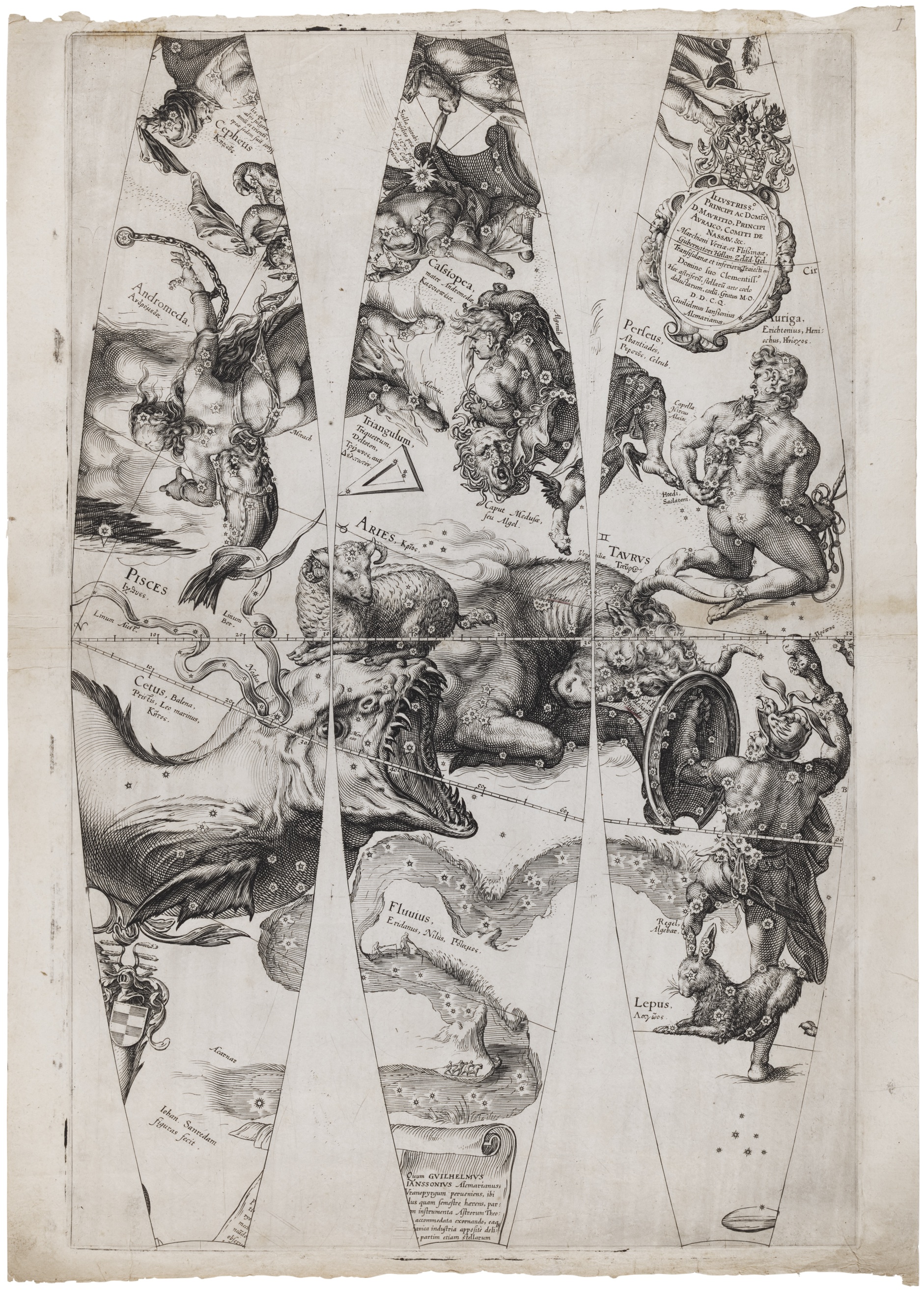
Jan Saenredam, from CELESTIAL GLOBE GORES FOR WILLEM JANSZ. Blaeu’s Sphaera stellifera. Before 1600. Houghton Library. Photo: Houghton Library, Harvard University
The catalog tells us that Dürer was the first one to make prints of celestial charts of constellations and planets. Soon after that artists began to adapt such charts to long, oval gores as in the three sheets above by Saenredam. (There had been a fourth sheet, but is is missing.) These gores were meant to be cut out and then bent and glued onto a wooden sphere, which they would cover except for caps at either pole. There are some examples of such celestial globes in the exhibition that can be handled.
I’ve always found terrestrial globes exciting, but these celestial ones are of a different order of marvelous. And they are wonderfully puzzling in a show devoted to science.
Here’s what fascinates me: Terrestrial globes are spherical, and we handle them and look at them from the outside. They are a model of the round earth on which we stand.

Jan Saenredam, from CELESTIAL GLOBE GORES FOR WILLEM JANSZ. Blaeu’s Sphaera stellifera. Before 1600. Houghton Library. Photo: Houghton Library, Harvard University
But standing on the earth, we are inside the heavens. A proper model of the constellations and planets would be a sphere surrounding us. But if the printed gores were glued to a hollow sphere, face down, that is, facing something inside, we couldn’t see inside, or if we could, through peepholes, say, it would be extremely awkward. So the artists and scientists who made these celestial globes made them analogous to the usual, terrestrial globes, facing outward but with constellations instead of land and sea.

Jan Saenredam, from CELESTIAL GLOBE GORES FOR WILLEM JANSZ. Blaeu’s Sphaera stellifera. Before 1600. Houghton Library. Photo: Houghton Library, Harvard University
But who could view our constellations and planets from above? Who looks down on the Milky Way? Not our sub-lunar selves. Holding these star spheres in our hands, as this exhibition invites us to, we become gods.
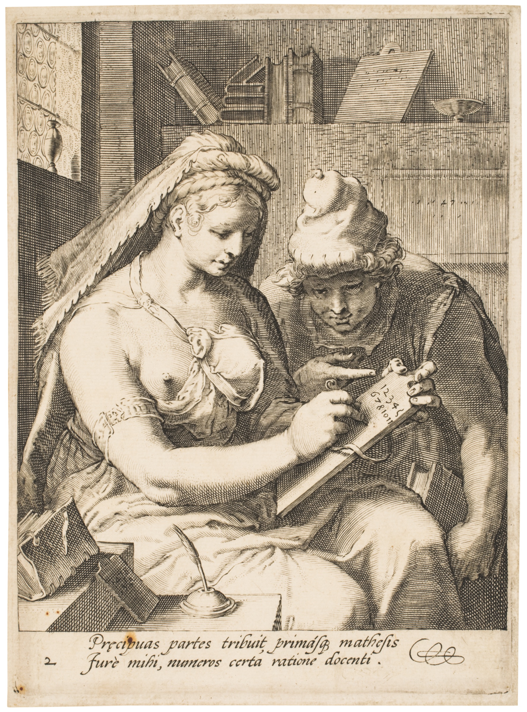
Cornelis Drebbel after Hendrick Golzius. ARITHMETIC, from the series The Seven Liberal Arts. After 1587. Engraving. Philadelphia Museum of Art. Photo: Philadelphia Museum of Art
Here, Arithmetic, personified as a hefty, blond goddess, is teaching the numbers to her young, male companion. Something odd has happened to her filmy bodice, and one of her breasts exposed. Then, as now, the naked bosom captures our attention, and many of the allegorical figures in this exhibition are women in extreme conditions of undress. The fine, black lines here, along with the geometric forms taken by the books on her shelf and the rondels of glass in the window, make us believe in the truth of the lesson. But something odd is going on here as well, for she has left out the number nine. (Zoom in if you need to, its absence is very clear.) Neither the catalog nor the wall notes mention this, so it is ours to question!
Is this a form of copyright protection, to insert a known “wrong” and see if it gets promulgated? Did the student not pay the full price for his lesson? Does the word for nine in Dutch have an obscene ring to it, the way it did for Isak Dinesen’s Swedish teacher of Swahili? Or is the number nine occult or mathematically esoteric, that the student may not learn it yet? Can you “cast out nines” before you even learn of their existence?
In any case, for me this was another case of the fine, black line giving the illusion of accuracy, leading me into the belief that I was seeing the full array of numbers on her tablet until I finally saw the puzzling omission.
Note that I’m not saying that the fine, black line is there to trick us. Not at all. For years I was a microscopist, and I still love the finest lines, the highest resolution. But those fine lines have to deserve our belief in their veracity.
Making Tools Visible

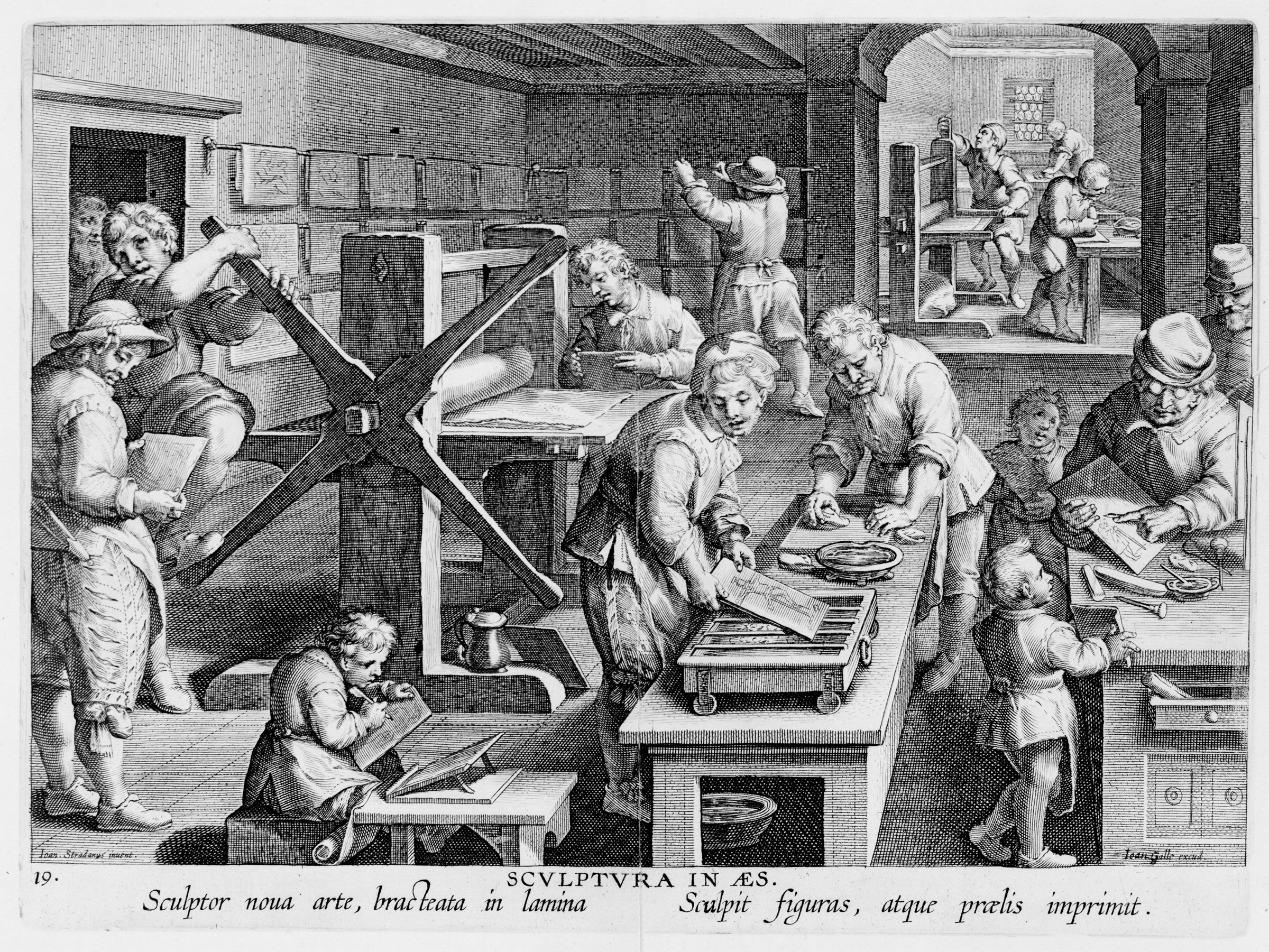
Unknown engraver, after Stradanus. INVENTION OF COPPERPLATE ENGRAVING from Nova Reperta (New inventions and discoveries of modern times) c. 1599–1603 Sarah Campbell Blaffer Foundation, Houston.
Here we see not the process of inventing but what happens during that process, which had been recently invented. In the lower left, a boy on a bench copies a drawing, engraving it onto a copper plate. In the middle, the first figure heats the plate, while the one behind is either rubbing ink onto the warm plate or rubbing the excess ink off. Behind them, to the left, a plate hidden by the paper lying on top of it is rolled through the press, which is so heavy that the man in the far left must use his foot and body weight to push on the lower spoke as he pulls the upper one toward him. In the back of the room, the prints are being hung on racks so the ink will dry.
I kept expecting that the plates they were working on would show the very scene we are looking at, in the manner of Escher– amise en abime, also known as “the Droste effect.” But though they are hard to see, the one on the left looks like architectural drawings, the middle one a crucifix, and the one on the right a man leaning on a stick. But Stradanus and his engraver were not playing this game.
In any case, this image of the printing process made me wonder about making visible the tools and elements of art. The tools for scientific observation and measurement—telescopes and compasses and dividers and rulers and gnomons and sextants—occur throughout the prints, always having to do with mathematics or astronomy or navigation. We see a (flawed set) of numbers in the allegory Arithmetic, and in the magic square of Melencolia 1, we see some elements of Number Theory.
In poetry it is easy to show the elements, as individual words or sounds can be so loaded, electric, fundamental, that the whole work can hover and hinge there.
In fiction it is harder to make the tools visible in a way that is deep and interesting. James Joyce reminds us, at the beginning of A Portrait of the Artist as a Young Man, that we all start with baby talk:
Once upon a time and a very good time it was there was a moocow coming down along the road and this moocow that was coming down along the road met a nicens little boy name baby tuckoo….
And Julio Cortazar, at the beginning of his story “Blow Up,” shows that psychic trauma can destroy the syntactic tools that, as adult speakers of the language, we take for granted:
It’ll never be known how this has to be told, in the first person or in the second, using the third person plural or continually inventing modes that will serve for nothing. If one might say: I will see the moon rose, or: we hurt me at the back of my eyes, and especially: you the blond woman was the clouds that race before my your his our yours their faces. What the hell.
It could be that in fiction our tools become most visible when they are broken or out of order. We notice syntax when it has devolved into nonsense as it has in the passage above. Happily neither Portrait nor “Blow Up” stay in that babyish or broken mode for long. But those modes shake us up and allow us to see the building blocks.
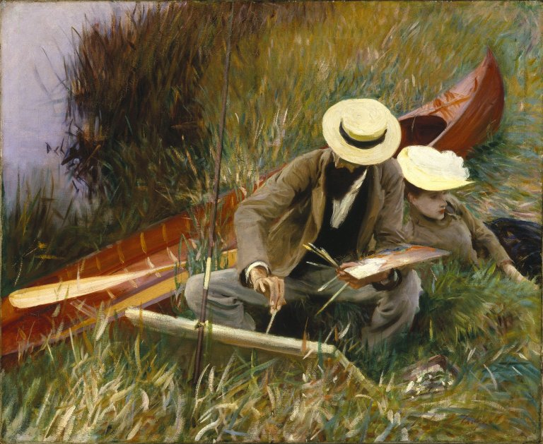
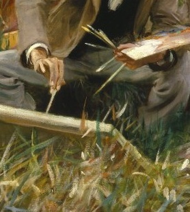
For the best visualization of the tools of art, I think we have to turn to a painting by John Singer Sargent. It is not in this show, it’s in the Brooklyn Museum, but an exhibition as deep as Prints and the Pursuit of Knowledge can lead us anywhere.

John Singer Sargent, AN OUT-OF-DOORS STUDY c. 1889. Oil on canvas. Brooklyn Museum. Photo: Wikimedia Commons.
In this painting of the artist Paul César Heleu and his wife Alice, Sargent paints the canoe, paddles, canvas, palette, brushes, as well as the clothing, hats, and skin of his two friends in a smooth, flowing, classical manner. But when he comes to the grasses, everything turns all spiky. Well, grasses are spiky, so at first we’re not surprised.

But then we look at Heleu’s fist-full of brushes, and the care with which he uses one of them, and we see the grasses in green, white, and rust encroaching on the canvas, and we realize that Sargent has built the grasses out of single brush strokes, which of course is how he has had to build everything. He has put into Heleu’s hands the artist’s material elements: canvas, pigment, brushes. But the working tool, the brush strokes, are his own, and he shows us how they turn into grasses before our eyes. His brush strokes are the poet’s words, the number theorist’s numbers.
The Difference between Art and Science

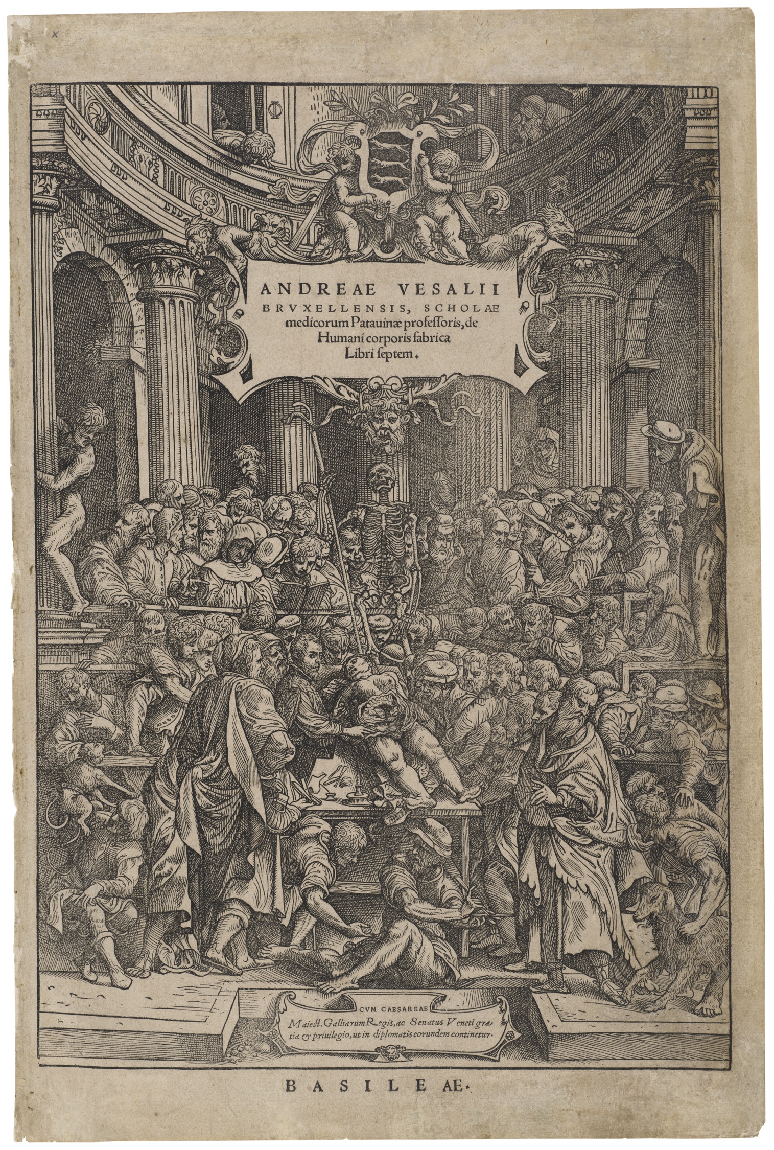
Andreas Vesalius, and unknown woodcutter. Title page from VESALIUS DE HUMANI CORPORIS FABRICA LIBRI SEPTEM (Seven books on the fabric of the human body). 1543. Woodcut and letterpress. Philadelphia Museum of Art. Photo: Philadelphia Museum of Art
This is the title page from an anatomy book by the scientist and artist Vesalius, showing an anatomy lesson where he is performing a dissection. Taking place in an amphitheater, it’s sort of a circus: a monkey is at the left hand margin; a dog in the lower right corner; a skeleton hangs above the cadaver; a naked man leans from an alcove, as though he were a statue come to life.
What is art and what is science? I used to be a scientist. Now I am a writer. This is an exhibition about the world of science and the way that 16th-century artists influenced that world. You would think that I would be able to think about this sanely, if not answer it. Perhaps we can reduce the question to something more manageable: if we look at any one of these prints and read the wall notes, can we tell if it is art or science?
If we are among those who hold that there are some wonderfully simple rules for art—rules like harmony, balance, proportion, symmetry, movement—then we would call most of the pieces in this exhibit “art.”
If, like Edmund Burke, we feel that beauty depends on some specific physiological response (e.g., its pleasure depends upon something like a relaxing effect on the fibers of the body), we might call a smaller number of them beautiful.
But, if—as in Kant’s Critique of Judgment—we insist that the purely aesthetic response to an object of art is essentially without rules and is focused on those aspects of the work that were conceived with no purpose, although deeply purposive, then our view of whether science or art is the primary terrain of these prints—star charts and beached whales, anatomy lessons and allegories—would lean further toward science than toward art.
Perhaps another way of looking at this would be to ask about the intention of the printmaker: Is the intention to inform and educate crowding out the intention to evoke emotions or aesthetic senses? Or does it go the other way?
Does any work showing a nude become a work of science if the musculature is shown with stunning accuracy?
Could one say that art leaves out everything it can, while science puts in everything it must? Not because it can all be parsed at once, but so it will be there when you need it; it is valuable to have as much information as possible in one place. Scientific prints can be amazingly dense, and many of the ones in this show are mind-boggling.

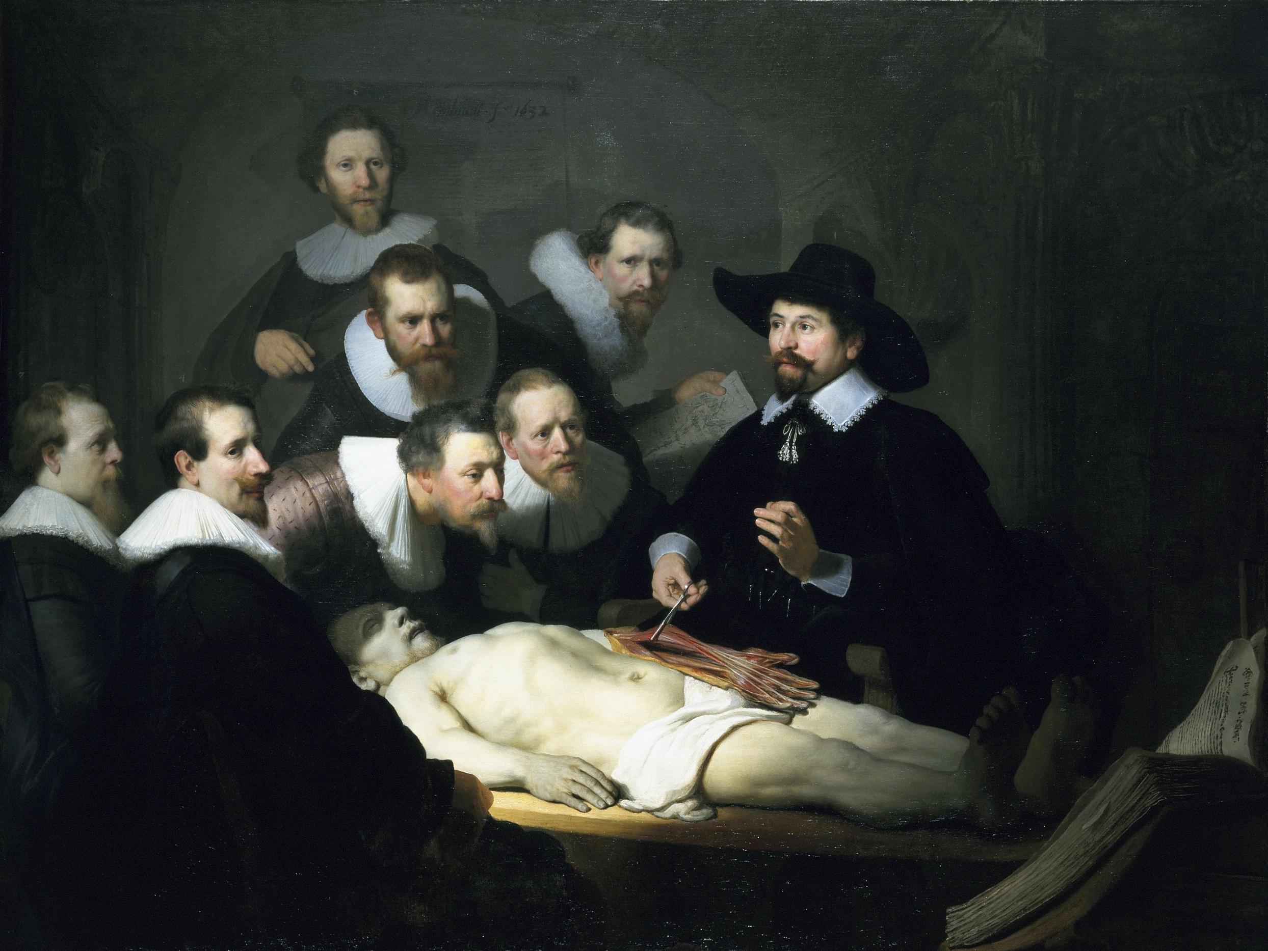
Rembrandt. THE ANATOMY LESSON OF DR. NICOLAES TULP. 1632. Oil on Canvas. Mauritshuis, The Hague. Photo: Wikimedia Commons.
Darting away from the Harvard Art Museums again for a moment, here is how Rembrandt looks at the anatomy lesson. He has left everything out except for the corpse, the doctor, and seven onlookers, one of whom seems to be gazing at us rather than the lesson. The effect is immense and immediate. Life, death, and learning. Is it the clearing away of excess information that intensifies our emotional and aesthetic response?

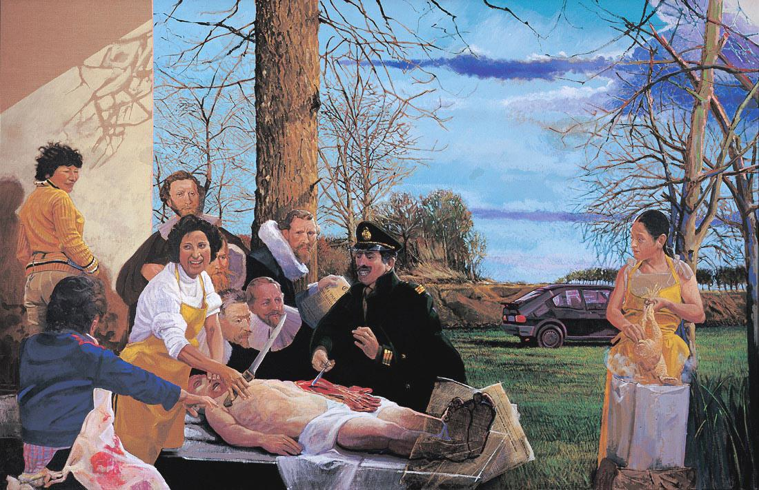
Herman Braun-Vega. THE . . . LESSON IN THE COUNTRY. 1984. Acrylic on canvas. Collection of the artist. Photo: Braun-Vega.
In this homage to Rembrandt, the Peruvian painter Herman-Braun Vega keeps five of Rembrandt’s onlookers. He has replaced Dr. Tulp with an officer of an undefined, Latin American country. Three local people pay no attention to what is going on with the army officer and the cadaver; a woman a few feet away acts as witness but does not stop plucking her chicken. The picture is influenced by photographs that were taken of Che Guevara right after he was killed, though the corpse itself is taken from Rembrandt. There are only two more figures in Braun-Vega’s version, 10 in all, but because of the social and political intentions of the artist, our response is no longer the breathtaking and sudden consciousness of mortality that we get from the Rembrandt painting but flies out in many directions and contains strands of guilt and puzzlement as well as reactions to the vibrant palette. By adding the intentionality of sociopolitical consciousness, has the artist diluted our aesthetic response?
I see that my question has turned into where does our intellectual response leave off and our aesthetic reaction begin? Or vice versa. It could be a case of “the farther off from England the nearer is to France,” and all these prints are inviting us to a Mock Turtle’s Quadrille of Art and Science.
Perhaps we could say that a great work of art interrogates us. The Title Page of Vesalius does not do this (for me), but Rembrandt’s Anatomy Lesson does. We might not have to change our life after seeing Dürer’s star charts, but we might after studying his Melencolia 1. When he is a scientist, he informs us; when he is a psychologist, he moves us; when he is a theologian—for I do think Renaissance artists often act as silent and vehement theologians—he can terrify us (For examples of this, see my book Hinges: Meditations on the Portals of the Imagination). And when he is an artist, he asks us to explain who we are.
Prints and the Pursuit of Knowledge has the strange beauty and density of a scientific diagram or star chart. You can’t examine it deeply all at once. It is best to take a certain reading, see what questions arise, and go off to your lair to think.
Click a thumbnail image in order to view the full-resolution image.
Tagged: Albrecht Dürer, Harvard-Art-Museums, Melencolia 1, Northern Renaissance artists
You raise some interesting, thoughtful questions in your review of what must be a marvelous exhibition to see in person.
The relationship of art and science is multi-faceted and fascinating. Last Thursday evening I attended a DASER (D.C. Art Science Evening Rendevous) talk at the National Academy of Science. Three artists, one of whom is working in UPenn’s Tonsor Laboratory, presented briefly. The implications for how one discipline influences the other and fosters creativity, innovation, discovery, and change of practice are exciting to explore.
I’ve been planning to see the exhibition, and your beautifully written and thought-provoking review has made me even more eager to see it (and to check out your books, as well). The curator (and we readers) couldn’t have asked for a more thoughtful and appropriate response to an exhibition connecting art and science. I look forward to reading more of your reviews.
Thank for giving some information on visual art and thanks for showing us marvelous exhibition on art
A wonderful, rich, and nuanced review of a marvelous exhibition. Many thanks.
Yes, what is it about all those tiny carefully placed precise marks that seems to be somehow part of the definition of love?
This is the best art review I have ever read. I now want to look look look and think feel wonder about pieces I have seen hundreds of times and understood only in the most superficial way.
Thanks for making the hi-rez images available.
There can’t be many reviews that draw out a fairly subtle but central difference between Burke and Kant and use it to illuminate the peculiar challenge of appreciating superdense Renaissance prints. This is one gem among many in this review, all of them as surprising as that dorsal horn.
On reflection it seems there is one question this fine show overlooks, namely, was any of the art meant to bring non-scientists closer to science? Wasn’t the work intended, rather, as an aide to science and scientists? Did it have an effect on those who were not in that community?
Grace Dane Mazur writes in a way that draws me into the prints and then i want to see more and sit in front of the prints, description. I’ve visited the prints of Bresdin at the MFA and find reality etched into, onto my mind. Thank you for a wonderful review of classical works that some might have forgotten, that some might forget could be done and is not done anymore. Fine art…