Visual Arts Review: Jim Dine Prints — A Vocabulary of Feelings
By Peter Walsh
Every subject in Jim Dine’s richly rendered work seems to edge toward something other than itself, deeper and more personal.
Jim Dine: “This Is Me” at the Yale University Art Gallery through June 8.
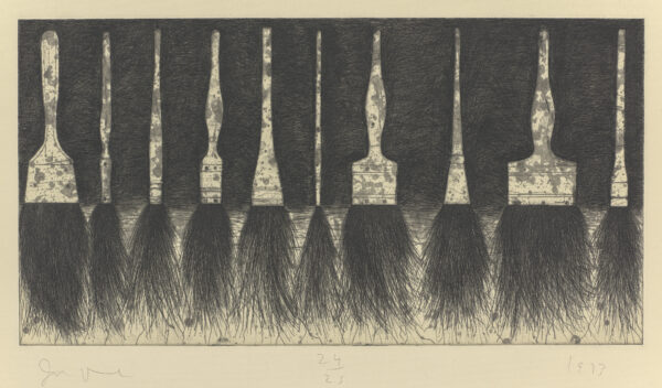
Jim Dine, Five Paintbrushes (sixth state), 1973. Etching, drypoint, and aquatint in black-green ink. Yale University Art Gallery, Richard Brown Baker, B.A. 1935, Collection. Photo: courtesy of the Yale University Art Gallery
One of the unfair things about being an artist is that you don’t necessarily get to choose the art movement you belong to. Some of the “isms” of art, such as Surrealism, are established by artists themselves, with written manifestos and official membership lists, like a political party. Others, including Pop Art, one of the most famous and successful art movements in history, are defined by art critics, academics, or the news media, who assign artists to them as they see fit. This system is hardly foolproof: lines blur, definitions equivocate, and artists, sometimes vociferously, object.
Two artists who have attempted to secede from Pop Art, without much success and despite what the association undoubtedly did to boost their careers, are Robert Indiana and Jim Dine. Both claim that the everyday objects in their works — signs and words in Indiana’s case, bathrobes, ordinary tools, heart shapes, shoes, and paint brushes in Dine’s — only superficially resemble the Brillo boxes, soup and beer cans, billboards, comic book panels, and advertising collages in the work of mainstream Pop Art. “Pop is concerned with exteriors,” Dine explains. “I’m concerned with interiors when I use objects, I see them as a vocabulary of feelings, I can spend a lot of time with objects, and they leave me as satisfied as a good meal. I don’t think Pop artists feel that way.”
Jim Dine: “This Is Me” makes the artist’s case succinctly. The show consists of works on paper — prints primarily (mostly intaglio) and also some watercolors and other drawings. It is the etchings that most vividly suggest the distance between Dine and a properly defined Pop Art movement. Their technique is classical, clearly handmade with great drafting skill, with a delight in the precise, sharp line of an acid-etched plate, the furry markings of drypoint, and the velvet blacks of aquatint. The quality of the drawing is deeply satisfying to behold.
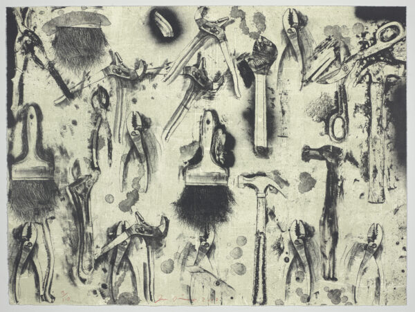
Jim Dine, Tools in the Earth, 2008. 2-color, 6 plate lithograph. Yale University Art Gallery, gift of the artist. Photo: courtesy of the Yale University Art Gallery
At least some of these prints, like The Five Hammer Etudes (2007), were produced in formal states, like a work by Rembrandt or Goya or other masters of intaglio. (As with Rembrandt’s etchings, Dine’s subsequent states can vary substantially from his first. The later states of the “Five Hammers” series contain considerably more than five hammers and concentrate on the elegant, slender negative spaces between the handles and the feathery bristles reaching below like roots.) It is no surprise to learn that Dine collaborated intensively with the Belgian master printmaker Aldo Crommelynck, from whom he probably learned the love of precision and experimentation with technique that the etchings show. The works on view are superb impressions: elegantly inked, wiped, and professionally pulled. This is worlds away from Warhol’s deliberately slapdash serigraphs or the slick Ben Day dots of a Lichtenstein.
Then there is the subject matter. The range of Dine’s subjects is notoriously narrow; here it is limited to portrait heads, paint brushes, crows, and an assortment of everyday household tools. But spend some time with them and you begin to see what Dine meant by “a vocabulary of feelings.” These ordinary objects — paintbrushes, wrenches, hammers, pliers, saws, hatchets, clamps, awls, scissors, wire cutters, the sorts of everyday tools Dine would have encountered at his grandfather’s hardware store — are faithfully and lovingly rendered yet strangely transformed. The objects are subtly animated with a kind of tool consciousness — bolts and handles become eyes, paintbrush bristles flow out like a beard, wrenches have heads with teeth. It brings Dine’s work closer to surrealism than to the deadpan of Pop, while he avoids the dreamscapes of Dali or Ernst: however intensely explored, his objects remain everyday fixtures of the everyday world. They are never static psychological symbols but deliberately evade specific meanings.
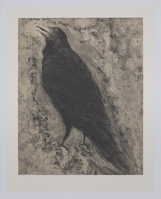
Jim Dine, Crow #2, 1994. Etching, spit-bite and sugar-lift aquatint, and power-tool abrasion with rose-gray Okawara chine collé. Yale University Art Gallery, gift of the artist. Photo: courtesy of the Yale University Art Gallery
It has been said that every Dine work is a self-portrait. Dine says he hit on the empty bathrobe, a signature image in his paintings though not in these prints, while searching for a way to make self-portraits without including his face. An illustration he saw of a bathrobe suggested his shape, and the garment, rendered in elegant lines, became his stand-in. Similarly, the tools rendered in these prints, especially the ones that suggest an artist’s studio, seem to be objects with which Dine has had a long working relationship, things he has come to see as extensions of himself. Anthropologists note that tools are extensions of the body, prosthetic claws and tentacles, that allow the bare hand to develop skills — pounding a nail, turning a screw, cutting a wire, painting a wall — it could never manage on its own.
Besides a series of printed and watercolor heads, some of which suggest the German Expressionist Emile Nolde, the only actually animated things in the show are the crows, inspiration for dream imagery prompted by an extensive exploration of Jungian psychology and its notion of the collective unconscious and universal archetypes. The crow is not quite a self-portrait, though. Its repeated presence in Dine’s work suggests a kind of spirit guide, though its symbolism remains undefined.
Here is another difference from Pop Art and its laconic, what-you-see-is-what-you-get portrayals of everyday, brand-name products. Every subject in Dine’s richly rendered work seems to edge toward something other than itself, deeper and more personal.
Peter Walsh has worked as a staff member or consultant to such museums as the Harvard Art Museums, the Museum of Fine Arts, Boston, the Davis Museum at Wellesley College, The Metropolitan Museum of Art, the National Gallery of Art, and the Boston Athenaeum. He has published in American and European newspapers, journals, and in scholarly anthologies and has lectured at MIT, in New York, Milan, London, Los Angeles and many other venues. In recent years, he began a career as an actor and has since worked on more than 100 projects, including theater, national television, and award-winning films. He is completing a novel set in the 1960s.