Visual Arts Commentary: Mid-Century Modern Furniture — Elegant Simplicity and Timeless Aesthetic Style
By Mark Favermann
The allure of clean lines, gentle curves, and organic shapes.
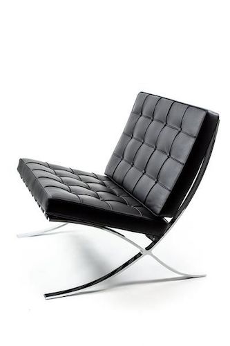
Barcelona Chair by Mies van der Rohe, manufactured by Knoll Furniture Company. Photo Courtesy of Knoll.
I grew up in the mid 20th century in a house with no distinctive design aesthetic. My father, a stoic WWII veteran, and my mother were first- and second-generation Americans who were employed as government bureaucrats. Children and grandchildren of Eastern European immigrants, they saw furniture as functional — it was meant to be comfortable but not stylish. My solidly middle-class parents brought a meat-and-potatoes approach to their furnishings, which were supposed to be heavy, ornate, and dark brown. Given my family background, my own sense of design — and admiration for contemporary style and beauty — has been a matter of lifelong education, of acquiring an evolved refinement of taste.
Though it didn’t personally affect my unimaginative family or me, an alternative style in architecture and furniture was being promulgated when I was a youth. It was called Mid-Century Modern, a style of design that originated roughly in the late ’20s. It was about clean lines, organic, smoothly geometric forms, and a lack of embellishment. When I rarely encountered it, at either a neighbor’s or more affluent distant relative’s home, I remember being a bit surprised by the look. Sometimes I was delighted by its sculptural quality, but more often than not I was confused by its somewhat unfamiliar characteristics — natural woods, organic and simple geometric shapes, etc. After a while, I began to appreciate these furnishings: the “shock of the new” stimulated an appetite for the more imaginative and aesthetically appealing. At that time what is now called Mid-Century Modern evoked, to me, an uncomplicated freshness that underscored a sense of the contemporary.
Mid-Century Modern is a subset of modern design, the latter standing in contrast because of its preference for a more understated, utilitarian, and even industrial look. In the US, the Mid-Century Modern movement was a direct reflection of the International and Bauhaus movements. That style is exemplified by iconic works by the usual modernist suspects as well as several prominent outliers, including Walter Gropius, Marcel Breuer, Charles and Ray Eames, Florence Knoll, Alva Alto, Le Corbusier, Charlotte Perriand, Isamu Noguchi, Harry Bertoia, George Nelson and, of course, Mies van der Rohe. Their striking furniture designs are currently among the most cherished and collectible in the world.
The term “Mid-Century Modern” was coined in 1984 by author Cara Greenberg. She used it to describe the signature designs, now considered paradigmatic, of the ’50s in her book Mid-Century Modern: Furniture of the 1950s. The most attractive elements proffered by Mid-Century Modern design include clean, simple, geometric or organic forms, a sculptured minimalist quality, furnishings that emphasize function over ornament, frequent use of woods like teak, rosewood, and oak, thoughtful use of metal, glass, and leather, and occasional bold accent colors.
There were strong Mid-Century Modern proponents on America’s east and west coasts, but the middle of the country was a hotbed of creativity, specifically Cranbrook Academy in Bloomfield Hills, Michigan.
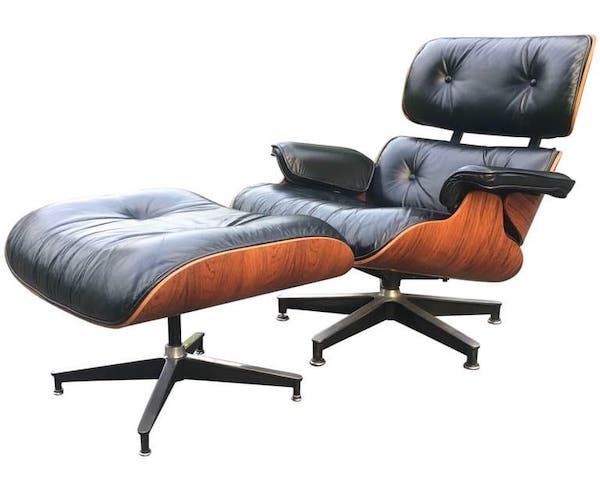
Eames Lounge Chair and Ottoman, by Charles and Ray Eames, Manufactured by Herman Miller. Photo courtesy of Herman Miller.
Founded by publishing magnates and philanthropists George Gough Booth and his wife Ellen Scripps Booth, Cranbrook Academy was modeled after the American Academy of Art in Rome. It was originally founded as an experimental artists colony: over the years the school produced exceptional graduates in numbers that belie its modest size. Teachers and students included Eliel Saarinen, Eero Saarinen, Charles and Ray Eames, Harry Bertoia, and Florence Knoll, founder of the high design Knoll Furniture Company.
Among the most important alumni were the married team of Charles and Ray Eames, who are considered today to be the titans of Mid-Century Modern design. They only recognized not only for their innovative furniture, but for their indispensable contributions to architecture and industrial and graphic design, along with film. Affordable design was a way of life for the pair, whose goal was to improve the quality of life for the masses. While at Cranbrook, Charles worked with his friend architect Eero Saarinen (designer of the St. Louis Arch) to develop a chair made from a new and revolutionary material: plywood. This approach became the apotheosis of mid-century modernism.
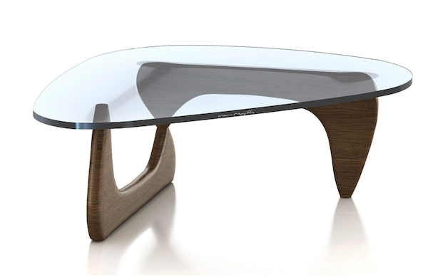
Coffee Table by Isamu Noguchi, manufactured by Herman Miller. Photo: Herman Miller
Since the ’60s, no other serious furniture design style has gained such popular traction. The Italy-based Memphis Style developed a colorful but edgy, often prickly, look that has garnered limited appeal. Postmodern design came off as mostly stage set–like cute. Its biggest non-furniture contribution is architect Michael Graves’s Alessi-manufactured 1985 Bird Whistle Teakettle, which has sold millions. Also, architect and designer Frank Gehry created his Experimental Edges furniture out of corrugated and laminated cardboard. Their appeal has been narrow as well.

LCW Chair by Charles and Ray Eames, Mural at Design Within Reach in Cambridge, MA. Photo: Mark Favermann
Online auctions and specialty antique stores sell original Mid-Century Modern furniture. As for the average consumer, a number of major furniture retailers carry the style, such as Design Within Reach with its expensive signature brands influenced by Knoll and Herman Miller. There’s also West Elm, Pottery Barn, and Crate & Barrel, with their often very good knockoffs and variations. Finally, there is Wayfair, a big box store/cost-effective furniture website.
And of course, there is IKEA, the 80-year-old Swedish furniture store chain that is almost a category unto itself. The original mass-produced flat-pack furniture brand has grown from a small Swedish company into a major global retailer. In fact, since 2008, IKEA has become the largest furniture retailer in the world. Does anyone know an individual who doesn’t have a piece from the store in their home?
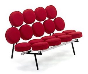
Marshmallow Sofa by George Nelson, manufactured by Herman Miller Furniture Company. Photo courtesy of Herman Miller, Inc.
A related design style, Scandinavian design, is characterized by a minimal approach that also attempts to combine functionality with beauty. Its focus is devoid of clutter, emphasizing simple lines and transparent spaces. IKEA has redefined and reintroduced its version of this popular design on a colossal scale. The downside: you generally need a degree in either mechanical or structural engineering to “easily” put IKEA pieces together. In addition, paying the store to put together its furniture seems to defeat the company’s claims to offer “low-cost” and uncomplicated products.
When my father passed away over 30 years ago, there were no pieces of furniture that I wanted from his home. Significantly, when my girlfriend’s mother passed away several years ago, she and her siblings thought that the family’s legacy collection of 19th-century ornate furniture would have the most value. Ironically, the antique dealers were only interested in her parent’s less familiarly cherished original Mid-Century Modern pieces. They sold at auction for substantial prices. The more traditional family heirlooms did not. Today, my home has only Mid-Century Modern furniture.
Mark Favermann is an urban designer specializing in strategic placemaking, civic branding, streetscapes, and public art. An award-winning public artist, he creates functional public art as civic design. The designer of the renovated Coolidge Corner Theatre, he is design consultant to the Massachusetts Downtown Initiative Program and, since 2002 has been a design consultant to the Boston Red Sox. Writing about urbanism, architecture, design and fine arts, Mark is contributing editor of the Arts Fuse.

Mark,
Just for the record, I don’t have any pieces or items from IKEA in my house.
Many years ago, my partner Robert put together an IKEA kitchen for a client, who wanted a quick and inexpensive kitchen. Robert and his friend Ned spent hours putting this kitchen together. It’s not particularly well designed nor designed to last…nor cheap, after the Ned and Robert hours of assembly.
And, one does need to be a structural engineer to figure out the assembly and installation.
As a person who frequents second hand stores, IKEA is well represented in second hand and Habitat for Humanity stores. IKEA designs get old and since it’s not well built, it ends up in second hand shops.
Regrettably, I haven’t found an Eames chair or Mid-Century Modernist piece of furniture in those settings. If I did, I’d buy it for you!
My home contents consist of: lounge chairs, where the frames were salvaged from the Georgetown, MA. transfer station and taken to an upholsterer and reupholstered in leather (I still can image Humphrey Bogart sitting in one and puffing on a cigar!); captain’s and pigeon hole Windsor chairs salvaged from the BPL (We have a good story with these chairs), family furniture, which was made by furniture-making uncles and great uncles from New Bedford, Newburyport furniture acquired at auctions and, my most recent acquisition, an accountant’s or doctor’s desk salvaged from the South Berwick, Maine dump.
This latter piece has some very interesting details and has been the subject of some investigation over the last year. The front legs of the desk are vertically cut and are made to look like the Portland Head lighthouse in its 1810 design. The piece was set aside at the South Berwick transfer station (aka “dump”) since the staff did not want the front end loader to squash it. While the Town’s policy was not to allow residents to “pick the dump”, no one had the heart to destroy it. Thankfully, they had an eye for keeping the piece, which has links to Portsmouth and South Berwick early furniture making and to Sarah Orne Jewett, South Berwick’s famed and local writer and poetess.
No IKEA for me but will continue to hunt for MCM furniture for you. You just never know what you’ll find out there!
By the way, a very good article !