Visual Arts Commentary: A Trio of Local Arts Colleges Complete Major Structures
Three Boston-based arts colleges have completed major structures. Each has taken a different aesthetic path to assert its very own institutional signature.
By Mark Favermann
Sometimes a building is more than just a functional structure. And often it needs to be. A building can serve as a physical statement about the purpose and meaning of its owners, be a 3-D symbol of an institution, and, in the best of circumstances, even succeed as a distinctive iconic form.
Today, institutions like museums and universities see their buildings as a vital expression of their brands. Historically, these entities have often chosen great or well-known architects to create their memorable edifices. In the last few decades or so, it has become very fashionable for cultural and academic institutions to pick “starchitects” to design or expand their new or existing structures. The institutional hope is that they will be distinctive pieces of civic or campus design. These, in turn, would be magnets for students, faculty, and donors.
There are several examples of “starchitect” structures in the Boston area, among them buildings at MIT by Frank Gehry, Charles Correa, Steven Holl, and Fumihiko Maki. This approach also can be seen at major museums, such as the Museum of Fine Arts (Lord Norman Foster), the Gardner Museum, and the yet to open Fogg Museum (Renzo Piano) at Harvard University.
Besides aesthetics and efficient functional and accessible design, green design is now a given for all newly built projects. Sustainability and fuel efficiency are now part of every structure’s program as well. Universal design is also a component of contemporary architecture in order to ensure that a space or a structure can be used and hopefully enjoyed by everyone.
Recently, three quite different Boston-based arts colleges have completed major structures. Each has taken a different aesthetic path to assert its very own institutional signature. These urban campus buildings have been commissioned and developed by the Massachusetts College of Art and Design, Berklee College of Music, and Emerson College.
Each architect has attempted to create a signature building, a goal that has been accomplished to varying degrees of success. The first two are located in Boston and the third is in Los Angeles. One is primarily a dormitory with visual art studios, another is a mixed-use dorm (made up of classrooms, offices, music production studio spaces, and retail space), and the third integrates residential, administrative, and academic facilities under one roof.
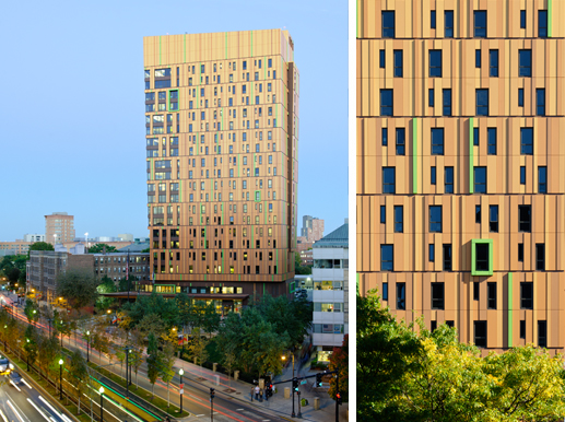
Tree House Residence Hall is the recently opened (2013) student residence tower, designed by ADD Inc. of Boston for the Massachusetts College of Art and Design. ADD Inc. is well known for its commercial towers. The 20-story tower was purposed to respond to the living/learning requirements of nearly 500 incoming art school freshmen. The façade of the structure was inspired by Gustav Klimt’s Tree of Life. The pattern of the famous painting is mirrored via the geometric imagery of the exterior of the building, an organic mosaic of over 5,000 composite aluminum panels of varying depths and hues.
Visually, Tree House Residence Hall is one of the most innovative new high-rises in Boston. The tower has already become a notable landmark along the growing spine of institutions, dormitories, and classroom buildings that roll down Boston’s Huntington Avenue.
This high-rise includes 493 beds for freshmen and sophomores in 136 suites in one-, two-, or three-bedroom layouts. The building comprises a ground-floor café and living room, a second-floor health center, and a “Pajama Floor” on the third level with communal kitchen, game room, laundry facilities, and a fitness center. Specially designed for emerging visual artists and young designers, studio spaces alternate with lounges on the 17 upper floors.
The exterior is in dark browns at the base in order to look like tree bark. On the upper floors, the color grows progressively lighter to make the building appear taller and lighter by the time you reach the skyline. Green window panels punctuate the façade, suggesting (in theory) the leaves of a tree.
Not surprisingly for a visual arts college, the building’s interior spaces are enhanced with original art, ranging from commissioned alumni pieces in the lobby to a rotating temporary gallery on the third floor.
While the budget did not allow for expensive finishes, ADD Inc. of Boston found creative ways to make use of modest materials: carpet and paint create bold visual color statements throughout the interior spaces.
During the engineering process, decisions were made with solar applications in mind. Windows on the tower’s north side provide light favorable to the work of resident art students, while the smaller number of windows on the south side of the building were engineered to reduce heat. The windows are operated by an electronic system that informs students of the optimum times to open or close them.
Expectedly, this is a green building that received a Silver LEED certification from the U.S. Green Building Council. Its energy usage is 22 percent more efficient than code mandates. Other green features include double-insulated metal panels, recycled construction and decor materials, and low-flow plumbing fixtures that reduce the amount of potable water usage by 33 percent.
Along with the building’s strengths there are some weaknesses. The art history conceit of Klimt’s painting on the Tree House Residence Hall façade treatment is a nice story, but it needs to be explained before it can be appreciated. Still, the building is one of the most visually striking in the Boston region.
Also, though the building has a strong, rather magnificent presence from a distance, at street level it does not provide a particularly distinctive visual experience. Connecting tall buildings to streets poses a challenge for creative architecture. The current front entrance is too institutional, too corporate. It comes off as more of an entrance to a fancy hospital or business headquarters, not the gateway to an art college’s major dorms. Less would have been more here.
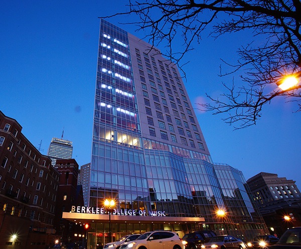
Designed by William Rawn Associates of Boston, 160 Massachusetts Avenue is Berklee College of Music’s first ground-up, custom-built facility. Previously, the college has appropriated or expanded a number of existing buildings in Boston’s Back Bay along Boylston Street and Massachusetts Avenue. This 16-story facility includes 173 residence hall rooms for 369 students, 23 practice rooms, six two-story common areas, a fitness center, and a 400-seat dining hall that doubles as a performance space. Also, there is a 10-studio music production complex that is one of the largest in the U.S. Without need of windows, these spaces are located in two floors below grade. The building also received a LEED Silver Certification.
William Rawn Associates is responsible for other projects, including the Cambridge Public Library, new buildings at Northeastern University, Boston Symphony Orchestra’s Ozawa Hall at Tanglewood and the theaters at Williams College, which are used each summer by the Williamstown Theatre Festival.
The 155,000-square-foot building increases Berklee’s total space by 23 percent. Included are six double-height lounges on residence hall floors, each of which serves two residence hall floors; a spacious cafeteria eating area that doubles as a 400-seat dining hall and evening performance venue; 20 student practice rooms and three rehearsal rooms for resident-student use; the ubiquitous student fitness facility; wonderful views from a roof terrace on the fourth floor; 14,000 square feet of impressive state-of-the-art music technology space; and 4,200 square feet of ground-floor retail space. The Walters-Storyk Design Group (Highland, New York) was in charge of the design of the cutting-edge music technology facilities.
A regional architectural star, William Rawn has set its asymmetrical tower design on an awkward site. Though the firm’s earlier projects have received an enormous amount of praise, parts of this project are plainly superior to the entire complex.
It is as if the budget ran out when it came to the rather nondescript dormitory space’s exterior. Given their glass curtain walls, the first four floors make a strong visual statement, and the first floor retail spaces connect well to Mass Avenue’s busy shopping area. But the building has one good side and, if not a completely bad one, a considerably weaker side.
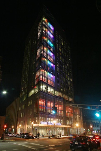
The problem is easily seen driving or walking up Mass Avenue from Boylston Street. The detailed windows that make up the tower portion of 160 are elegant and beautifully articulated on the Belvidere Street side. However, the plain grey tower, viewed coming from Huntington Avenue at St. Germaine Street, is uninspired and rather dull. That said, the whole building looks better lit up at night.
As part of the opening festivities on February 26, light sculptor John Powell (who has lit buildings, monuments, and bridges internationally, including Boston’s Northern Avenue Bridge) worked with a Berklee technology class to create a moving, color-changing light show on the 16 floors of the Belvedere Street fenestrated tower. Too bad this wonderfully animated light sculpture is not a permanent nightly visual event; it would be a spectacular addition to the Boston urban texture.
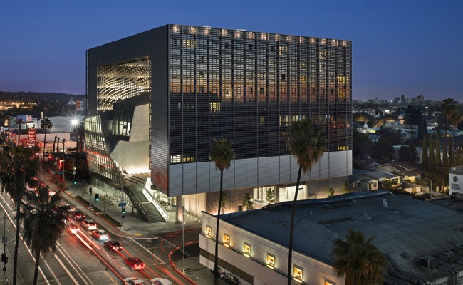
The most dramatic of the three new buildings is Emerson College Los Angeles (ELA), designed by Thom Mayne of Morphosis. Mayne is a “starchitect,” winner of the 2005 Pritzker Prize, architecture’s version of the Nobel Prize. ELA opened on March 8, 2014. With its many prominent left-coast alumni living in and around LA, Emerson College has maintained a strong internship program in Los Angeles for the past 20 years.
Concentrating the many activities of a college campus into one urban site, this futuristic structure integrates residential, administrative, and academic facilities while it establishes Emerson as a striking part of the LA skyline and a presence in the heart of the West Coast entertainment industry.
It is a 10-story square frame structure that encloses a central open space that creates a flexible “outdoor room.” An elegant sculpted form weaves through the interior — it houses classrooms and administrative offices. Multilevel terraces are arranged to be locations for informal social activity. Exterior corridors connected to student suites and common rooms are shaded by a wavy, textured metal scrim spanning the full height of the two towers’ interiors.
In its design, Morphosis looked to the precedent set by the Hollywood film studios. Outwardly, the studios were rather mundane facades that housed flexible interior spaces for the generation of celluloid fantasies. The architects have turned this notion inside out, with rigging for screens, media connections, sound, and lighting incorporated into the framework.
Creatively transforming the undulating scrim into a dynamic visual backdrop, the upper platform serves as a flexible armature for outdoor performances. The entire building is a stage set for student film screenings and industry events. The Hollywood sign, the City of Los Angeles skyline, and the Pacific Ocean in the distance afford spectacular scenery.
ELA is LEED Gold certified. In part, this was granted because the residential towers proffer an exterior “skin” that actively responds to local weather conditions. The automated sunshade system opens and closes horizontal fins outside the building’s high-performance glass curtain-wall to minimize heat gain while maximizing daylight and views.
Further green initiatives include the use of recycled and renewable building materials, installation of efficient fixtures to reduce water use (by 40 percent), energy savings in heating and cooling through a passive valence system, and a building management infrastructure to monitor and optimize systems efficiency.
Morphosis’ ELA is an LA kind of structure. It probably could not have been built in our more traditional, and quite stuffy, Boston. Emerson College should be congratulated on its innovative vision and creative openness.
Besides serving as institutional branding statements, the real test for the trio of buildings will be to see how each structure works day-to-day, generating suitably pragmatic and creative spaces for its students, faculty, and visitors.
An urban designer, Mark Favermann has been deeply involved in branding, enhancing, and making more accessible parts of cities, sports venues, and key institutions. Also an award-winning public artist, he creates functional public art as civic design. Mark created the Looks of the 1996 Centennial Olympic Games in Atlanta, the 1999 Ryder Cup Matches in Brookline, MA, and the 2000 NCAA Final Four in Indianapolis. The designer of the renovated Coolidge Corner Theatre, he has been a design consultant to the Red Sox since 2002.
Tagged: 160 Mass Avenue, ADD Inc of Boston, Berklee College of Music, Emerson College Los Angeles. ELA, Mark Favermann, Massachusetts College of Art and Design, Morphosis, Tree House Residence Hall


