Design Review: The Look of the 2026 Milano Cortina Winter Olympic Games
By Mark Favermann
The “Look” of the 2026 Games succeeds at what should be its elemental function — the connection of beauty, athleticism, celebration, and memory.
2026 Winter Olympics Logo. Photo: 2026 Milano Cortina Winter Olympics Organizing Committee
The 2026 Winter Olympic Games are the most geographically spread-out Winter Olympics ever, covering a vast area of Northern Italy. The stunning Dolomite Mountains and other Northern Italian Alps make for a naturally beautiful background for the Milano Cortina Winter Olympics 2026. Given those surroundings, the “Look of the Games,” its visual identity and branding, could have chosen to serve as graphic punctuation or poetic visual narrative. What we have is a lyrical design that is only partially impressive graphically. The “Look” works overall, serving as an energetic framing device for Olympic sport.
The goal of the “Look” for any Olympics is to express the spirit of the event while also communicating the distinctive culture of the host city, or, in this case, cities and expansive surrounding region. Branding’s challenge is to serve as the visual glue — functional and celebratory — for the various Olympic components. More than just a design concept, the “Look of the Games” serves as the individual visual signature for each event in the Olympics and Paralympics. Thus the pictograms must meet a fundamental demand: that they can be easily fit alongside the ubiquitous five rings, which are placed everywhere — venue interiors and exteriors, pictograms, banners, etc. The inevitable questions arise: Does the “look” work pragmatically? Is it visually distinctive? Is it visually connective? Will anyone remember it?
Layered into the concept of a specific Olympic Look is the usual talk about Olympic platitudes of harmony, diversity, athleticism, inclusiveness, and humanism. There is often an inverse relationship between the quality of the graphics and the length of the verbal and philosophical descriptions they require. In the case of Milano Cortina, there was an express effort to tap into the beauty of the Italian spirit, which is envisioned as vibrant, contemporary, dynamic, and youthful. But it takes a lot of wordy explanation.

Short Track Speed Skating. Photo: 2026 Milano Cortina Winter Olympics Organizing Committee
The visual identity for Milano Cortina 2026 attempts to communicate an innovative design language that celebrates the creativity, beauty, and spirit of Italy, highlighting the distinctive and dynamic charm of its mountainous region, vibrant cities, and sports venues. It invites locals, visitors, and viewers from around the world to experience “Italian Spirit” while underscoring the enduring legacy of the Winter Olympic Games.
The 2026 Winter Olympics design theme attempts to incorporate the notion of Armonia (Harmony), celebrating Italian style, art, and nature. The design team focused on the “look” of human gestures and movement, seeking a way to strategically merge innovation with tradition. Its key visual elements include the Vibe, a design series using linear, curved, and dotted line systems that represent speed, human energy, and Italian artistry. There’s also a standardized color palette inspired by Italian landscapes and culture that embraces fiery reds, glacial whites, and deep blues, along with key motifs that draw on the Futura typeface, connecting the shapes of venues, mountains, and cities across the region.
Created by the mega design firm Landor/WPP, the 2026 Milano Cortina Olympic logo, or what the design team calls its “emblem,” strongly evokes the concept of “gesture,” a very Italian expression of emotion and physical movement. Above the traditional Olympic rings and the words “Milano Cortina 2026” sits the number 26, as if it was lightly traced by a finger in the snow. We are told that this represents a single, spontaneous gesture, suggesting the idea that the smallest gesture can somehow change the world. A minute movement can lead to great and sometimes unexpected victories in sport and life.
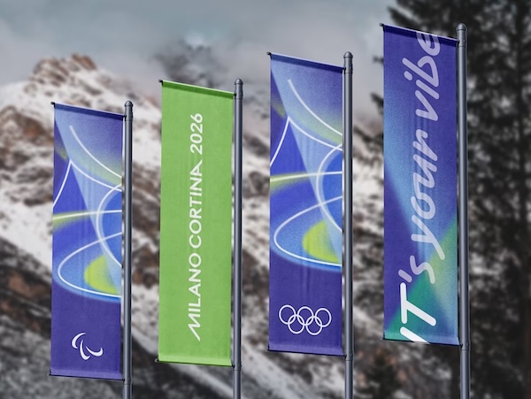
2026 Olympic Banners. Photo: 2026 Milano Cortina Winter Olympics Organizing Committee
This notion of pictograms as a human gesture, a nod to the physical expression of talent, is a triumphant idea for the 2026 Winter Games. Physical gestures are a distinctive element in Italian culture, a means of communication that has strong roots in the country’s DNA and the Italian identity. The style of the pictograms is an exercise in “gesture drawing,” an approach whose primary purpose is to emulate the human figure in motion via the most efficient use of line. These pictograms elegantly speak to the action, form, and vigorous pose of the athletes. Bravo to the 2026 pictograms!
Less visually winning, however, are the 12 “Vibe” graphics, colorful atmospheric expressions that are placed at venues and along streetscapes. They are abstract representations, supposedly visual translations of energy, creativity, imagination, passion, inspiration, glory, style, and beauty. These images are too conventional — they are not individually distinctive. Use of color and line here leans on set design or secondary prop additions — not strong enough to stand in foreground or background venues. They are examples of more being less.
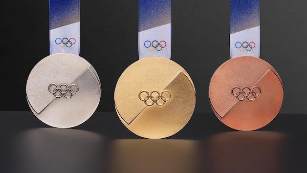
2026 Olympic Medals. Photo: 2026 Milano Cortina Winter Olympics Organizing Committee
Drawing on essential lines to express the ideas of union and movement, the 2026 Winter Olympic medals use dynamic graphic abstraction to show the two elements unified in constant motion. This design highlights the contrast between a granular texture and a mirrored surface. The medals’ concept is to represent ongoing change — and it works.
The 2026 Winter Olympic and Paralympic torches are named Essential and were designed by Italian architect and engineer Carlo Ratti. Concerned with sustainability, featuring a minimalist aesthetic, they have been made from recycled materials. The Olympic torch is blue-green, while the Paralympic version features bronze tones.
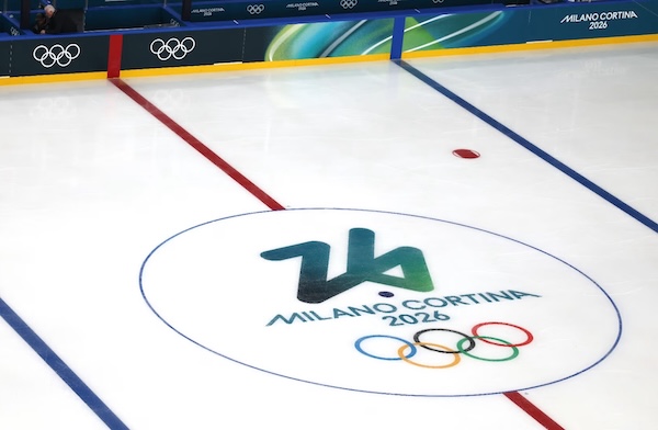
Milano Cortina Ice Hockey Rink. Photo: 2026 Milano Cortina Winter Olympics Organizing Committee
Cartoon mascots, as a way to market to children and generate additional revenue, have been a debated aspect of every Olympics. Two cheerful stoats (aka ermines) are the official mascots of the 2026 Winter Games. One is dark brown and the other is lighter hued: named Tina and Milo, the creatures embody the Italian spirit of the Olympics. They are naturally curious, love sports and the outdoor life, and want to have fun. Milo has only one paw, representing the Paralympic participants. The names of the mascots were inspired by the host cities. In addition, six mischievous snowdrops/flowers (The Flo) always accompany Tina and Milo. These elements symbolize rebirth.
Criticism of the 2026 Games has touched on unfinished venues and the great distances between venues, which pose problems for winter transportation. There were similar complaints about past Winter Olympics. In terms of specific design critique for these Games, the charge has been leveled that there is a lack of visual cohesion. The sniping begins with the logo or emblem, the “Futura” emblem—a stylized white “26” trace. For some, it fails to align visually with the primary Milano Cortina typeface or the Olympic rings. Thus there are accusations that the overall branding feels too cluttered, that it is simply a collection of disparate ideas. Also, typography and font choice may impact legibility across different media.
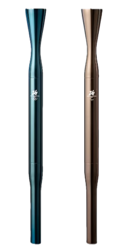
2026 Olympic Torches. Photo: 2026 Milano Cortina Winter Olympics Organizing Committee
Because of its geographically dispersed venues, there are those who argue that the lack of a single “emotional center” undercuts a unified visual identity — the “Look” must compete with vastly different regional landscapes. Also, on a human level, while the “Look” was made to reflect on sustainability, the Games dependence on existing infrastructure means that the industrial or corporate vibe of some venues may clash with the vibrant, 2026 Games human-centric marketing campaign. This attack may be a bit harsh, however. What are the alternatives? Additional costs?
Several Winter Games ago, my sister insightfully described the athletic efforts of the Winter Games participants as doing things elegantly and sometimes astonishingly that most people would never try. Since the late ’60s, the Olympic “Look of the Games” has become not only a visual and thematic framing device for sport and the athletes themselves, but has served as a form of graphic remembrance, an evocation of shared celebration. Imperfect as a few aspects of the 2026 Winter Games “Look” may be, they do not undercut the spirit of an exuberant and passionate Italy. The design of the Games still succeeds at what should be its elemental function — the connection of beauty, athleticism, celebration, and memory.
Mark Favermann’s firm, Favermann Design, was one of five design consultancies chosen from 481 to design the 1996 Centennial Olympic Games in Atlanta. He is an urban designer specializing in strategic placemaking, civic branding, streetscapes, and retail settings. In 2024, he was awarded the Journalism and Communications Award by the American Planning Association/Massachusetts for his decades of writing on the built environment. In 2025, the Mass Cultural Council awarded him a Creative Individual Award for Sculpture.
Thank you for the explanation!
A (highly)stylised figure 26???!!!
Too stylised for it to be recognisable to me
as a figure ’26’
THANK YOU for enlightening me
Ich habe die “26”als zb im Symbol gelesen und habe mich gefragt, was zb bedeuten soll?
Durch KI habe ich nun erfahren, dass es 26 heißen soll!
I saw the “26” in the symbol and wondered what it meant. Thanks to AI, I now know that it means 26! (English Translation)
Rosemarie Cäsar