Visual Arts Commentary: Street Furniture — The Dilemma of Making Urban Spaces Comfortable and Unique
By Mark Favermann
The City of Boston needs to think seriously about maintaining its distinctive charm, and street furniture is a very powerful tool to that end, when strategically applied.

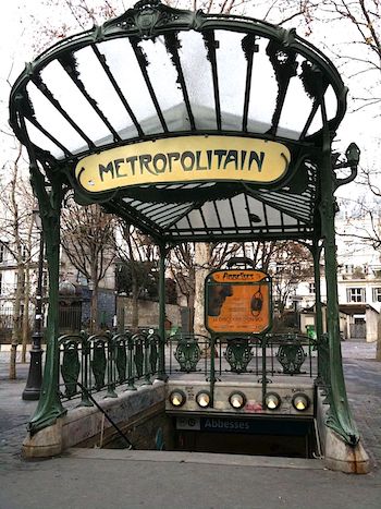
Art Nouveau Porte Dauphine Metro Subway Entrance, Paris, France, designed by Hector Guimard, c. 1905. Source: Paris Adele.
Hopefully sooner rather than later, when we once again can walk around the City of Paris, we will once more be able to appreciate the unique entrances to their subway system. Designed from 1901 to 1914 by architect Hector Guimard, these ornate covered structures and sign brackets were inspired by a highly stylized Art Nouveau motif. The result is over 80 Metró entrances — organic ornamentation in stunning sculptured bronze, brass, and glass — spread across the entire city. They project a distinctive sense of place and comfort. These entries are among the most beautiful elements of street furniture ever created. They brand Paris.
Street Furniture is a collective term for functional objects and equipment elements that are installed along streets and roads for various purposes. Like Metró entrances, the best street furniture takes into account aesthetics, visual identity, function, pedestrian accessibility, and road safety. Design and placement inevitably follow form and function. What can be considered street furniture? The list is expansive and will be defined in different ways by various municipalities.
A street furniture list could include gateways, benches, bollards, kiosks, street signs, litter bins, traffic barriers, streetlights, bus shelters, fountains, public lavatories, bicycle racks, tree guards, tree grates, public clocks, memorials and historical markers, fences and railings, sidewalk pavers, transit entrances, crosswalks, utility boxes, planters, and even traffic and directional signs. Public art can also be considered part of street furniture, which can often be taken for granted, especially when they can be chosen, bought, and placed with little imaginative thought by civic administrators.
Crucial elements in the framework for organizing, differentiating, and focusing on a city or town’s distinctive identity, street furniture is an essential tool for community branding, which is about asserting the unique character and personality of a particular location, transforming it from a place to a destination.
In the best of circumstances, street furniture should be used to enhance the quality of life of residents and visitors. The ideal is to add comfort and enjoyment to public spaces. It would be great if designers, planners, and administrators would set goals for creating and maintaining spaces that make us smile and relax, and are accessible to everybody. The public mandate should be to create a sense of place that leads to long-term benefits for businesses and residents.
Creative approaches by artists, architects, and designers should be encouraged by the powers-that-be in cities and towns. Several Massachusetts communities have realized this, such as Cambridge, Somerville, Wakefield, Chelmsford, and Natick. Examples of a refusal to be creative in public spaces: a number of attempted projects either in or for the City of Boston.
The unfortunately long-running, creativity-adverse administration of Mayor Thomas Menino installed sets of homogeneous, cookie-cutter neighborhood identifiers –it was the one size/one color fits all approach. There is absolutely no difference between the signifier for Fields Corner and Back Bay — except for the name written on the sign. A major opportunity to give distinct character to more than 30 neighborhoods, lost.

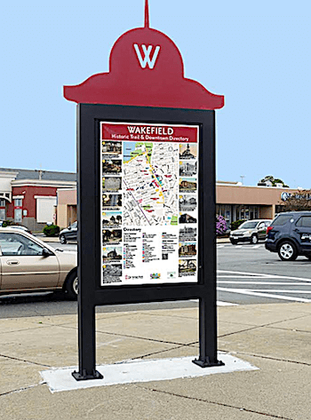
Branded Informational Kiosk in Wakefield, MA. Photo: Jessie Wyman.
An imaginative outdoor seating program for Boston Public Library branches was also nixed during the Menino period. The project was to have Boston-area artists create a series of outside benches for reading and conversation. The BPL hierarchy liked the idea, but this project was considered too innovative by the Menino administration, which feared public art. Perhaps some Philistine voters would have been offended by them?
Several years ago the Longwood Medical Area planning council, which is made up of 43 institutions, museums, hospitals, and schools (Children’s Hospital, Harvard Medical School, The Gardner Museum, etc.) rejected DNA outdoor furniture — benches, bike racks, drinking fountains — that had been suggested to enhance boring, monolithic Life Science towers. The mostly medically trained and academic types felt that custom designed elements would be too costly and untested. They were unaware that even designs from catalogues took the same time to fabricate and install. In other words, if Johnson & Johnson, Merck, or Pfizer didn’t make it, they didn’t want it.
To celebrate the 100th Anniversary of Fenway Park in 2012, a plan for specially designed temporary crosswalks was submitted to the then Boston Redevelopment Authority (now Department of Planning and Development). The colorful designs were approved by the BRA staff, but the project needed to be signed-off on by Boston’s Department of Public Works. Usually this is perfunctory, but the DPW turned down the request, arguing that the BRA was not a real City agency and couldn’t institute crosswalk changes. The folks who are in charge of potholes, street cleaning, and streetlight repair saw themselves as authorities for making aesthetic decisions.
After the MBTA contracted with the worldwide company of JC Decaux for a percentage of the advertising garnered by free but boring bus shelters set throughout the region, the Menino administration saw these free (but money-making) structures as a no-brainer — they were put everywhere. Currently, Mayor Marty Walsh’s regime brags about its 430 characterless JC Decaux street furniture pieces — kiosks, public urinals, etc. Where is the City of Boston’s brand on these? They would look the same in Des Moines or Phoenix — and probably do.
During this time of pandemic recovery, outdoor public spaces need to reinforce safety (social distancing, etc.) yet also be compelling contributions to the space. Strategic street furniture could be used to extend our sidewalks and public spaces. The obsession with efficiency, lower cost, and homogeneity blocks what is demanded now — thoughtful creativity and imagination. Our design community needs to be invited to meet these new challenges.

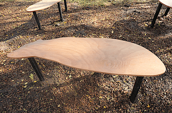
Creature Comfort Benches on Natick Common, part of a 2018 Placemaking Competition in Natick, MA. Photo: Mark Favermann.
Adding personality, character, and even familial presence, creatively inspired street furniture, by drawing on thematic branding, symbols, textures, and colors, enhances our environment and public health. It also strengthens our sense of the city’s social/historical value. The City of Boston needs to think seriously about maintaining its distinctive charm, and street furniture is a very powerful tool to that end, when strategically applied. In this desolate time, we need visual urban poetry.
An urban designer and public artist, Mark Favermann has been deeply involved in branding, enhancing, and making more accessible parts of cities, sports venues, and key institutions. Also an award-winning public artist, he creates functional public art as civic design. The designer of the renovated Coolidge Corner Theatre, he is design consultant to the Massachusetts Downtown Initiative Program and, since 2002, he has been a design consultant to the Red Sox. Writing about urbanism, architecture, design and fine arts, Mark is Associate Editor of Arts Fuse.
