Visual Arts Review: Terry Winters — A Distinctive “Structure of Things”
Something clicked when I visited the MFA’s diminutive but brilliant new exhibition of Terry Winters’ works on paper.
Terry Winters: The Structure of Things at the Museum of Fine Arts, Boston, through June 18, 2017
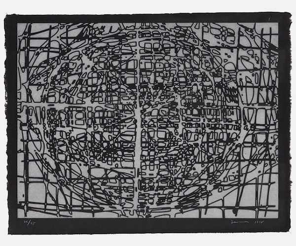
Graphic Primitives, 1997-1999, Terry Winters. One from the portfolio of nine woodcuts, laser‑cut cherry woodblocks. Photo: Courtesy of the Museum of Fine Arts, Boston.
By David Curcio
One aspect of Terry Winters’ work has always irritated me, predicated as it is on the interconnections between art and science (a reaction compounded by memories of droning curators pounding the point home). The enthusiasm presupposes a scientific bent on the part of the viewer, and that left me out. But something clicked when I visited the MFA’s diminutive but brilliant new exhibition of Winters’ works on paper, The Structure of Things. Nodes and nets, grids and structural forms suggest overarching links between science and art. Fortunately, the work ultimately stands firmly with the latter. The scientific elements are molded, shaped and rearranged by an artistic imagination, asserting, in the words of an exhibition’s label, “the fundamental interconnectedness of things.” Well, “things” is a pretty broad, vague word, but in this case it is worth teasing out.
Winters, whose work began to gain some attention in the early ’80s, takes its impetus from mathematical grids, cell structure, cross-sections of biological forms, computer imaging, engineering structures… all of which collude to create imagery whose scientific references range from the microcosmic (cellular) to the macrocosmic (galactic). The result is to bring viewers into a world in which, perceptually, we have no idea where we stand. All we know is that we exist somewhere in there. In this case, “things” can mean anything or everything. I’m not even sure that Winters himself knows the intention of the finished work, but his impetus to create is rooted in the scientific. The rest is up to us.
A prolific printmaker since the 1980s, Winters generally works in series. While fields of multiples occasionally dazzle, the show confirmed what irks me about curators’ bent for toward displaying these sets crammed together, in grids or tight arrangements: the impact of most of the prints shown here diminish considerably when viewed in isolation. There are notable exceptions. The sublime grouping of four woodcuts entitled Furrows (1989) stands out for the simplicity of its execution: a grey woodblock is inked in its entirety (that is, without any cutting) and printed in a light grey with the grain running vertically. Then a black block is carved with a thin gouge, this time with the grain running horizontally, and printed over the grey to create large, organic, isolated shapes comprised of lines that run together within millimeters of each other, like combed-out grids vaguely representing the biological cross sections (some more than others) from which they are derived. Imagine a Josef Alpers woodcut stripped of its origami angularity. The swirling grain adds natural undertones to the severity of the imagery, but it is now replaced by indescribable, organic linear forms. It is probably the best work in the show, wherein each print stands alone as a puzzling cross between controlled cutting and (seeming) random biology.
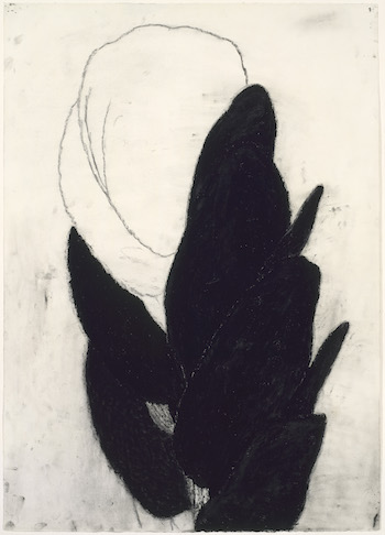
Dark Plant Drawing #16, 1982, Terry Winters. Photo: Courtesy of Museum of Fine Arts, Boston.
A portfolio of six “hand-cut” linocuts (Winters frequently relied upon laser cutting in his relief work) titled Glyphs (1995), displayed in two rows of three, generate poignancy. The set knocks you out with its combinations of warbly marks, drawn upon the block with what must have been a three foot brush to drag out lines that resemble a frustrated child’s aborted attempt at drawing a net. Frustration takes over and the cuts become rounded, scribbled, swirled, and x’d out. The wall labels tout a “play with positive and negative [space].” This a banality: it is the expected outcome – the intention even – of single color relief prints where there is no possibility of gradation. A charming element — almost a coda to these Glyphs — is the hand-dying of the thin Japanese paper on which they are printed. Winters’ signature is playful; he eschewed standard graphite and scrawled his name in blue colored pencil, the edition number in red.
Similar, though far less appealing, is a large series of etchings entitled Graphic Primitives (1998). Using a technique dreamed up by a bored Picasso with oil paint (as opposed to printing ink) and woodcut, these come off as scientific mainly because of their mechanical, almost digital-like imagery. Using digitally cut cherry wood (an extremely strong wood that difficult to cut, used in 18th and 19th century Japanese woodcut because it created the finest, sturdiest of lines), Winters has printed the images (very similar in feel to the Glyphs) with white ink on white paper, which is then covered in its entirety with black Sumi ink. The water-based Sumi is rejected by the oily printed ink, leaving the negative spaces of the carving black. The result is described on the label as a “wonderfully ambiguous relationship… between the positive and negative.” Depending on your definition of “wonderful,” “positive,” and “negative,” the arrangement is slightly obfuscated by the gradations that hug either side of the forms and lines that seem to represent alien electronic chips or demented architectural plans. Their dimensionality and grey spaces seem to do away with that whole “positive and negative” observation. And not a print among them stands on its own.
Winters also delves without hesitation into lithography, which he executes with cavalier abandon. Folio (1985-1986), produced roughy a decade earlier than the relief prints discussed above, is a series (yes, another series) of medium size lithographs (approximately 22 x 30”). They come across as an undergraduate’s attempt at imitating Rauschenburg imagery, the efforts disparately pieced together upon the paper. His mixing of blacks with silvers, grays, and occasional color are of interest only for the artist’s decision to leave grease stains upon the lithographic stones prior to printing, encouraging smudgy marks that, had I not studied them up close, struck me as charcoal smears. Sadly, Winters other lithographs are a mixed bag: The large Yellow Stone (2010) is layered with horrid oranges, purples, and yellows. The colors are not unappealing in themselves, but placed together make up a kind of wounded, dissolving image that will take a long, long time to follow through on its decomposition, so abrasive and strong are the colors.
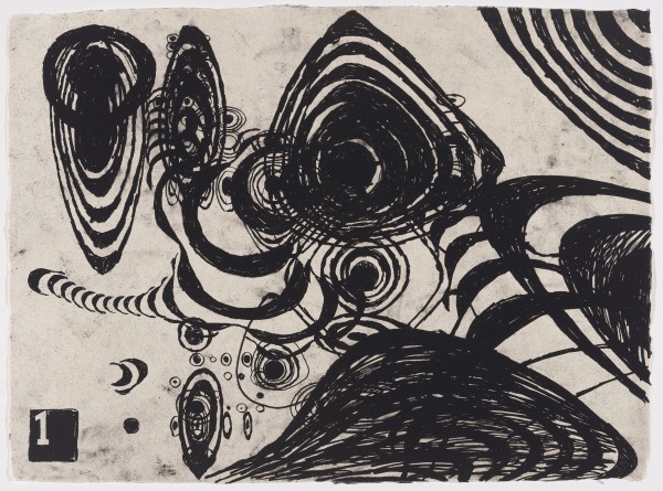
“Tokyo Notes,” 2005, Terry Winters. Plate one from the portfolio of nine lithographs. Photo: courtesy of the Museum of Fine Arts Boston.
Lest I come across as maligning all of Winters’ lithographs, there are two magnetic works from the series Tokyo Notes (2004) that hang on the freestanding wall next to the exhibition text. Unlike anything else on display here (with the exception of a graphite drawing discussed below) their joyful, playful (and very un-Winters like) looping half moons recede like floating DNA or the backward swing of a vertiginous carnival ride and lie somewhere between a far-sighted scientist gazing into a microscope and a very clever 10th grader’s bored drawings done in her notebook during math class.
Hanging next to the awful Folio are two of the show’s best pieces. In the large (30 x 40”) woodcut Wood/Cut/Figures (2011), Winters again relies on laser-cutting (whatever works) to make several blocks that have been printed over one another in gradations of grey, running the gamut between the white of the paper and the black ink. These layers create a nearly symmetrical, puzzle-like structure that looks like a screwball set of tangrams where grids and rounded edges live together in harmony, seeming to expand and contract before out eyes. The other serious gem here – the great sleeper of the show – is the graphite drawing 7-Fold Sequence, Two (2008). Part of a series called Knotted Graphs, it is thankfully shown alone — it more than holds its own. In what anyone would mistake for an 18th century Chinese woodcut comprised of stamps, the careful mix of rounded and angular forms migrate like cells toward the left of the sheet as if about to spill out onto the floor and leave the paper behind for good.
Sure, it is an uneven show, but given its size (approximately fifty works if you include each piece in the grid-hung collections of series), there is enough here to give viewers considerable pleasure
figuring out what works and what doesn’t. Process and intent are, for the most part, unified in The Structure of Things, which at its best serves up a refreshing blast of Winters’ distinctive vision.
David Curcio received his MFA in printmaking from Pratt Institute in 2001. He continues to work in the field of prints as well as embroidery and fiber arts. He has written for bigredandshiny.com, boxingoverbroadway.com and boxing.com. He lives in Watertown, MA.
Tagged: David Curcio, drawings, lithographs, museum-of-fine-arts-boston, prints, Terry Winters