Visual Arts Review: Mark Pharis and George Mason — Beautiful Micro-Infusions of Chaos
By Anthony Merino
All of the pieces in this exhibition are both well designed and smartly executed — apt examples of just how smart and complex purely ‘decorative’ objects can be.
Mark Pharis Solo: The Vessel–Stretched, Compressed, Bent and Reconfigured. and George Mason. At the Lacoste Gallery, 25 Main Street, Concord, MA, through October 10.
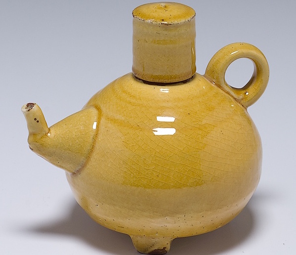
A Mark Pharis teapot.
The Lacoste Gallery’s pairing of ceramicist Mark Pharis and fabric artist George Mason seems obvious. They use similar fall foliage palettes of redbrick and rubbed charcoal mixed with muted yellows, oranges, and crimsons. Pharis goes his own way from time to time, adding intense highlights of blue or green. They both mix geometric and organic shapes into their compositions. They both draw on a sense of nostalgia in their work, which can appear quaint, perhaps to the point of seeming to be saccharine at times. But at its best their work is more than vacuous decoration. All of the pieces in this exhibition are both well designed and smartly executed — apt examples of just how smart and complex purely ‘decorative’ objects can be.
Two of Pharis’ teapots (“Teapot, Red and Black” and “Teapot, Red, Green, and Blue Lid”)) serve as illuminating introductions to the show. His pieces are usually based on traditional utilitarian forms: plates, bowls, and vases. Yet Pharis alters many of these pedestrian forms. Yes, these teapots honor the form’s essential design. But there’s a difference. The vast majority of ceramic objects are made either by slip-casting or wheel throwing. These two processes tend to create shapes that are sharply defined and geometric. But Pharis cuts and assembles slabs of clay together to make his pieces, allowing the clay to buckle, undulate, and bow. This approach creates objects that mimic the physical qualities of stiff leather, including its impression of softness. This suggestion of the handmade an important part of Pharis’ craftmanship. The random bulges and bows give his pieces a kind of pastoral aura. This weirdly ‘homey’ quality is at its strongest in his teapots because they are not as abstract as his other works.
Economy of form and sharpness dominate contemporary aesthetics. Our culture is bullied by the aesthetics of the logo — a demand that all visual information be tidy, minimal, and easily digestible. Pharis confounds consumerist expectations by purposely creating works with the appearance of being used and worn. He does this by rounding the edges of his forms and including graphite blushes around the seams. Twisting and bowing for no reason, decorated with wonky bulbous curves and fattened lines, Pharis’ forms and decorations are intriguingly secretive; their whys and wherefores are hidden — you are invited to guess the method behind the madness. The disorientating sensation is much like the first day of driving in a foreign country. You know that the signs mean something and assume they have some kind of internal logic — but you have yet to figure them out.
Sometimes these shapes can read as vaguely rude –like the bicycle seat shape he marks out in “Bowl, Pink and Yellow, 2014.” Most consistently, his works look like a mishmash of randomly processed three-dimensional shapes and forms. The added surface decorations read like (ironic?) references to traditional vases or bowls. His aim appears to be to create a three-dimensional rendering of a cubist painting. The original source object — a vase, a bowl — is transformed into a seemingly random conglomeration of planes and curves, a visual scramble. The resulting confusion contributes to the social function, the radical message, behind of Pharis’s work. For most of us, our lives are rigidly structured, an invariable pattern of waking, working, and sleeping. Pharis’s small pieces are micro-intrusions of chaos into these set structures. They remind us that there is a certain beauty and reassurance in not having everything be legible, that there is a world beyond the sleek logo.
Pharis’ work tends to be confounding, an attempt to shake up legibly saturated lives by introducing the illegible. In contrast, George Mason’s work is meant to be reassuring. He hangs plaster, clay, burlap, paint, encaustics, and fabric off of boards. In his work “Pageant, 2015,” for example, he tacks narrow four to six inch wide sheets of differently textured sheets into a curtain of color that’s approximately nine feet long. The arrangement of the narrow strips generates a vertical, grid—like forest. His use of earth tones — reds, ochres, oranges and browns — suggests autumn. The result is a strikingly strong piece that mimics the visual sensation of looking out of a spacious window and viewing a landscape of deciduous trees.
When it comes to considering quality in the visual arts, decorative is often used in a derogatory sense, a synonym for the banal or the childish. It is a term relied upon, at times a bit too blithely, to banish crafted objects to the kiddie tables of kitsch or flea markets. In the complex, nuanced hands of Pharis and Mason, the ornamental becomes a very adult pleasure.
Anthony Merino is an unaffiliated artist and critic working out of Adams, Massachusetts. He has published and presented papers on contemporary art internationally. Additional articles are available here.
Tagged: Anthony Merino, ceramicist, fabric artist, George Mason, Lacoste Gallery