Visual Arts Commentary: Boston City Hall — A ‘Triumph’ of Brutalism
Urban pollution and acid rain have not dealt kindly with Boston City Hall’s mostly concrete facade.
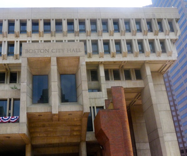
Boston City Hall — the building is held in utter contempt by a majority of Boston’s citizens. Photo: Mark Favermann.
By Mark Favermann
Boston City Hall has suffered a sad fall from grace. It was once ranked as the 5th Best Building on world architectural lists, praised as the jewel at Government Center. Now it is held in utter contempt by a majority of Boston’s citizens.
In fact, it has probably become the most hated structure in Boston. Urban pollution and acid rain have not dealt kindly with the building’s mostly concrete facade. Water stains from leaks are noticeable. Boston’s late Mayor Thomas Menino said on more than one occasion that he wanted to sell it or to tear it down. Current Mayor Marty Walsh has less radical plans — he is trying various means to visually enliven both the exterior and interior of the building
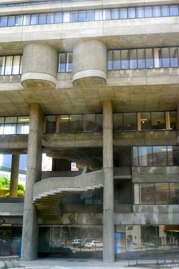
The winner of an international architectural competition, Boston City Hall was designed in 1962 by the firm of Kallmann, McKinnell and Knowles; it was built in 1967 at the height of enthusiasm for the Brutalist architectural style, which flourished from the 1950s to 1970s.
In 1954, English architects Peter and Alison Smithson coined the term Brutalist or Brutalism. The label was inspired by the French “béton brut” (raw concrete), a phrase used by architectural icon Le Corbusier to describe his favorite building material.
Its architects envisioned Boston City Hall to be divided into three distinct zones. The first was the ceremonial section where great and often symbolic events could take place; the second was the retail piece where tax bills, parking tickets, and fees could be paid; the third was the offices where government work took place. The facade of the building was designed to abstractly speak to these three functions as well. It is an open question whether the citizens of Boston ever saw or understood this vision.
Maintenance of the exterior of the structure has been haphazard at best. The unpleasant brick City Hall Plaza has become a windswept, barren wasteland since the building opened in 1968. Given its hostile affect on pedestrians, brutal is a good word for it.
A section of the Mass Dept of Mental Health Building designed by Paul Rudolph. Photo: Mark Favermann
Brutalist buildings usually incorporate strong geometric angles and are generally made from pre-cast concrete elements that reveal the texture of the wooden forms used in casting. In contrast, Peter and Alison Smithson built many of their projects with bricks. Brutalist building materials also included glass, steel, rough stone and other textured substances.
Strangely, or perhaps not so strangely, Brutalist architecture was closely associated with post-war utopian theories, especially in Europe, given the degradation of so many cities because of World War II. The irony is that these cold, often abstract structures were often aggressively unfriendly, partly because they disregarded social and historical context. Not surprisingly, criticism of Brutalism arose almost immediately because of the forbidding nature of these buildings. These structures starkly out of time and place and appeared to be part of an ‘alien’ environment. Most of these buildings, even in simple sculptural terms, were not visually appealing. Almost from their onset in the early 1950’s, there was little community support for Brutalism.
However, there were prominent architects who championed Brutalism because the approach was relatively inexpensive in terms of construction and design. They embraced the sense of “honesty” that was supposedly a hallmark of the style as well as its allegedly sculptural qualities. Even with its divisive aesthetics, Brutalism’s main selling point was that it was anti-establishment and anti-conventional — a totally modern approach to design.
This is clearly acknowledged by Le Corbusier’s public housing complex Unite d”Habitation (1952) and the Secretariate Building at Chandigarh in India (1953). Besides the Smithsons, Louis Kahn (several buildings in Asia), John Andrews (The Graduate School of Design building at Harvard, 1972), I.M. Pei, and Tadao Ando all designed major Brutalist works. Marcel Breuer’s Whitney Museum (1966) can be considered a softened version of Brutalism.
Because the materials and building methods were cost-effective, the argument was that Brutalism represented the average working person, that it was democratic in spirit. However, in reality, the structures often quickly degenerated into high-rise tenements that were frequently crime-ridden, overly crowded, and ill-kept or neglected by responsible authorities. Also, the idea that the tough concrete material hampered vandalism provided to be short-sighted — no one envisioned the sight of graffiti-covered walls or the degradation that would come after decades of acid rain. Other bad versions of the Brutalism style includes retail concrete mega-boxes that became our ubiquitous and ugly shopping malls.
Noted architect Paul Rudolph designed a number of Brutalism buildings, including campus housing. One of his well-known Brutalist structures is The Hurley Building on Boston’s Staniford Street. Ironically, it is the home of the Massachusetts Department of Mental Health. The building served as the State Police Headquarters in Martin Scorcese’s Academy Award-winning film The Departed. In 1958, Rudolph designed the much maligned (eventually renovated and expanded in 2008) Yale Art and Architecture Building. In 1970 The structure was set on fire, perhaps by students irate about being uncomfortable. He also designed the awkward University of Massachusetts at Dartmouth, MA campus.
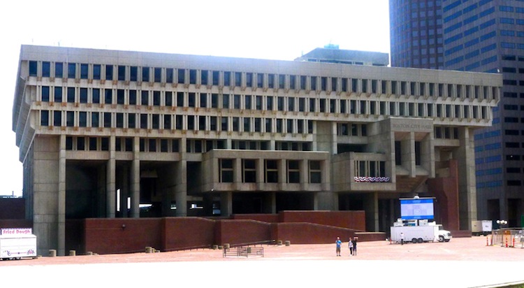
Boston City Hall — good luck to Mayor Walsh and his plans to enliven the exterior of the building. Photo: Mark Favermann
Other campuses touched by the Brutalist style include the ungainly State University of New York at Buffalo, buildings at University of Toronto, Ryerson University, and York University (all in Toronto), Cambridge University’s Churchill College and the Aula at Delft University in the Netherlands. Some urban myths suggest that these buildings were built to be viscerally prickly in order to discourage urban terrorists during the ’60s and ’70s.
In recent years there has been a small but significant revisionist outbreak in architectural circles, critical thinking in the service of positively reappraising the Brutalist style. The argument goes that these structures were attempts at visionary sculptural expressions that were disliked more because of poor maintenance and lack of proper management than their off-putting designs. Really?
The quality, even the elemental appeal, of various Brutalist edifices is highly debatable. The bottom line is that most of these structures now appear aesthetically and even functionally dated.
No matter what is said in their defense, these Brutalist structures are generally not well-liked by the general public. And for good reason — they are expensive to clean and visually off-putting. Simply put, Brutalist buildings like Boston City Hall are the porcupines of architecture. The best of luck to Mayor Walsh in his attempt to put lipstick on this giant beast of a structure, but there is not much that can be done to make Brutalist buildings welcoming rather than repellent.
An urban designer, Mark Favermann has been deeply involved in branding, enhancing, and making more accessible parts of cities, sports venues, and key institutions. Also an award-winning public artist, he creates functional public art as civic design. Mark created the Looks of the 1996 Centennial Olympic Games in Atlanta, the 1999 Ryder Cup Matches in Brookline, MA, and the 2000 NCAA Final Four in Indianapolis. The designer of the renovated Coolidge Corner Theatre, he has been a design consultant to the Red Sox since 2002. He has previously written for The Phoenix, Art New England, American Craft Magazine, Boston Herald, and Leonardo.
Tagged: béton brut, Boston City Hall, Brutalism, Brutalist building, concrete, Le Corbusier, Mark Favermann
Mark, thank you for an interesting survey of this style. And a welcome correction to the common understanding of “béton brut”. I think a good cleaning would help this building and if complimented by improvements to the plaza I believe we could have a City Hall we can take pride in.
How about an article on the “other” Paul Rudolph building; 133 Federal Street?
I believe the case against these buildings has been overstated. Sure, some of them were a bit gimmicky, with needless gravity-defying cantilevers and concrete blades protruding between windows for no apparent reason. I was never a fan of rough concrete, whether it was the rough-troweled stucco look or the plywood-imprint more commonly associated with Brutalism. But plenty of Brutalist buildings created interesting spaces and did interesting things with light. I’ve found the walk through many of them, including Boston City Hall, a little like exploring an old castle. I don’t see how so many architecture critics can hold Frank Loyd Wright in such high esteem without appreciating at least some of what these buildings have to offer.
Of course there were examples that just didn’t work; the Harvard GSD building has, from all that I’ve heard, more than earned its bad reputation, and I realize that modern concrete is not quite as permanent as its “Stone Henge” appearance might suggest. But I seriously doubt that the products of the rut in which “modern” architecture currently finds itself; cheaply-clad boxes with a few odd angles thrown in in lieu of any real innovation, or Frank Gehry “Whoville” novelty buildings, will age even as well as these behemoths, unless their disposable exteriors are meticulously maintained long after the public has grown tired of them.